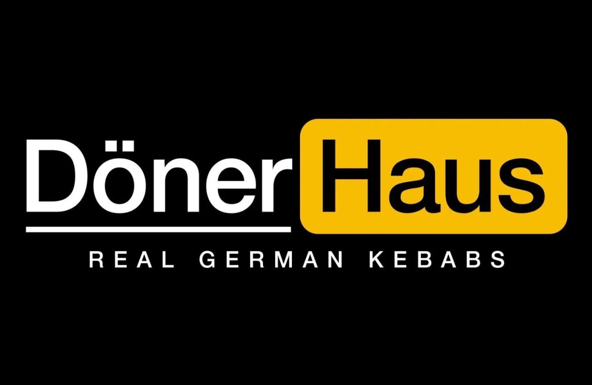
Pornhub has ignited a contentious debate over branding. Their latest rival is not what you’d expect – it’s a kebab eatery nestled in the bustling streets of Lower Manhattan.
Döner Haus, a newcomer to Lower Manhattan’s dining scene since March, pledges to deliver the quintessential German kebab experience. These savory offerings make for an ideal midday snack, a delicious dinner to go, or a hearty end to a night of revelry.
However, the tantalizing tastes promised by Döner Haus are being eclipsed by a controversy that’s a bit spicier— their emblem bears an uncanny resemblance to that of a prominent player in the online adult entertainment world.

The adult entertainment powerhouse has voiced worries that Döner Haus’ emblem might lead to customer mix-ups due to its striking likeness to their platform’s symbol. They’ve even hinted at possible legal steps if this branding clash isn’t sorted out amicably.
Pushing back, Döner Haus’ marketing strategist Pauline Phan emphasizes the stark contrast in market sectors between the two entities, suggesting that confusion is highly unlikely.
It’s true, the logos share a visual kinship, and one could surmise Döner Haus had a motive behind their design choice. Still, is this clash truly worth the adult site’s resources and efforts? Is there a realistic chance diners will mistake the eatery for the adult website? The verdict is still out, though Pornhub is intent on tackling the issue head-on.
Contrasts between the logos do exist, most notably in the hue differentiation and the distinct emphasis on the word ‘Döner’ below its icon.
Such logo quarrels aren’t exclusive to this case; larger corporations have previously bullied smaller entities over emblems. Consider Apple’s aggressive confrontation with Prepear in 2020. Their grievance? The sight of a pear logo. That’s correct – not even the fruit associated with their brand. Fortune favored the bold, and ultimately, Prepear emerged victorious, retaining its pear-themed emblem.

