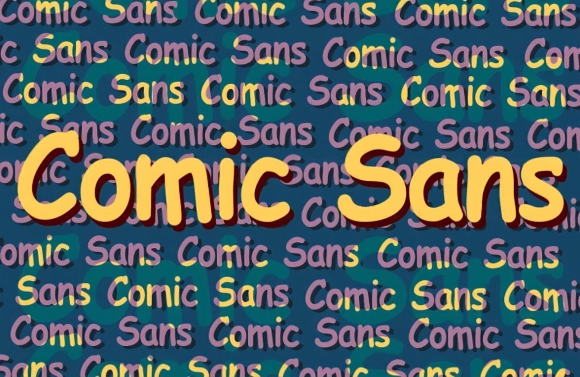
Take a stroll down memory lane to a time when Comic Sans was adored rather than ridiculed, and using the Impact font felt revolutionary rather than obligatory. In this roundup, we present a selection of the top ten typefaces that have fallen from grace and become the subjects of our collective disdain.
Bleeding Cowboys on merchandise, Trajan on film billboards, Brush Script on restaurant menus, and the omnipresent Comic Sans on, well, everything—these fonts have shifted from being design darlings to victims of their own popularity.
This compilation is a journey to uncover the typefaces that have arguably earned the public’s disapproval more than any others.
To kick things off, let’s chat about why a font might find itself on the unpopular list.
The Ingredients for a Disliked Typeface
One might jump to the conclusion that these fonts are universally panned because they’re inherently flawed, or that they’re unsuitable for any professional work.
However, that’s not quite accurate. Many of the fonts we’re about to explore are, when you get down to it, well-crafted designs.
So, what makes them so unpopular? The prime catalyst that shifts a font from cherished to chastised is simple: overuse.
Whether it’s slapping a decorative font onto a formal document or mindlessly churning out menu designs in what should be a unique script—repeated overuse and mismatches between the font’s personality and its application inevitably lead to a good design’s downfall.
With that framework in mind, let’s dive into our list of the top ten typefaces that have overstayed their welcome in the design world.
10) Courier

Planning out a script? Courier’s your pal. Writing code? Courier works. But, Courier for anything else? You might want to think twice.
Its stark simplicity, a throwback to the era of typewriters, gives it unparalleled clarity—valuable traits for certain tasks. However, its lack of sophistication and style renders it a dull choice for modern designs. So, if it appears on a website’s content, it might be a signal to steer clear.
9) Arial

You might be surprised by Arial’s inclusion here, given its prevalence. Its poor reputation amongst some designers stems from its origin—it was created as a Helvetica clone to help Microsoft dodge licensing fees.
Though visually similar to Helvetica, Arial lacks its refinement, which didn’t escape notice when it became Microsoft’s staple. Typography expert Mark Simonson likened it to settling for an impersonator instead of the real star.
8) Neuland Inline

Neuland Inline often conjures adventures in wild locales, adorned with dinosaurs or safari scenes. This font enjoyed its heyday in the 1930s, embraced by 20th-century marketers for its unique and exotic visage. Unfortunately, its ubiquity in modern film marketing has reduced it to a cliché.
7) Bleeding Cowboys

Awarded the dubious honor for having a name as unfortunate as its design, Bleeding Cowboys had its moment back in 2007, embraced for its gritty design. But as its popularity skyrocketed, so did people’s ire. Its inconsistent, uncomfortable curves and odd flourishes epitomize design overkill.
6) Impact

Impact, as the name suggests, was designed to grab attention, and it excels in visibility and boldness. Yet, its status as the go-to choice for amateurish banners and obnoxious ads has tarnished its initial appeal, rendering it a tiresome option rather than a standout choice.
5) Times New Roman

According to typography authority Matthew Butterick, opting for Times New Roman isn’t a choice—it’s the lack thereof. The font’s long tenure as the default for Microsoft Word sealed its fate as a bland and uninspired selection for today’s creative endeavors.
4) Trajan

If there’s a font that’s become synonymous with epic cinema, it’s Trajan. Its grand, classical form is perfect for grandiose film posters. Still, overuse has sapped this font of its unique appeal, leaving it as awkward as a toga at a modern cocktail soiree.
3) Brush Script

Brush Script aims to emulate handwriting but fails to capture the true irregularity and charm of penmanship. Its overuse in projects aiming for a ‘handcrafted’ feel only highlights its synthetic nature and inability to truly replicate human writing.
2) Papyrus

Papyrus has become a byword for typeface mishaps, embedding itself in everything from spa branding to cinematic adventures since the 2000s. Its distinctive character might have been celebrated if used judiciously, but exposure to excess has solidified its status as a typography pariah.
1) Comic Sans

Comic Sans rightly lands at the pinnacle of this list; once enjoyed for its playful appearance, it’s now derided for its infiltration into all realms of life. This font’s charm has been diluted by its adoption into every use imaginable, leaving it overexposed and out of place in most professional settings.
In Conclusion
If there’s a lesson to be learned from these unfortunate tales of font infamy, it’s the peril of overuse. What starts as a novel and interesting typographical expression can quickly become the bane of designers and viewers alike when ubiquity sets in. Unique fonts often flounder in serious contexts, and being a default option on Microsoft Word certainly doesn’t help a font’s case.
Have your own list of typographical tragedies? Feel any notable offenders have been omitted? Reach out and share your thoughts with us.

