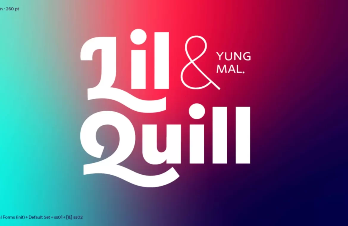
Selecting the appropriate font is crucial to setting the mood for your design projects—whether you’re aiming for a sense of tradition, aspiration, modernity, dynamism, or practicality, the right font makes all the difference.
With this in mind, each month we curate a list showcasing the 15 most exciting new fonts we’ve encountered online over the past month. Here’s the latest collection for your enjoyment!
Bulk
Bulk stands out with its bold, block-like shapes and fine interior lines crafting each letter. Suitable for impactful posters, large-scale typography, and distinct branding endeavors.

AW Conqueror Stincilla
Continuing the legacy of the AW Conqueror family, AW Conqueror Stincilla impresses with its stencil design. It boasts engaging shapes perfect for high-end branding, editorial use, and headline typography.

Vesterbro Sans
A breath of fresh air in the sans-serif genre, Vesterbro Sans is a masterclass in simplicity and casual aesthetics, now also in a variable font format.

Miau
The playful exuberance of Miau is apparent in its barely legible ribbon-like forms—ideal for a statement piece.

Rikna
Rikna, a versatile slab serif, offers a balance of functional text sizes and engaging display features, perfect for projects needing reliability infused with personality.

Austerlitz
The Austerlitz typeface family mimics the didone style with elegance, suitable for a variety of applications, including print and digital media, and has potential for use in branding.

Gramma
The contemporary sans-serif Gramma distinguishes itself through unique terminal designs, ensuring clarity on screen at any size and interest at larger scales, making it an excellent brand font.

Miracle Fairway
For a striking logo, consider Miracle Fairway, a bold display typeface with serifs that seem to propel the letters forward with dynamic energy.

Vitrine
Vitrine brings drama to the table with its high-contrast sans-serif design, especially pronounced in its bolder and blacker weights, ready to make a statement as a display face or in logos.

Kelyon
The refined Kelyon invokes the past with its medieval and Art Nouveau influence, providing an elegant choice for editorial design with its range of stylistic alternates.

Fit Devanagari
Fit Devanagari redefines the essence of style, allowing for versatile sizing solutions, perfect for creating perfectly fitted text spaces.

Precise Sans
The futuristic Precise Sans, with numerous weights and vibrant italics on the horizon, captures the essence suitable for user interfaces where legibility is king, yet a dash of character is desired.

Mistont
Mistont marries serifs with grace and fluidity, embodying a perfect selection for uplifting lifestyle brand identities.

Exergue
The exquisite Exergue opts for flared terminals that complement its serifs, rendering text that feels both new and recognizable—an impeccable option for extended reading material.

Manier
Manier features angular wedges and open proportions across its six weights, infusing a bold and up-to-date vibe into your design work.


