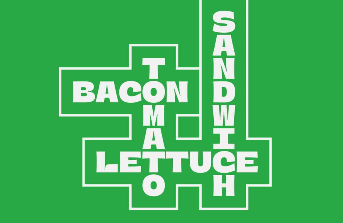
Typographic design translates our words into visually impactful statements, significantly impacting our creative expressions.
However, navigating the vast array of typefaces to find the perfect one for a project can be an arduous task, especially when many leading brands tend to default to neutrally safe geometric sans-serifs.
Our curated list this month offers you new and intriguing options, including adaptable variable fonts, timeless revivals, and some complimentary offerings.
Unconventional DT Random Display
DT Random Display injects a lively burst of originality into your projects, though it’s a font best enjoyed in moderation due to its challenging readability. Perfect for an avant-garde music album cover, DT Random Display is up for grabs at no cost.

Bold and Maximalist Escura
Escura masterfully merges tradition with contemporary forms, blending Celtic scripts into a striking geometric pattern. This font also boasts variable abilities.

Chunky Charm with Merni
Merni offers a hefty display option that’s great for making a solid statement in branding or packaging. Despite its bulk, it maintains a welcoming, whimsical vibe without veering into childish territory.

Elegantly Crafted VEQAY
VEQAY stands out with its elegant stencil form, ideal for sophisticated editorial or branding projects. The typeface’s uppercase particularly shines with its dynamic, seaweed-esque curves.

Distinct and Dynamic Binate
Binate fuses the clarity of sans-serif with the personality of brush serifs, crafting an expressive yet neat typeface far more engaging than its more sober relatives.

Versatile PP Fragment
PP Fragment encompasses an eclectic mix of four typefaces, all created to provide a robust, versatile environment. Drawing inspiration from vintage 19th-century adverts, it includes Sans, Glare, Serif, and Text line-ups, all available as a variable font.

Whimsical OBO Star
OBO Star is a delightfully plump display font brimming with unique flair. Its semi-monospaced design builds on square shapes, offering a flexible choice for dynamic branding.

Ping Round’s Simplistic Beauty
Ping Round strips back complex forms to the barest essentials, achieving a look characterized by its distinctive teardrop-shaped counters.

Mathematically Harmonious TT Interphases Pro
TT Interphases Pro offers a newly refined look tailored to the structured world of UI design. It’s perfectly suited for those requiring a clean, unambiguous sans-serif for interfaces or infographics.

Sleek Apta
Apta achieves a subtle equilibrium between the humanist warmth and geometrical precision, reminding one of classics like Gotham or Gill Sans. It presents three varied stylistic sets, catering to both tastes and creating a versatile toolkit for designers.

Vintage-Inspired Gardez
Gardez boasts a retro Californian charm with its distinctive inverted contrasts and excels at grabbing attention in any banner ad space.

Revamped Classic Effra
Effra may not be new to the scene, but it has certainly been rejuvenated with a variable font option for its range of weights and styles. It combines a geometric structure with humanist nuances, making it a digital design favorite.

Retro Charm of Vermors
Vermors revives the spirit of yesteryear with its charming vintage touches. This all-caps, display-only font might whisk you away to a scene straight from an old western.

Rhythmical Satiata
Satiata bursts onto screens with a vivacious chunky display style that seems to hop and dance thanks to its angled strokes.

Innovative Rund Display
Rund Display breathes fresh life into the well-trodden path of geometric sans-serifs with its concave terminal features that enhance legibility and style, especially at larger scales.


