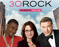
Let’s dive into a diverse collection of popular television series, spanning from nostalgic hits to modern sensations, and explore the distinctive typographies that give their titles a unique identity.
It’s captivating to note the mix of traditional and more recent typefaces, with several unexpected selections that may catch your eye.
For those among our readers who have had a hand in these creative decisions, we’re eager to hear your thoughts on why certain typefaces were selected.
Although identifying the exact fonts was challenging, and there were instances where a similar alternative was presented, the following typefaces represent the closest matches we could find.
This compilation is not an authoritative list of the greatest or least impressive TV series, nor does it imply any political endorsements.
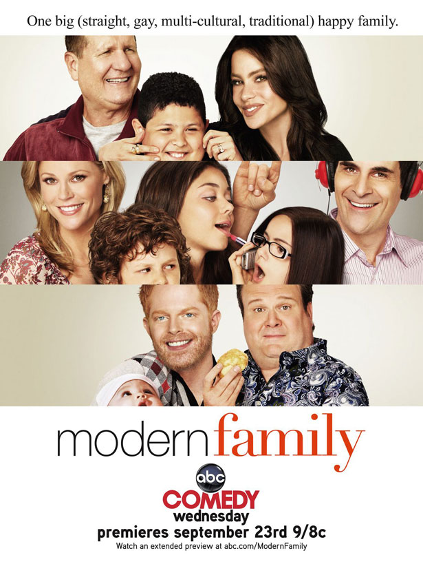
“Modern Family”
“Helvetica 35 Thin” and “Didot Roman”
“The Amazing Race”
“Eurostile Extra Bold” or “Microgramma”
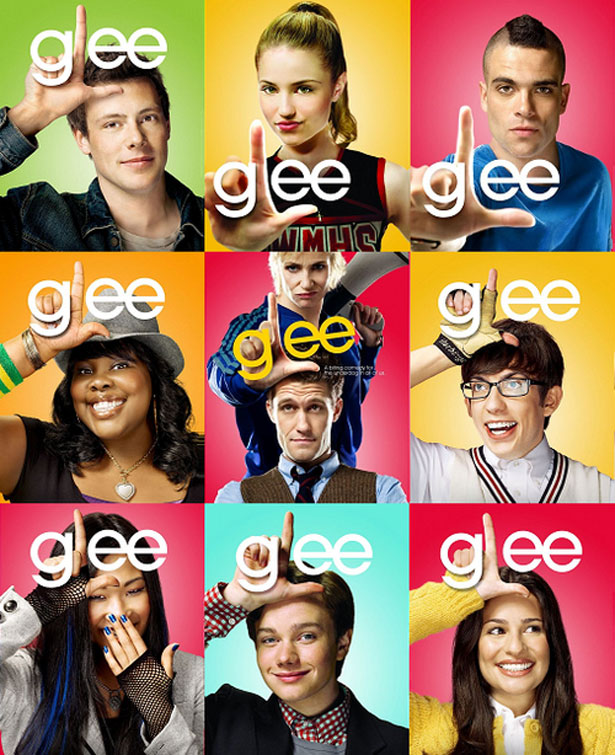
“Glee”
“ITC Avant Garde Gothic”
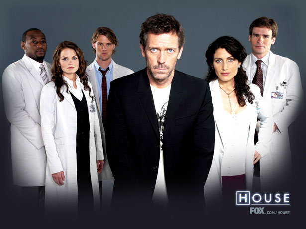
“House”
“Futura Futuris Medium”
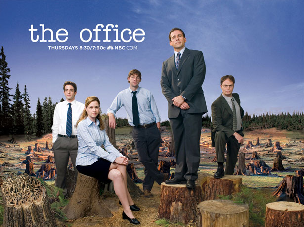
“The Office”
“ITC American Typewriter”
What are your thoughts on these typographic selections for these famous television shows? Any in particular that stood out to you? Drop a comment and let’s discuss!
