
1. Missing-in-Action Contact Page
A surprisingly common oversight among websites is the complete absence of a contact page. Despite a trend among portfolio sites to skip this page, this decision can be a barrier between you and interested parties. Rather than offering a contact page, some replace it with social media icons, which fails those without social media or those needing a more direct line of inquiry about your services or products. The Fix: Establish a contact page without delay. It’s inexcusable to forgo one while you polish your homepage with flashy videos and sleek design. Neglecting to provide easy contact options may signal to visitors that you’re not serious about doing business. The website of Badass may veer from traditional contact forms but still ensures comprehensive contact details are available, complete with multiple phone numbers and emails, as well as social channels for quicker replies — a commendable approach. 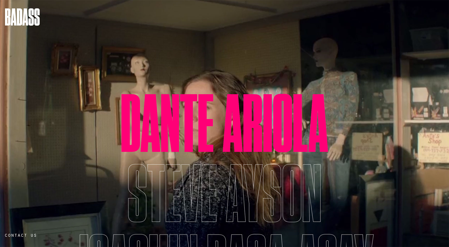
2. Elusive Contact Page
We’ve all experienced the frustration of embarking on a digital scavenger hunt just to locate a contact page. Navigation menus should intuitively direct us there, not require a tedious search that sometimes ends with a desperate Google search for a concealed contact link. Relegating the contact page to the footer is a common mistake but often leads to user dissatisfaction and site abandonment, negatively impacting your conversions due to poor user experience (UX). The Fix: Prominently display your contact page on your navigation menu. Eliminate any guesswork for users by using clear terminology like “Contact” to guide them directly to your contact information. A site like Kickpush exemplifies UX-conscious design by featuring its contact page right on the main menu, ensuring that users don’t need to hunt to connect with the team. 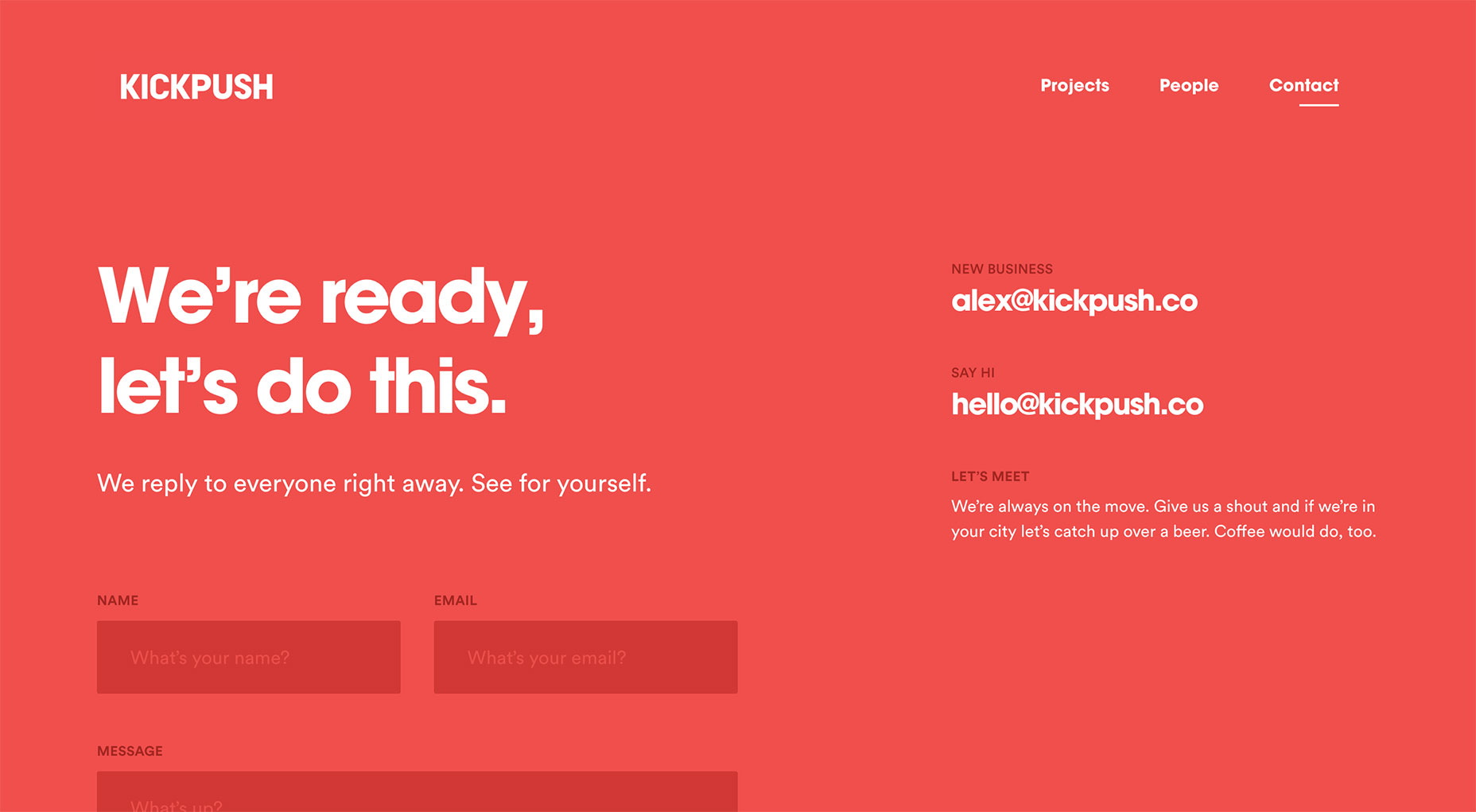
3. Overly Simple or Invasive Contact Forms
Designing the perfect contact form is a fine balance between too few and too many fields, the latter often including excessive personal details and dreaded phone number requests. A contact form that is either too brief or too demanding fails to accommodate user needs and can be a conversion killer. Failing to clearly explain form fields or how to input data can also drive users away. The Fix: Craft a contact form that aligns with your website’s purpose and audience. Ensure that forms are streamlined, take less than two minutes to fill, and facilitate users in communicating their requirements effectively. Sites like Forefathers Group hit the mark by tailoring their contact forms to anticipate the specific needs of their clients, rather than offering a one-size-fits-all approach. 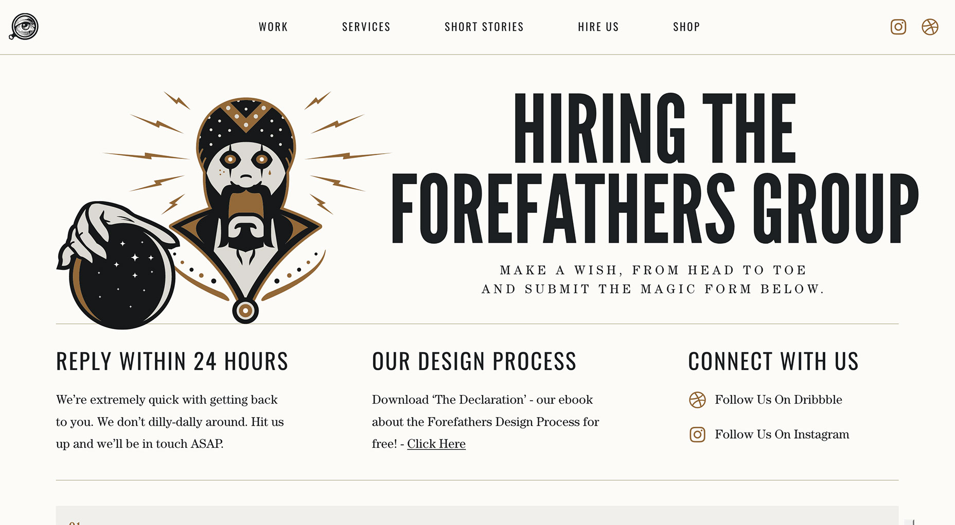
4. Neglecting Feedback Analysis
Overlooking the analysis of contact form submissions can affect the effectiveness of your contact page. A deep understanding of the common reasons behind contacts can inform potential improvements in design and content. Identify patterns in inquiries to possibly introduce categorized topic selections for more targeted and efficient responses from users. The Fix: Actively maintain a log of inquiries. Trends in user outreach can inform adjustments to better cater to common needs or address recurring site issues. The approach taken by SpicyWeb illustrates the benefits of submission analysis with a “How Can We Help?” section, which aids both the clarity of user messages and the relevance of replies. 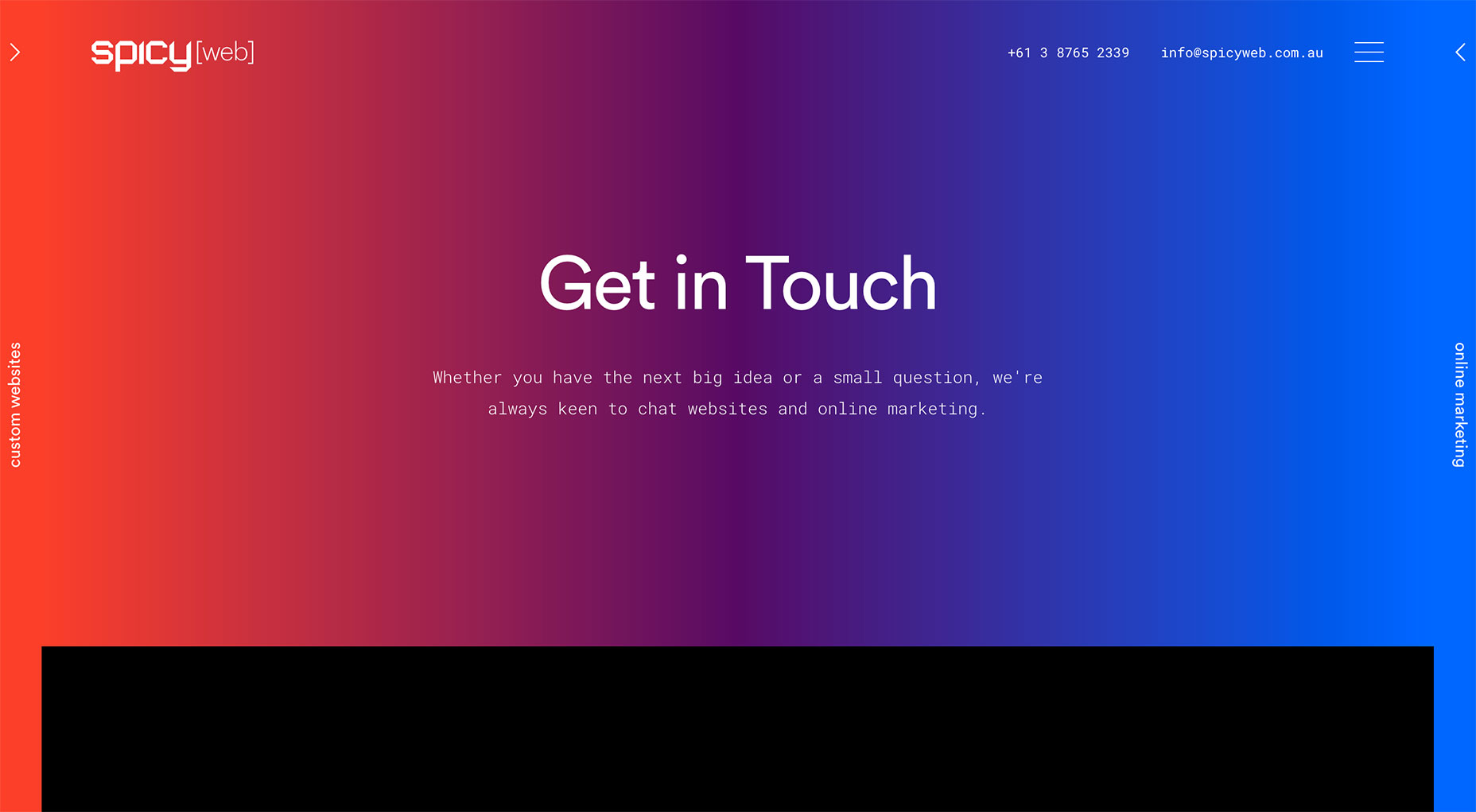
5. Lack of Alternative Contact Methods
Contact forms can’t be the be-all and end-all; users may have urgent matters or simply prefer a different method of communication. A singular way of reaching out can project an image of inaccessibility. Examining Moo’s Contact Us page reveals a trio of contact options: chat, call, or email — a good example of providing variety. The Fix: Diversify your contact options. Even if a phone number isn’t suitable, consider live chat, email, and your social media channels as viable alternatives to connect with you. Sites like Wonder provide a multi-faceted contact approach, offering social media links, multiple email addresses, and even a physical mailing address, ensuring users have a plethora of ways to reach out. 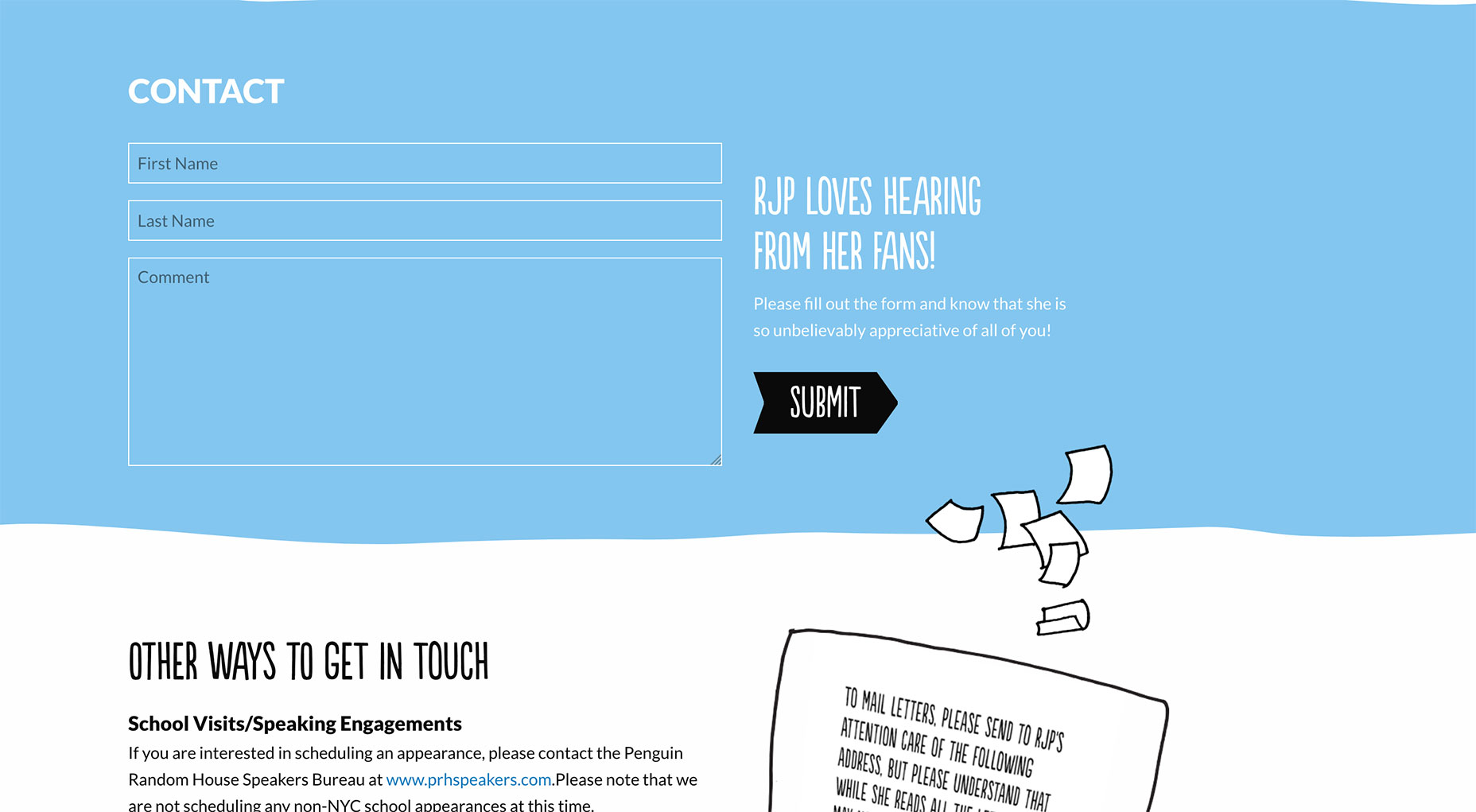
6. Unfriendly CAPTCHA Requirements
CAPTCHAs can present accessibility challenges to those with visual or cognitive impairments and can be a nuisance to all when images are unclear. This leads to frustration and abandonment of contact attempts. Although CAPTCHAs aim to prevent spam, the inconvenience they pose often outweighs the benefits as users struggle with deciphering distorted images and text. The Fix: Opt for more user-friendly alternatives to traditional CAPTCHAs that are less disruptive and more inclusive. For visitors eager for a quick and painless contact process, Sila Sveta offers CAPTCHA-free forms, significantly reducing barriers to successful communication. 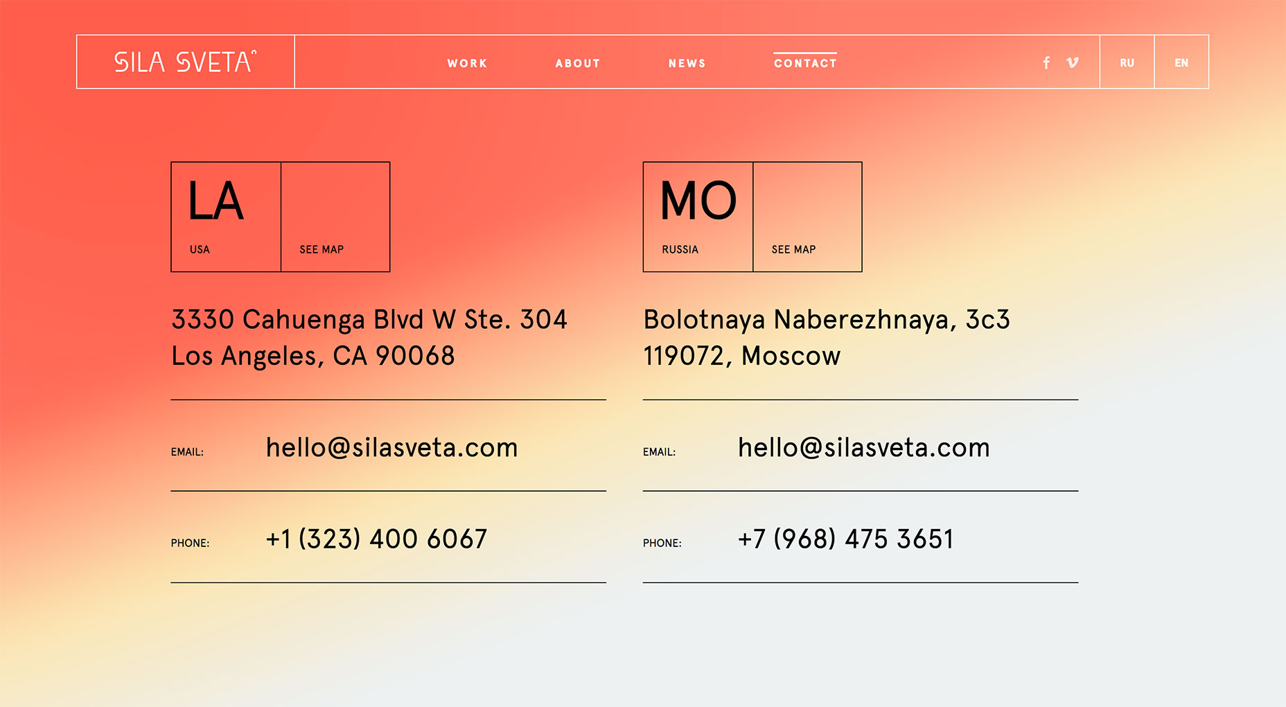
7. Ignoring Submission Responses
Submitting a form with no reply is akin to speaking into a void; it suggests poor site management and neglect of user relationships. Failure to monitor and respond to inquiries squanders valuable engagement opportunities and can tarnish your credibility. The Fix: Ensure that your contact form is linked to an actively checked account or assign a dedicated team member to manage responses. Consistent and timely replies validate users’ efforts in reaching out to you. Sites like NJI3 foster trust by offering assurances right on the contact form, like a same-day response promise from a designated team member, boosting the likelihood of users utilizing the contact feature. 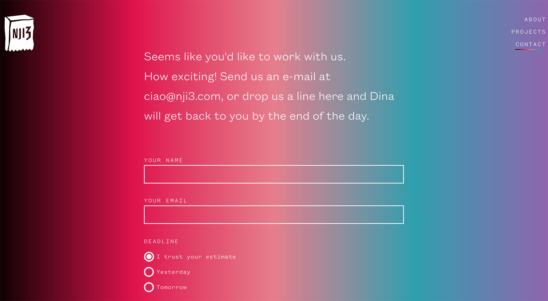
8. Dysfunctional Contact Forms
While occasional site glitches are inevitable, leaving them unaddressed undermines user trust and potentially drives them to leave your site, taking their business elsewhere. Dysfunctional forms, whether it be non-working submit buttons or persistent error messages, can appear neglectful and discourage users from completing their contact attempts. The Fix: Regularly test your contact form to ensure functionality, ideally checking monthly or if there’s an inexplicable drop in submissions. Prompt fixes can prevent user frustration. Providing clear confirmation messages, as implemented by designer Dani, instantly reassures users of successful form submissions, promoting further confidence in the site’s functionality. 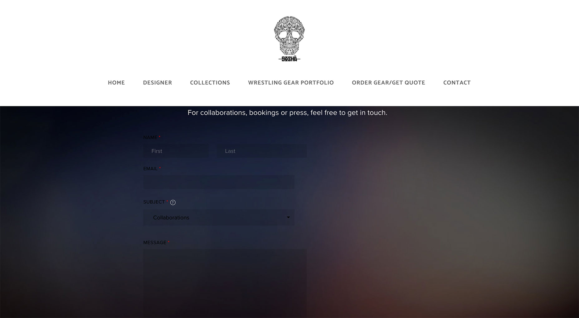
Continually Enhance Your Contact Page
Correcting the above mistakes is a great step forward, but don’t rest on your laurels. Continuous refinement, including A/B testing, strategic contact button wording, and reducing form friction, can elevate your contact page even further.
