The maxim that circulates, claiming there are only two core storylines in the entirety of western narratives—a person embarking on a journey and an outsider entering a new place—might not hold up under close scrutiny. Yet, the repetition of this notion and its apparent resonance indicate how pivotal the theme of the unforeseen is to our conceptualization of storytelling. In both scenarios, whether it’s Clint Eastwood trotting into a decrepit town in the 1800s or Frodo Baggins’s arduous trek to Mount Doom, the narrative propels from the unfamiliar to the familiar.
When it comes to design, the analogy of storytelling falls short. Many designers like to consider themselves as storytellers, but this is perhaps a more decorative way of speaking about conveying information. In storytelling, uncertainty is cherished until the climax, but this is at odds with how people usually interact with design, which is nonlinear and indefinite. Design, instead, shares a common ground with poetry—a realm of compact expressions where themes can be openly interpreted without the need to construct a dramatic arc.
By unraveling secrets through microinteractions—straightforward UI elements made up of triggers and responses—we capture attention. Think of the iconic moments in Jaws; the shark’s impending arrival is announced by a musical cue that has become legendary. Similarly, we can infuse our designs with little narrative ‘spoilers’ that hint at what awaits, enhancing user engagement.
Consider the use of thumbnails. These miniature previews, such as those showcased on talent agency Jacky Winter’s website, convey much more than just images; they provide glimpses into larger content, guiding expectations. Or Alexandre Nacache’s interactive designs, which move beyond conventional thumbnails by teasing elements from his projects. The allure of Taiwanese restaurant Bao is not just its food but the prospect of an experience, subtly suggested through picturesque location illustrations. This approach is echoed by Glasgow-based design studio A Day Out, whose thumbnails not only showcase their work but encapsulate their brand identity.
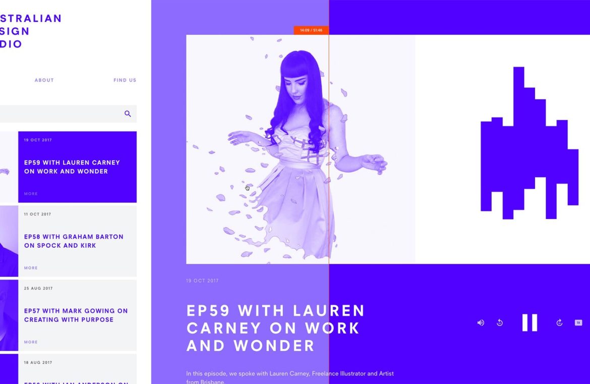
Another fine example is the “5 minute read” notification; a seemingly trivial piece of information that greatly aids the user in gauging their time investment. Culinary website Australian Design Radio, venture capital firm Sequoia, the video platform Vimeo, and Italy’s bike brand Cinelli all employ this concept in creative ways, utilizing design elements that provide users with a sense of duration and position within the content.
In enriching interfaces, qualifying data with meaningful context is key. Presenting information with just enough depth for a quick comprehension, as practiced by customer service software Help Scout, or the visual journey-time indicators of Trainline, allows users to navigate more confidently.
Similarly, labeling and microcopy employed in the interfaces of Lattice, health tracking company Thriva, and financial services API provider Plaid act as maps, providing clarity and reassurance in the user’s journey.
Embedding these ‘spoilers’ through microinteractions lays the foundation for a user experience that is predictable yet engaging, providing a clear path that users can follow to forge their experience while remaining well-informed about their position within a broader context. In doing so, we craft experiences that are not only more coherent but ultimately more satisfying for the user to navigate.

