
1. Opt for an Eye-Catching Button Design
The visual appeal of your CTA buttons can have a significant impact—indeed, the color you choose could make or break their effectiveness. To garner attention, opt for bold, contrasting hues that distinguish themselves from the website’s backdrop while still harmonizing with the page’s aesthetic. Below are illustrations of how Firefox and Hipmunk employ vibrant green and orange colors, respectively, to make their CTAs pop on the page.

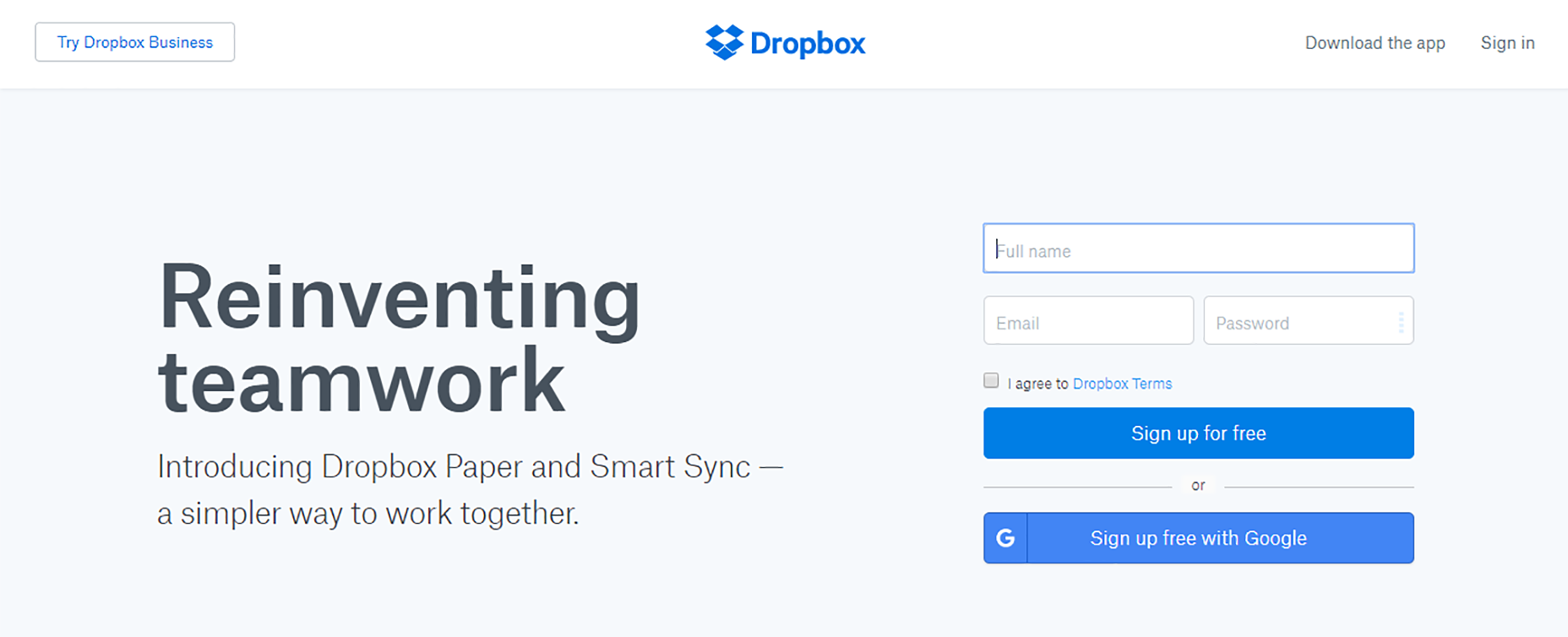
Negative space is also crucial in bringing your CTA into the spotlight. This space isolates the CTA and helps capture user focus, as shown by Dropbox’s approach of framing its “Sign up for free” CTA with generous breathing room against a lighter backdrop.
2. Implement Action-Driven Text
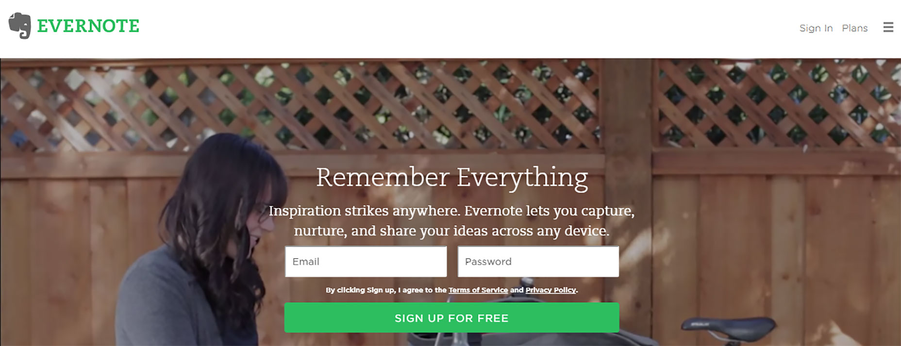
Crafting motivational text for your CTA is a nuanced art. To encourage user engagement, employ verbs that spur action, such as “Start”, “Get”, or “Join”. Evernote’s straightforward yet effective “Sign up” prompts action without unnecessary complexity, and Treehouse adds a personal touch with “Claim Your Free Trial,” which implies value unique to the user.
Concise, Clear Button Messaging
Your button text should be succinct, spanning no more than five words, and must clearly state the benefit: what’s in it for the user? Providing additional details, like Netflix’s “Cancel anytime” assurance next to its “Join free for a month” CTA, helps alleviate user hesitations.

Exploit Urgency and Clarity
Creating urgency and clarity in your CTA buttons can significantly improve click-through rates. Pairing time-limited offers with straightforward additional information helps streamline user decisions and prompt immediate action.
3. Ensure Prompt Visibility
Strategically placing your CTA buttons in prominent, intuitive locations ensures they are immediately visible, ideally without the need for scrolling. Positioning CTAs ‘above the fold’ guarantees immediate visibility upon page load, drawing attention while additional content remains accessible but unobtrusive lower down.
4. Embrace Large, Rounded Button Designs
The shape and size of buttons cue users about their interactivity, so consider larger buttons with soft, rounded corners that are easier on the eyes and perceived as friendlier. These design choices improve user experience and increase the likelihood of interaction.
5. Simplify Choices
Simplifying user choices is key to driving action; too many options can overwhelm. Prefer presenting a single, standout option, as Evernote emphasizes with its primary “Sign up for free” CTA, downplaying secondary options like plan comparisons.

Conclusion
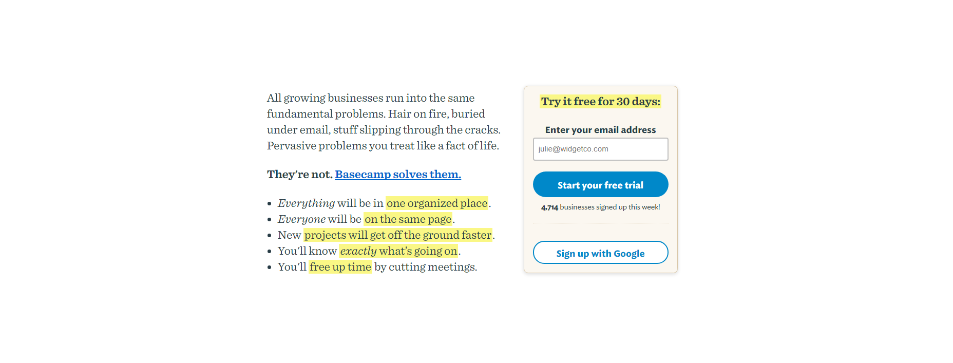
Effective CTA design transcends the button itself; it’s the result of a harmonious integration of surrounding elements like color and text. The Basecamp team’s thoughtfully designed landing page perfectly illustrates this holistic approach, even incorporating persuasive microcopy to embolden potential clients.
Utilize these tips to refine your website’s CTAs, but don’t forget the importance of testing various designs to discover what resonates best with your audience.
