
- Registration Form
- Introductory Email
- Sequential Email Campaign
- Initial Login & Tutorial
- Importing Data & Alerts
- Follow-Up Calls & Promotional Gifts
Each facet of the process is pivotal in forging a brand’s esteemed reputation in the customer’s perspective throughout onboarding. Today’s focus is set on the initial step, registration forms, dissected in depth here. Given their role as the initial touchpoint between the user and the application, I will concentrate on these before exploring the subsequent steps. I will provide six valuable strategies to simplify the process for customers, empowering startups to have a seamless and user-friendly onboarding experience.
Minimize Questions at the Start
A lengthy registration form can cause frustration amongst users. To enhance the transition from registration to engagement, it’s advisable to ask fewer but strategic questions initially. Identifying which queries to prioritize is pivotal; ask for details that lay the groundwork for customer connection. A single email address can begin the subscription process, hence it should top your list. Here’s how Shopify succeeds in crafting a succinct and direct registration page. 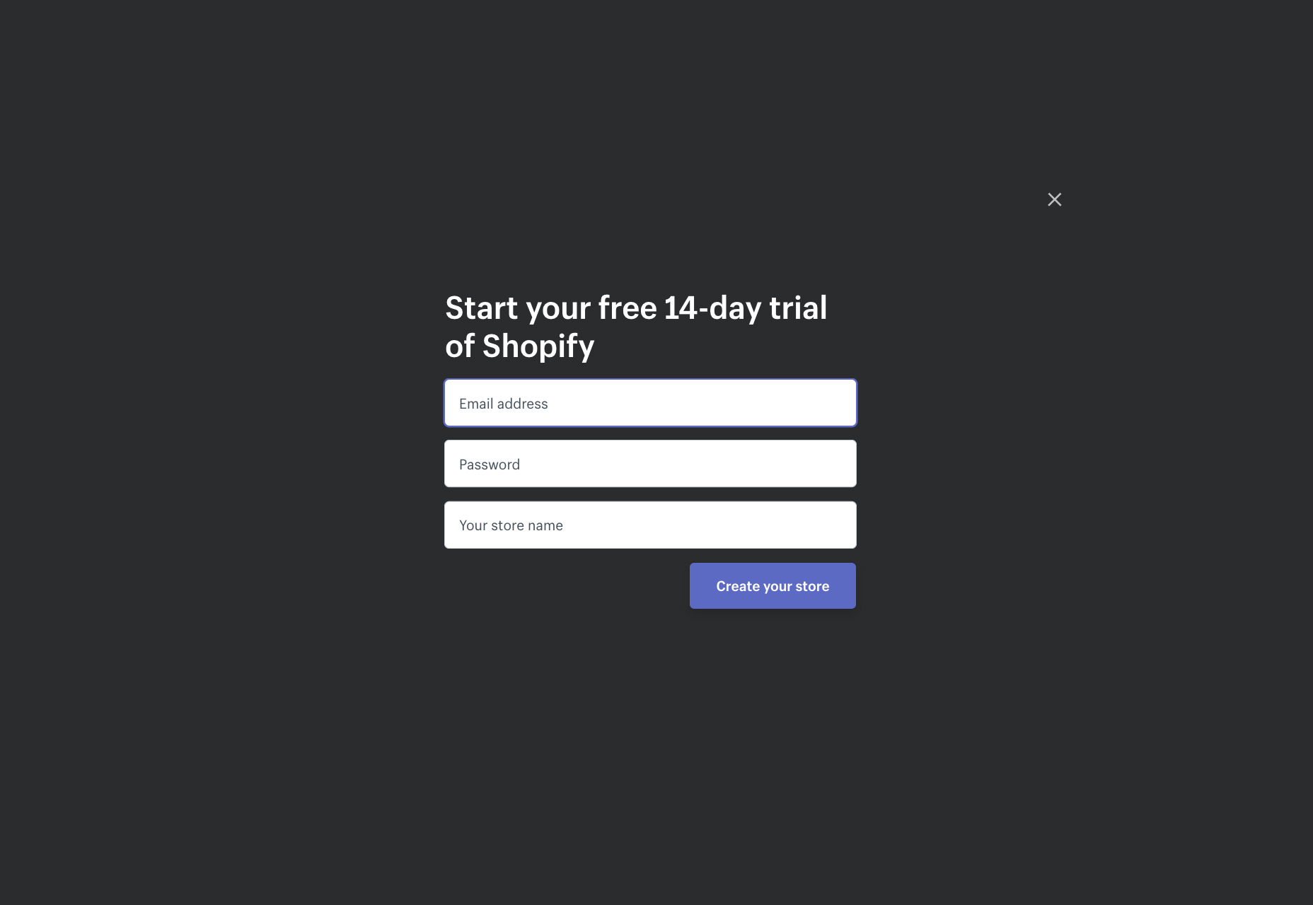 Ask only what’s needed to forge a rapport and urge the customer to move forward. While an email address and username are vital, save further personal questions for a later step, like completing the user profile. Shopify does this by nudging new registrants to flesh out their profile post-registration:
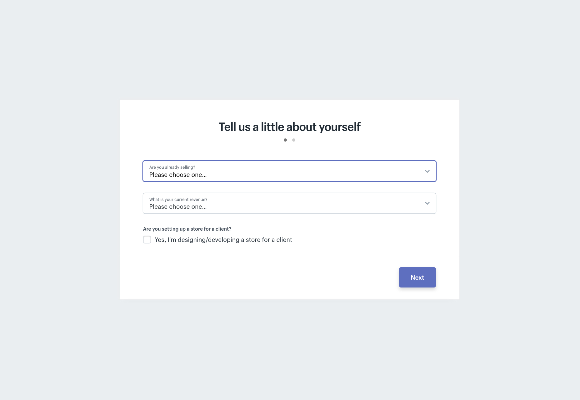
Cement Your Registration Form with Persuasive Social Proof
Common in today’s culture is the inclination to follow popular trends or join collective movements. Demonstrating the success and satisfaction of existing users on your platform can notably influence new sign-ups. Salesforce exemplifies a brand that effectively showcases customer benefits directly beneath their sign-up area. Salesforce displays these advantages tantalizingly close to their registration form. 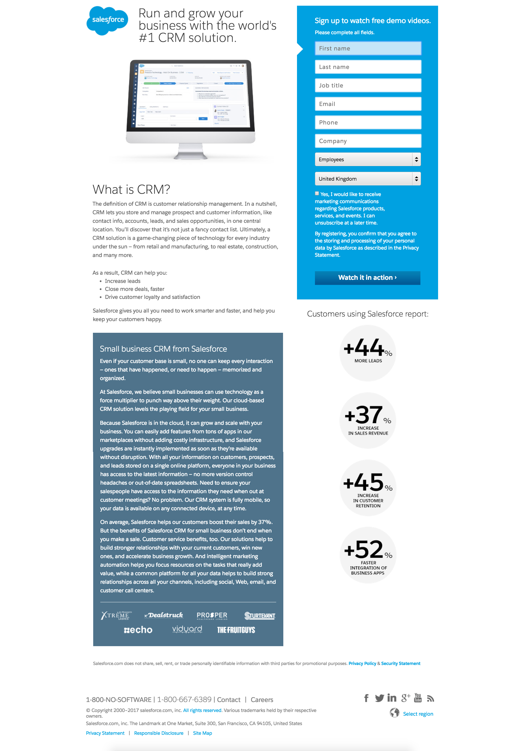 Other companies such as SingleGrain craft social proof by showcasing their notable clientele on the sign-up page.
 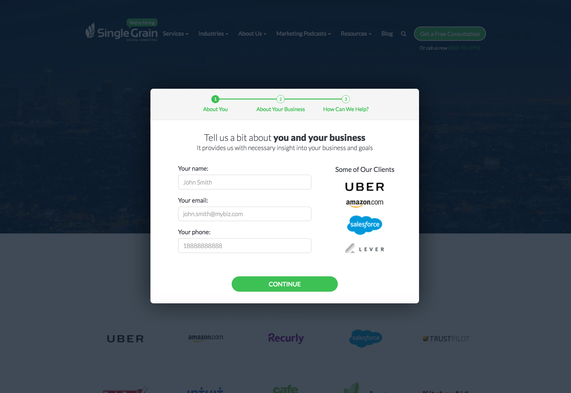 InVisionApp capitalizes on authority, featuring testimonials from influencers like Mike Davidson (Vice President of Design at Twitter) and Andy Law (Manager of Mobile Product Design at Netflix) on their sign-up page.
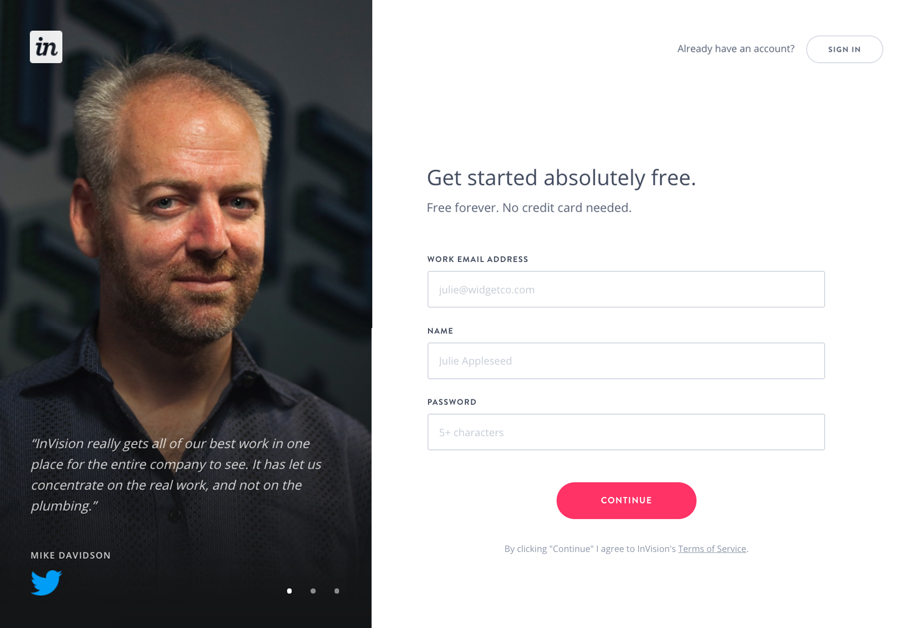
Frame Email Sign-up as a Rewarding Proposition for the Customer
Succeeding at sign-up persuasion is a win for the initial onboarding stage. While users seek to minimize information sharing, they expect value in return. Resolving this dilemma involves presenting a mutually beneficial agreement. Create a compelling offer, like Convertize.io, which lures users with a tempting 14-day trial to test their service. 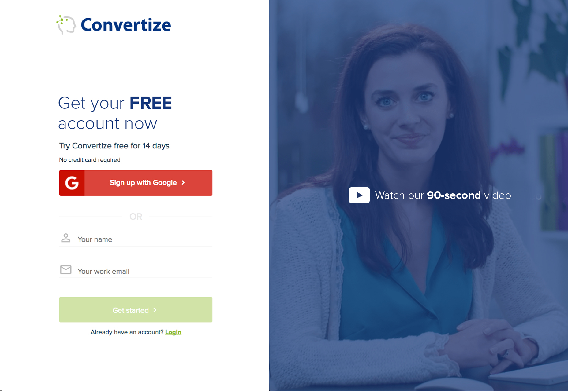 The value you extend to potential customers is your magnet—the core of your attraction. Complementary details enhance this lure, culminating in the perfect user-brand engagement.
Aesthetic Design Bears Significance
The aesthetic appeal of your form is just as important as the content within. An attractive design not only captivates users but also generates trust. Studies, such as those by Dr. Coker of the University of Melbourne, indicate that visually pleasing websites garner more trust:
Internet users today display a 20% increase in trust towards aesthetically appealing websites compared to five years ago.
Coinbase presents a registration form that combines simplicity, elegance, and user-friendliness. 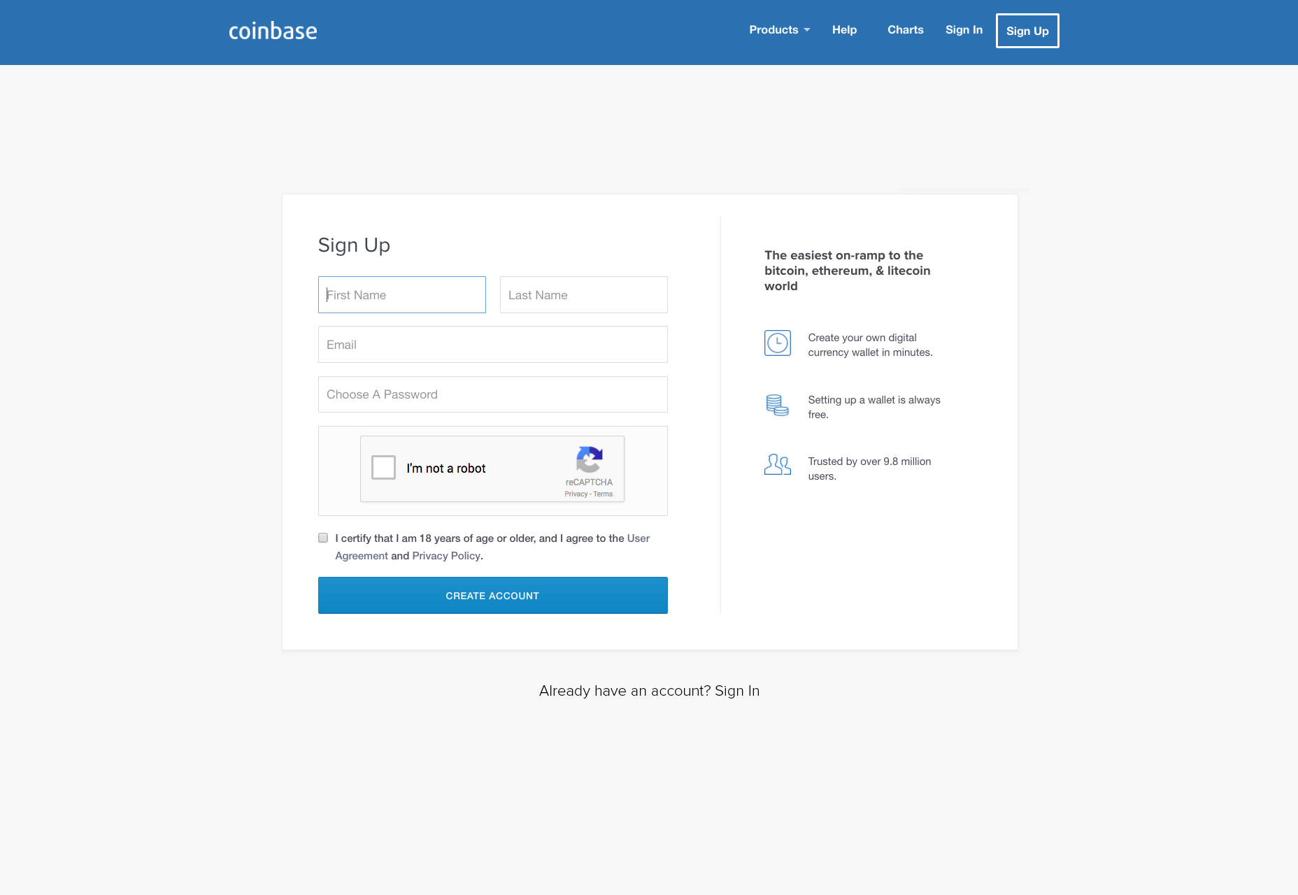
Clarify What Happens Post-Registration
Dissipate any uncertainty by making it clear what follows after registration. Maintaining trust from the onset is critical, hence informing users of what they’re signing up for eliminates doubt. For example, instead of a generic ‘submit’ button, altering the text to reflect the subsequent action can empower users with clarity. Have a look at Leanplum’s promise of instant access upon signing up. 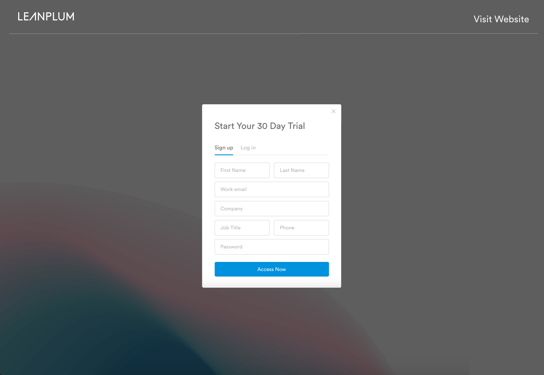
Social Media Registration Enhances Convenience
Offering registration via social media can significantly streamline the user’s experience and boost sign-up conversion rates. Popular options like Facebook, Twitter, and Google Plus, provide a hassle-free alternative to manual input. Social media sign-ins bring both pros and cons to the table:
- Eases Password Fatigue. Remembering another password can deter users from registration—a social sign-in relieves this issue.
- Accelerates Signup. Social media accounts expedite the registration process considerably.
- Insights for Targeted Marketing. Social account sign-ins yield valuable data from personal preferences to demographics, enabling refined market analysis.
- Enhanced User Engagement. Based on Facebook’s research, users logged in via social platforms have increased engagement, potentially spreading your website’s reach.
However, there are also drawbacks:
- Choice Overload. An array of social sign-in options may overwhelm users leading to procrastination.
- Brand Identity Concerns. Side-by-side branding with social platforms may dilute your brand’s impact. Security breaches on social accounts could affect your users as well.
- Dependency on Third-Party Services. Social platform downtimes can hamper access to your services necessitating a backup plan.
- Workplace Restrictions. Some users’ access might be impeded if their workplace blocks social media.
- Privacy Considerations. Users with high privacy sensitivity may prefer to create a separate account.
The Pathway of Registration
Beyond the aesthetics and content of the sign-up page, consider the “sign-up flow”—the procedural steps a user traverses from registration to product usage. This path may evoke ‘friction’, conceptualized as the effort needed to complete the registration. To estimate friction, consider the following factors as suggested by Totango:
- Data Entry Load. The total number of fields for user completion.
- Process Length. The number of steps/pages before application access.
- Decision Load. The number of decisions and additional actions required from the user.
Three Widespread Registration Flows
Diverse products and demographics lead to various sign-up flows, though three primary patterns are often seen:
Flow 1: Gradual Access Post-Steps
A commonly adopted sequence, familiar to users, though it requires multiple pre-access steps. 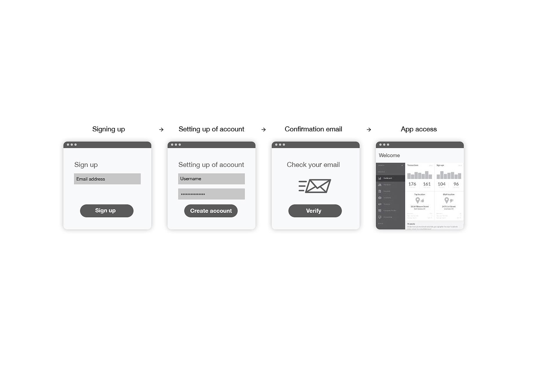
Flow 2: Account Setup Post-App Access
Immediate app access post-signup reduces friction; however, it may attract users with no intent of completing registration. 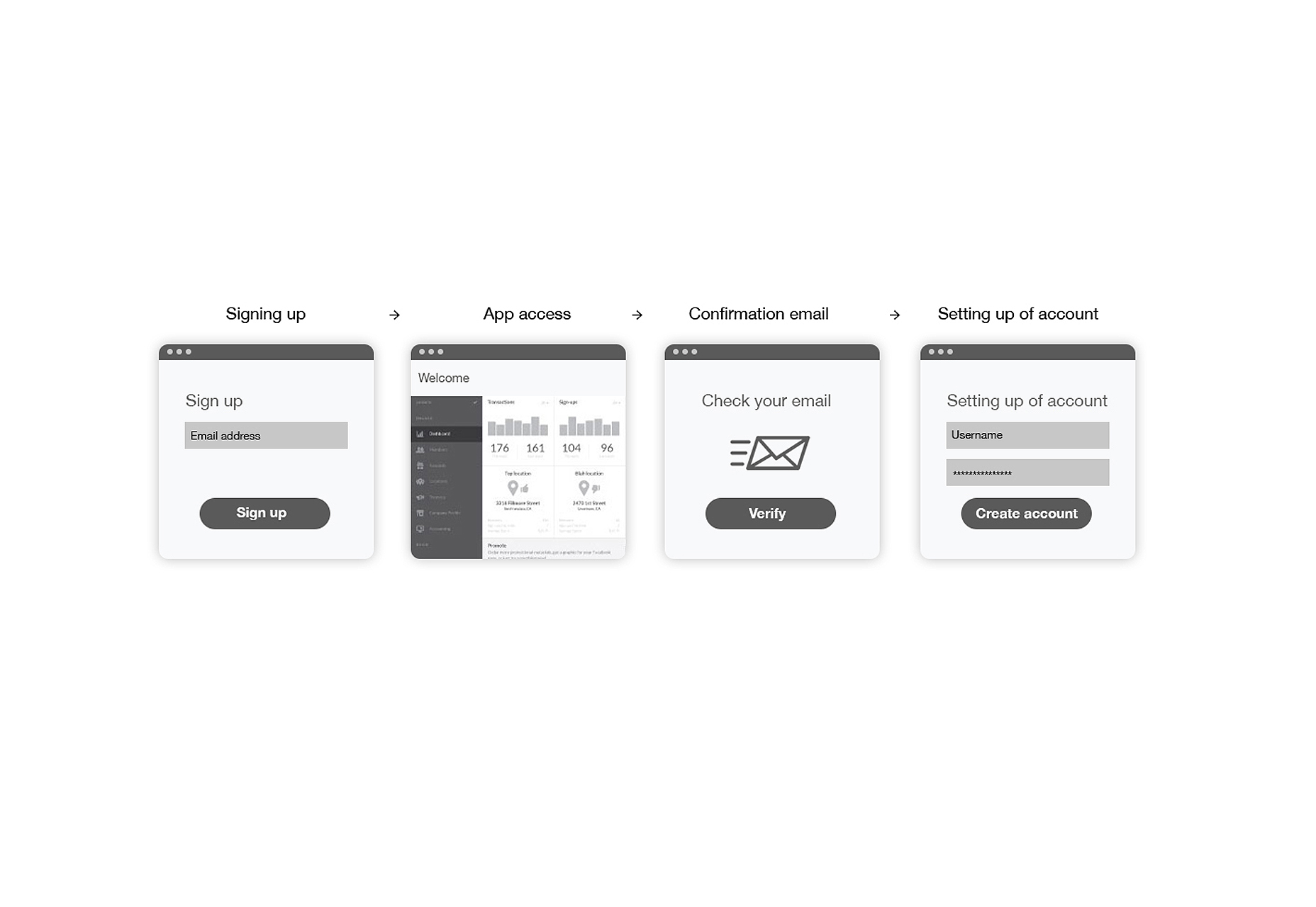
Flow 3: Instantaneous App Use
An extension of the second modality, it offers a zero-friction experience. 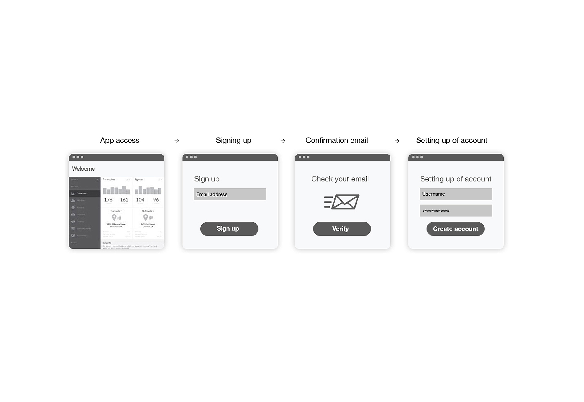
Final Thoughts
Registration forms may not seem like the linchpin of website design, but their significance is undeniable. Whether through a vibrant color scheme, a clever headline, or a visually stunning layout, ensuring a memorable first impression is crucial. Considering the pivotal role the registration page plays, perfection should be the goal, leaving no room for errors.
