1. Facilitate Offline Access to Essential Content
Information from Google suggests that 34% of users are inclined to use mobile applications rather than mobile websites in situations of weak internet connectivity. It’s crucial that users find the content they need in your app, even in the absence of a stable connection. Absent content leads to irritation and may drive users to seek alternative apps with better offline accessibility. For instance, the differences in offline capabilities between Apple Maps, which shows no content without an internet connection, and Google Maps, which retains considerable map details offline, are starkly apparent. 
2. Customize Design for Each Mobile Operating System
The graphical interface (UI) of your app is an important element that influences user experience. If you’re launching an app on multiple platforms, be aware that each one possesses a unique visual language comprising specific conventions and styles. Even minor UI details—such as status bars, headers, text alignment, and font choices—need to adhere to platform-specific norms to maintain an authentic native feel. Transferring UI elements from one OS to another could undermine the user experience and affect engagement. For customized UI elements, align them with your brand identity rather than the conventions of a disparate platform. 

3. Eliminate Dead-ends Within Your App
A fluid and progressive user experience is imperative. Avoiding dead-end screens in your app is essential, as these halt user progression towards their goals, leading to frustration and needless additional steps. Consider how a poorly designed error-state screen, such as one from Spotify, lacks useful guidance for users to rectify the issue or proceed further.
4. Do Not Mimic the Web User Experience in Apps
Mobile apps and websites should deliver experiences tailored to their respective environments. Often, web-centric designs transposed onto mobile apps appear out of place, owing to different user expectations. For example, a web-like approach to text and hyperlink presentation within mobile apps can feel awkward. The TD Bank iOS app sign-in form is one such instance where the mobile web design influence is evident, including underlined hyperlinks — a predominantly web-based UI feature. 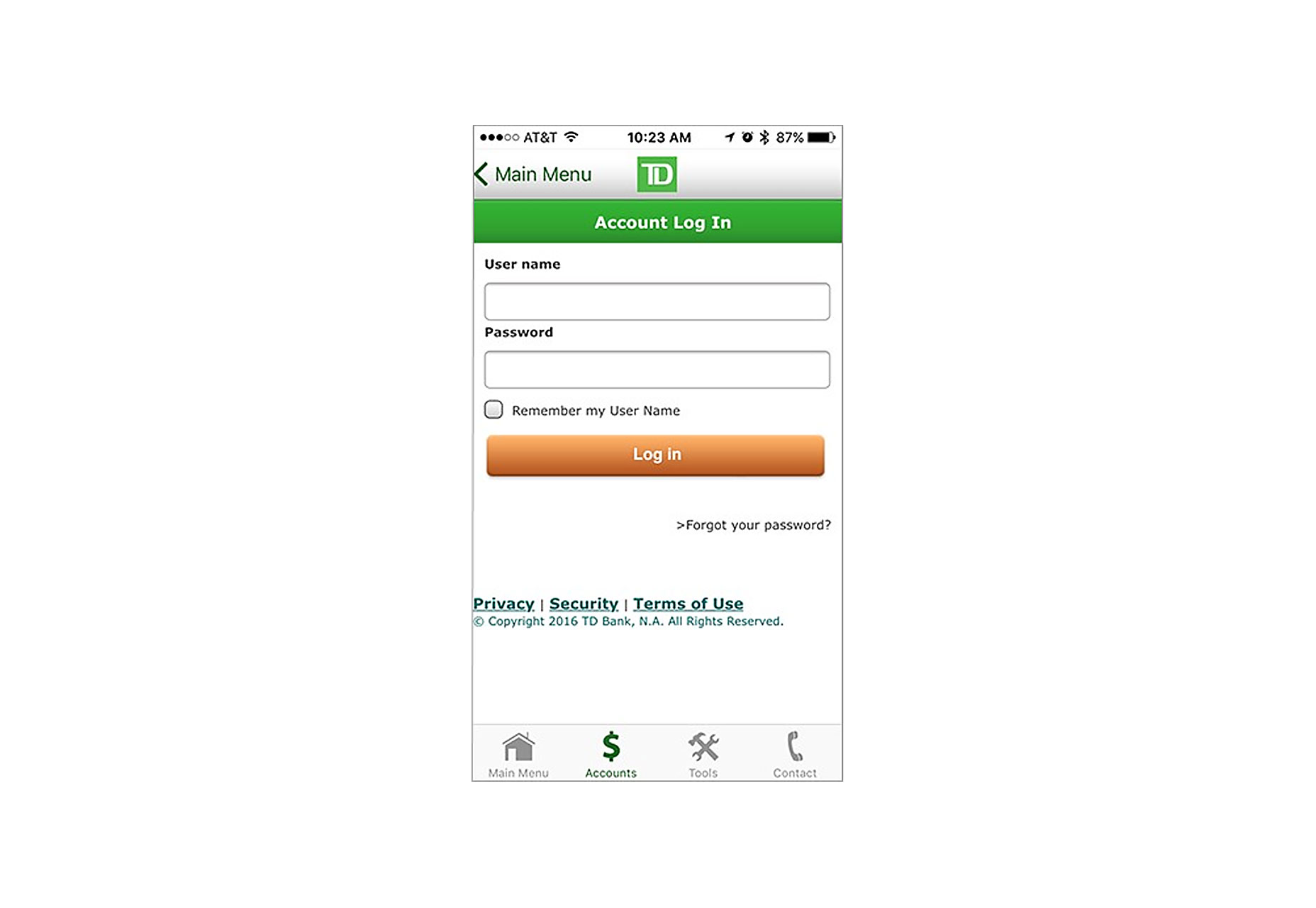
5. Avoid Disruptive App Review Prompts
Interruptions, especially for non-essential requests like app ratings, are a major nuisance for users actively engaged with an app. Frequent or inopportune prompts for reviews can disrupt the user experience. Instead, introduce review requests after users have demonstrated repeated use of the app, ideally at a moment of minimal interruption. A clever example is Clear, a to-do list app, which invites users to rate the app following the completion of their tasks — capitalizing on the positive sentiment of goal accomplishment to potentially elicit favorable ratings. 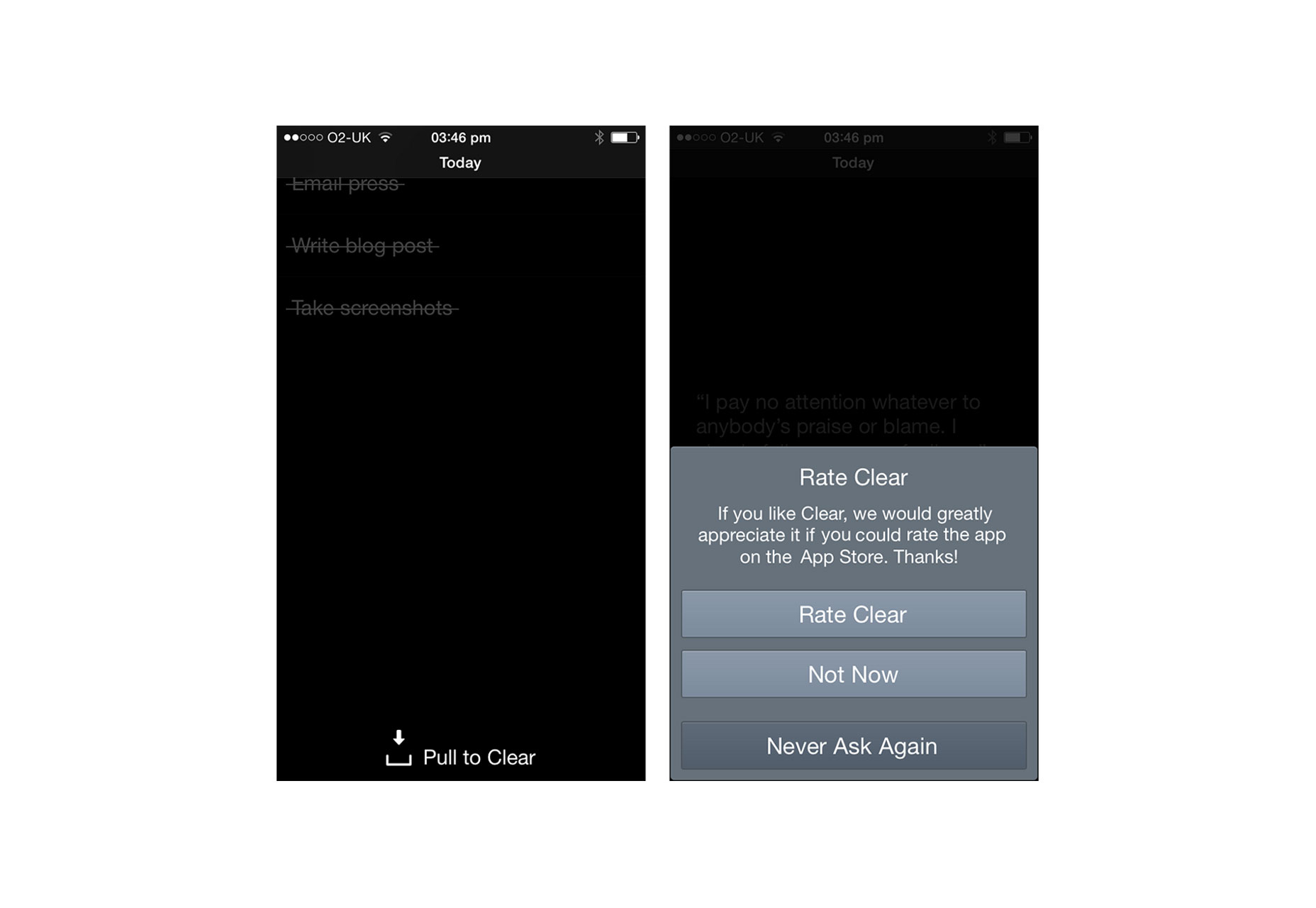
6. Retain Users Within the App for All Activities
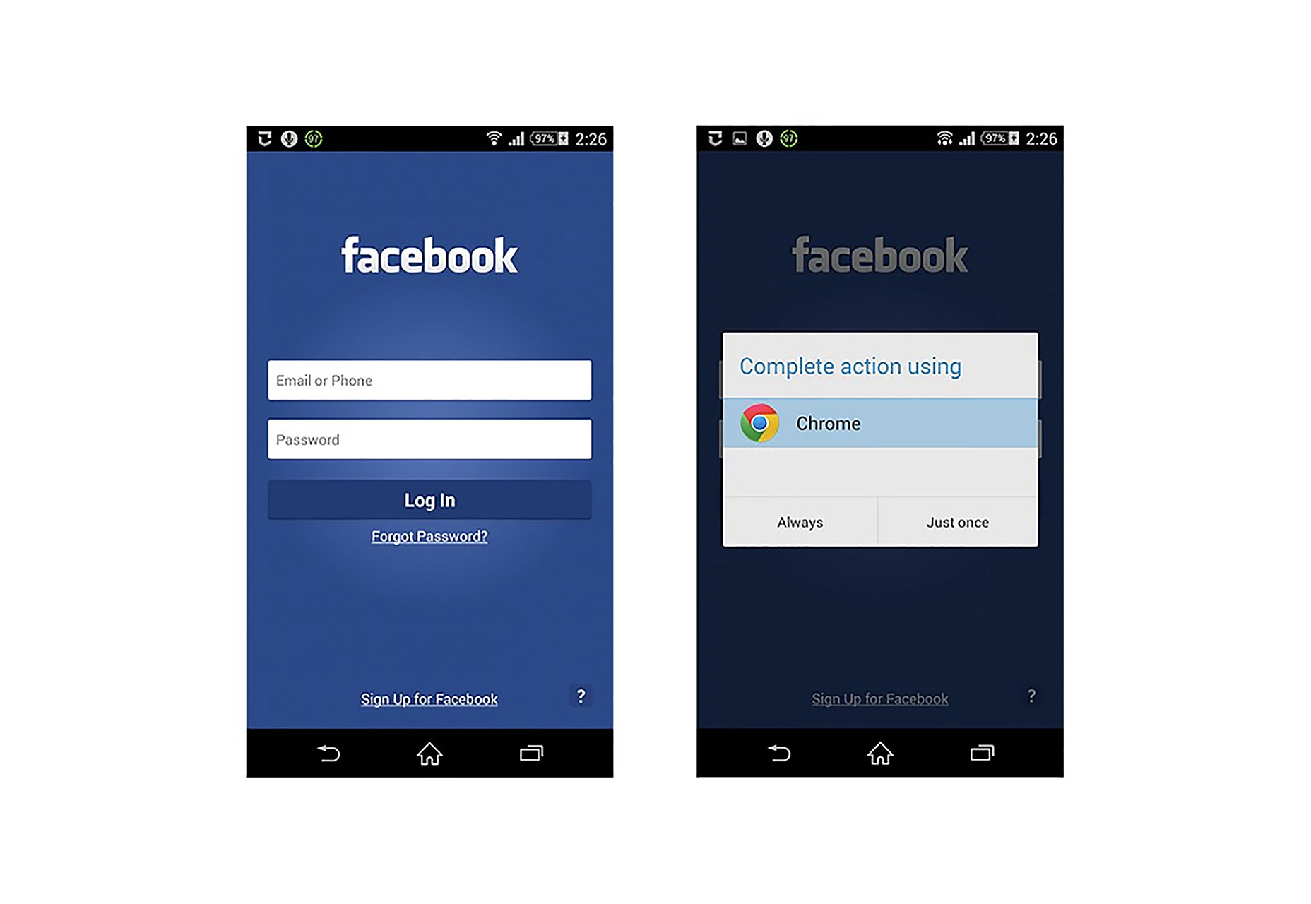
It’s crucial to keep users engaged with your app, without redirecting them to external browsers, whenever possible. When an app redirects to an external browser, it risks users losing their place or, worse, not returning to the app, resulting in increased abandonment and lowered conversion. For example, even a routine action like “Forgot Password?” should be handled within the app, as demonstrated in the Facebook app scenario, where users are prompted to utilize an in-app browser instead of the phone’s native one. 