
1. Clarity is Key
Confusion tends to take root when website visitors are uncertain about what clicking a link will yield, or how to navigate effortlessly to their sought-after page. Uncertainty can be alleviated with a navigation design that visitors find intuitive. Take for instance the navigation on Abercrombie & Fitch’s site. It exemplifies clarity, immediately orienting the visitors upon their arrival. 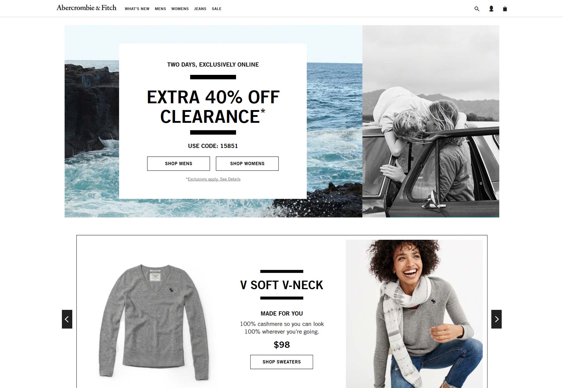 Transparent labeling ensures visitors understand the nature of your business and how they might navigate to their points of interest. Consider the language used for your website’s navigation; aim for terms your visitors are likely to seek out. Sidestep the trap of organizing navigation by content format—instead of a generic videos page, why not offer a ‘how-to’ hub categorized by subject? Ensure that navigation items stand out from regular content, shunning subtleties that might hinder your users from finding their path seamlessly.
2. Consistency Counts
Ever landed on a website where the navigation seemed like an afterthought? Such inconsistency can diminish visitor trust and degrade their overall experience. Uniform and thoughtful navigation, as seen on Bouguessa’s website, significantly enhances visitor engagement. 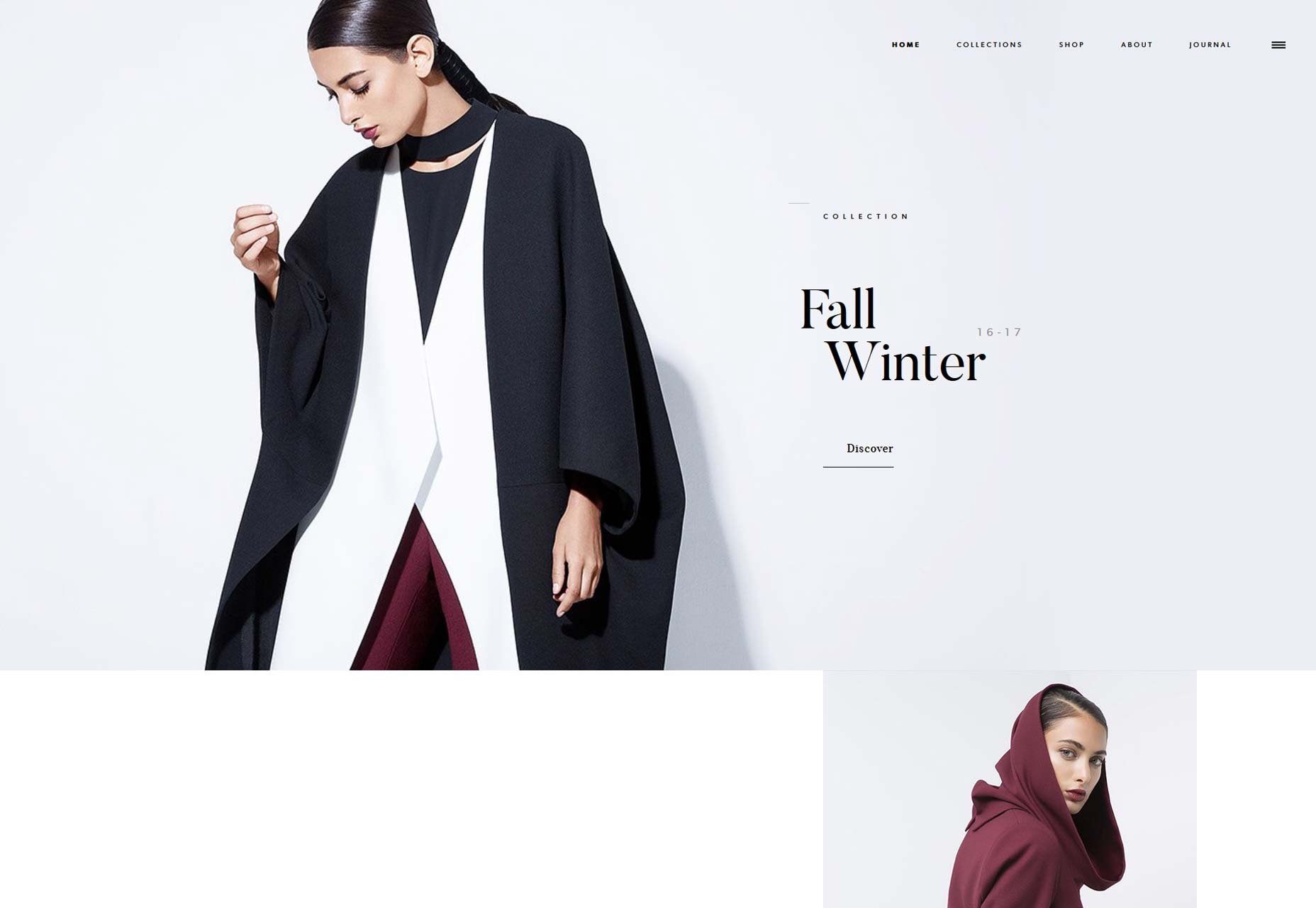 Additionally, avoid the pitfall of non-clickable menu items which resemble links—this only serves to frustrate and confound your visitors. Use design cues to differentiate clickable links from stationary headers within your menus. Similarly, ensure that any secondary navigation imitates the primary navigation’s design, maintaining a cohesive user experience. Highlight critically important pages with dedicated feature blocks instead of cluttering the navigation menu with too many emphasis points.
3. The Virtue of Brevity
Oversized menus can be daunting; limit yourself to around seven menu items to mitigate the decision-making burden on your visitors. Simplified choices enhance user engagement and facilitate navigation. Psychological studies suggest that the brain prefers to digest information in ‘chunks,’ making it easier to process and remember. This can be particularly beneficial for websites needing to categorize an extensive range of topics. Streamlining your website’s content not only foregrounds remaining items but also increases their chances of visitor interaction. Prioritize and prune with care, focusing on what adds value to the user experience. The Olson Kundig website exemplifies crisp navigation. 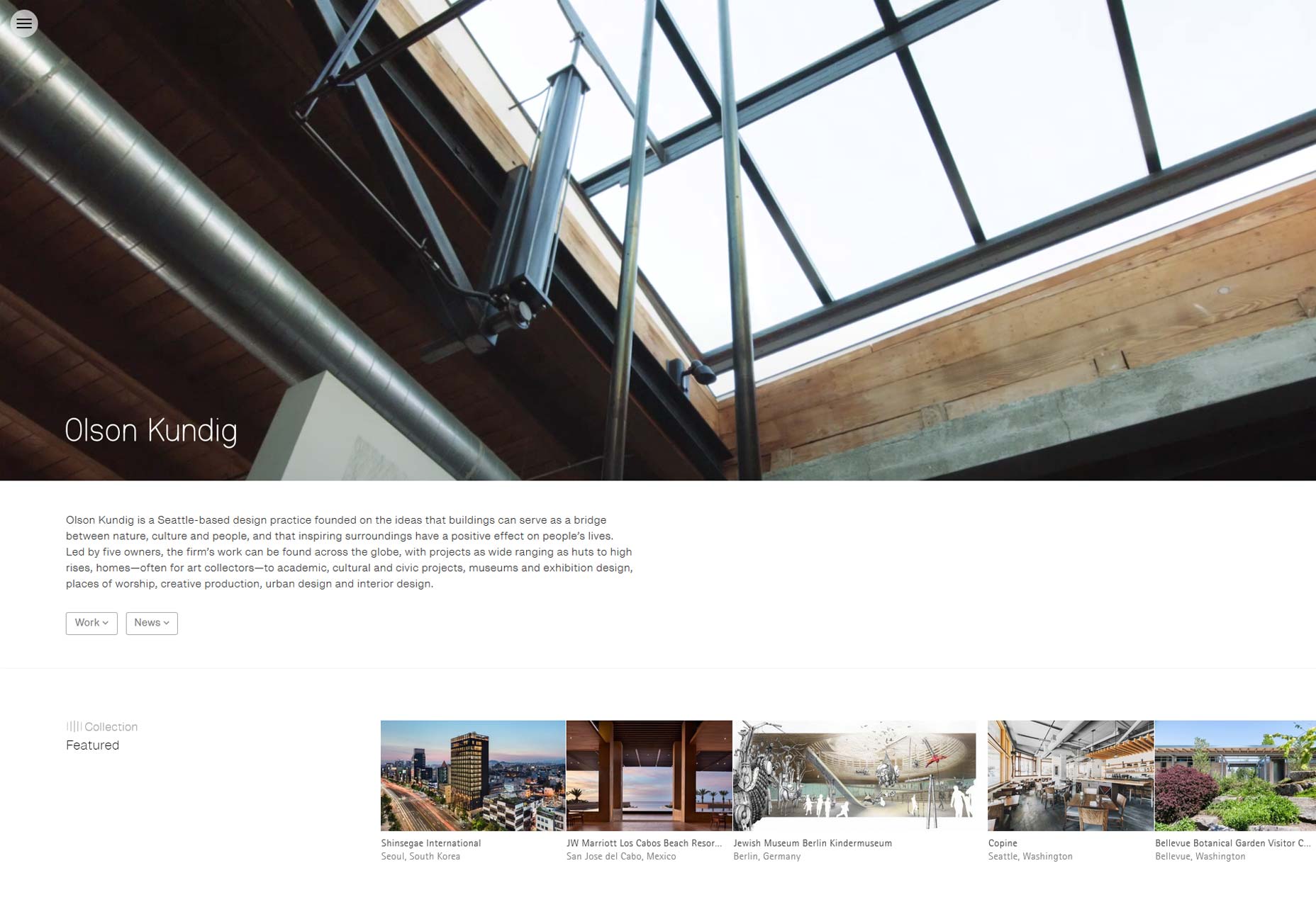 Additionally, consider the sequence in your navigation—items positioned at the start or end are typically more memorable due to psychological primacy and recency effects. This can be leveraged to highlight significant areas of your site, optimizing ease of access based on visitor demand.
4. Embrace Flat Architecture
Exceptional navigation is rooted in thoughtful information architecture (IA). Strive for a flat website structure that allows users to access any page in just a few clicks. Minimizing hierarchical levels curtails confusion and accelerates navigation for your visitors. Instead of endless nesting, categorize content into broad, meaningful groups that resonate with your users’ expectations. Use visual hierarchy in your design, distinguishing between primary and secondary navigation without creating discord in the overall aesthetic.
