Simplicity in Structure
Form layout on mobile devices demands a no-frills approach. A prime specimen of this design philosophy is demonstrated by Leadformly, with their forms lining up neatly in a single-column display. 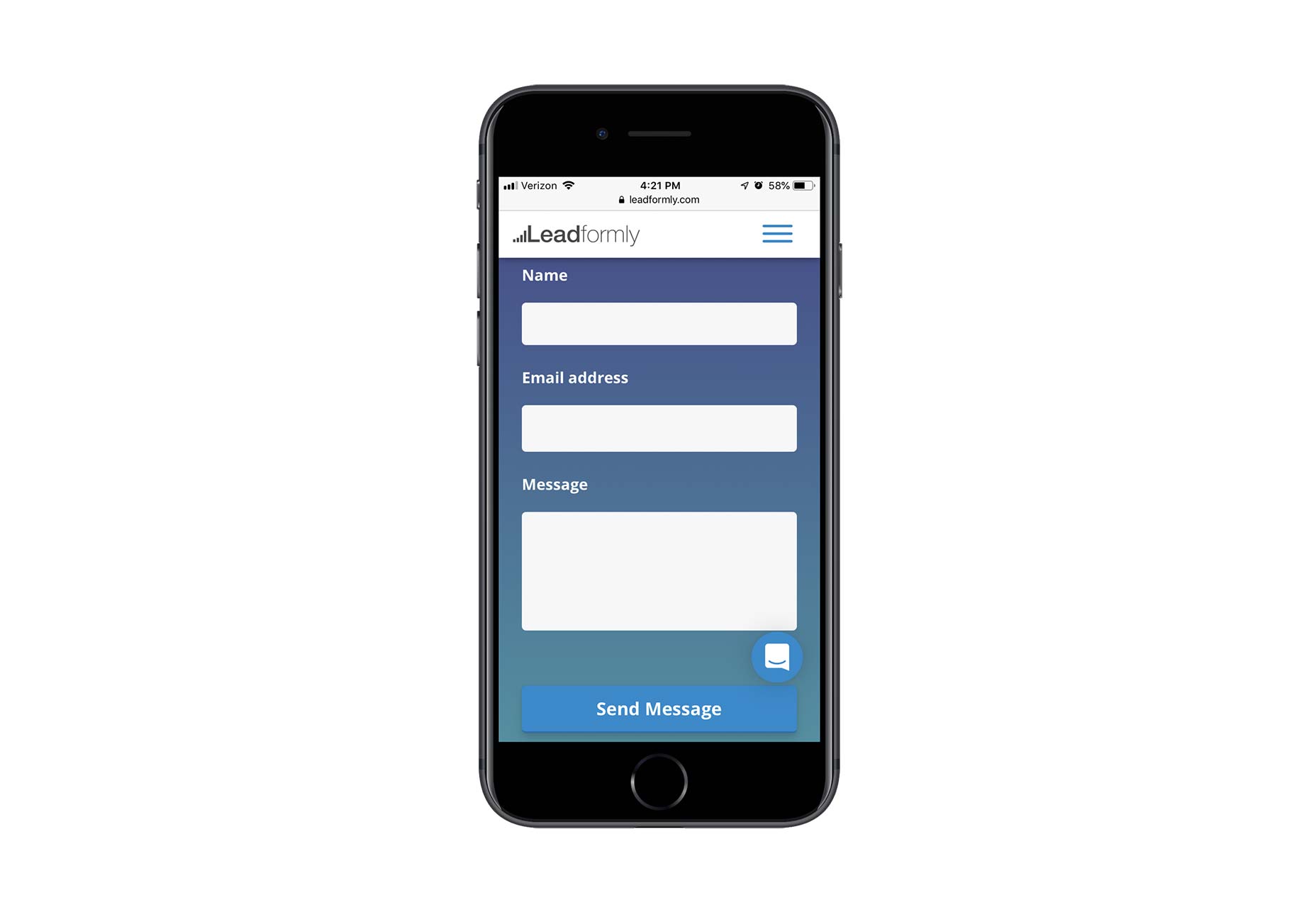 Furthermore, condensing field components like ‘Name’ into one instead of separate ‘First’ and ‘Last’ names can greatly reduce user input effort, keeping the experience straightforward with one field per line.
Relevance of Fields
Determining the necessity of each field in a contact form is critical. Taking Shopify as an example, their mobile support form wisely includes an address field for existing customers, but could potentially streamline by auto-generating subject lines to assist their support team, as having too many optional fields can deter user completion and cause confusion. 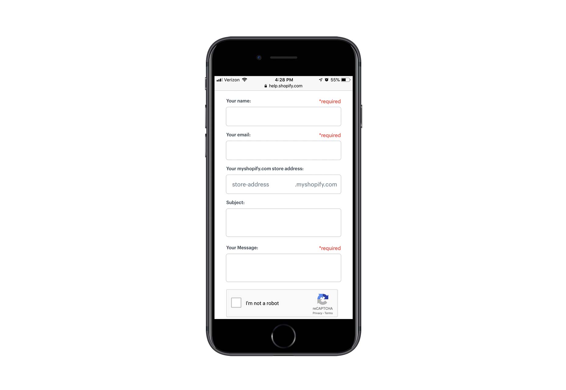 Thus, engaging with clients and users is crucial to designing a form that addresses their specific needs and enhances the mobile experience.
Pagination for Lengthy Forms
Multi-page forms can alleviate the overwhelming effect of lengthy forms on mobile screens. An example of this technique is by Typeform, where progress indication through a bar adds clarity and interaction appeal compared to a long, static form. 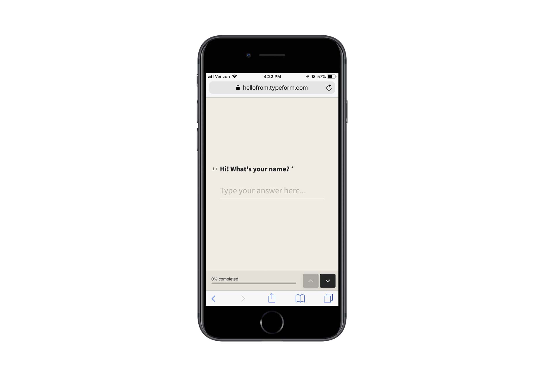 If multi-page forms are not preferable, collapsible menus and hidden dropdowns can be employed to manage space without compromising on the amount of information requested.
Clarity in Labeling
Labeling within mobile forms must be concise and unambiguous to avoid creating friction. MailChimp offers a good model, with clear external labels for each field, placeholder text within fields, and immediate error feedback—all while avoiding the clutter of unnecessary asterisks for required fields. 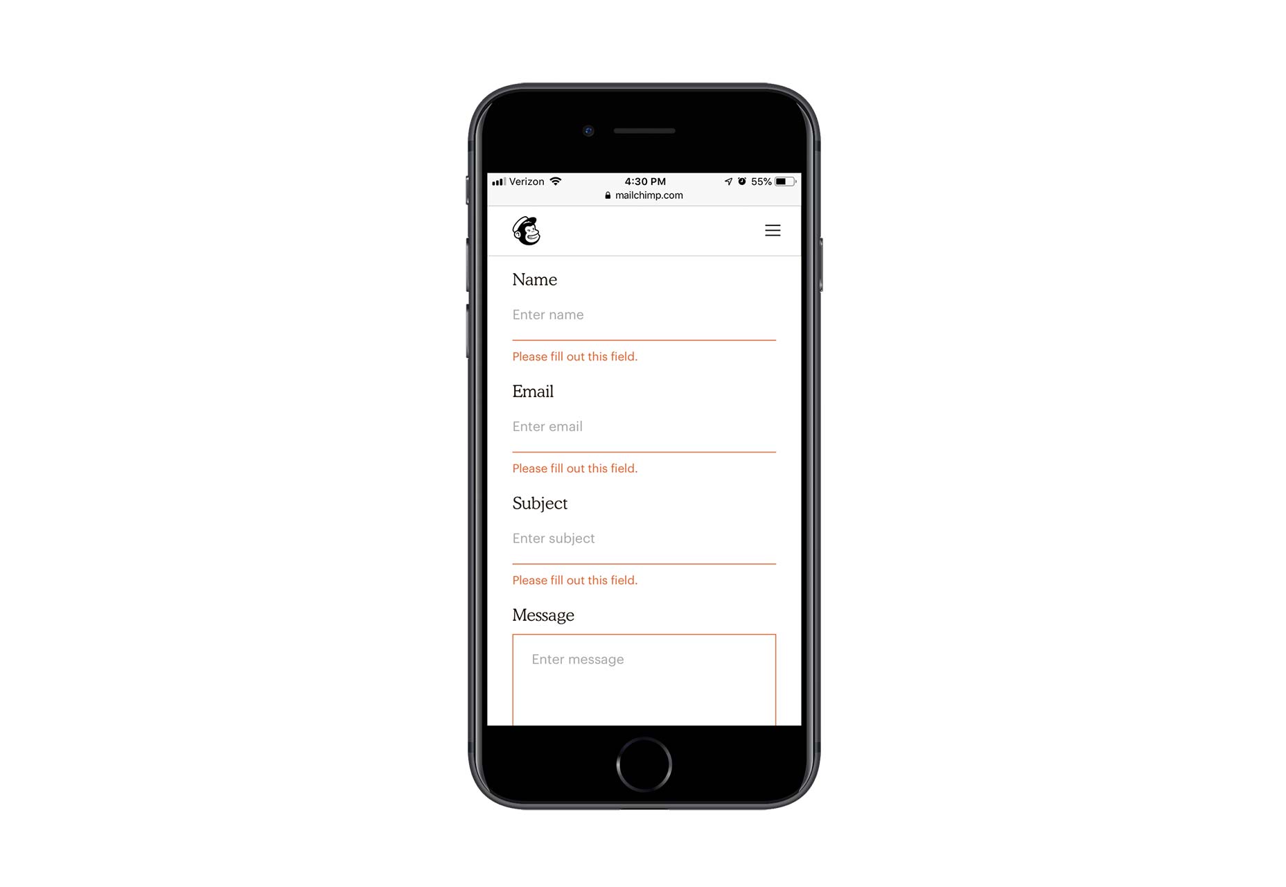 Streamlined labeling facilitates focus and encourages form completion.
Keyboard Optimization
Another measure to enhance form-filling ease is to trigger the appropriate keyboard for different fields. WPForms showcases this by displaying a standard alpha keyboard for text fields and a specialized keyboard for email and website fields, each adapted to reduce typing effort and time. 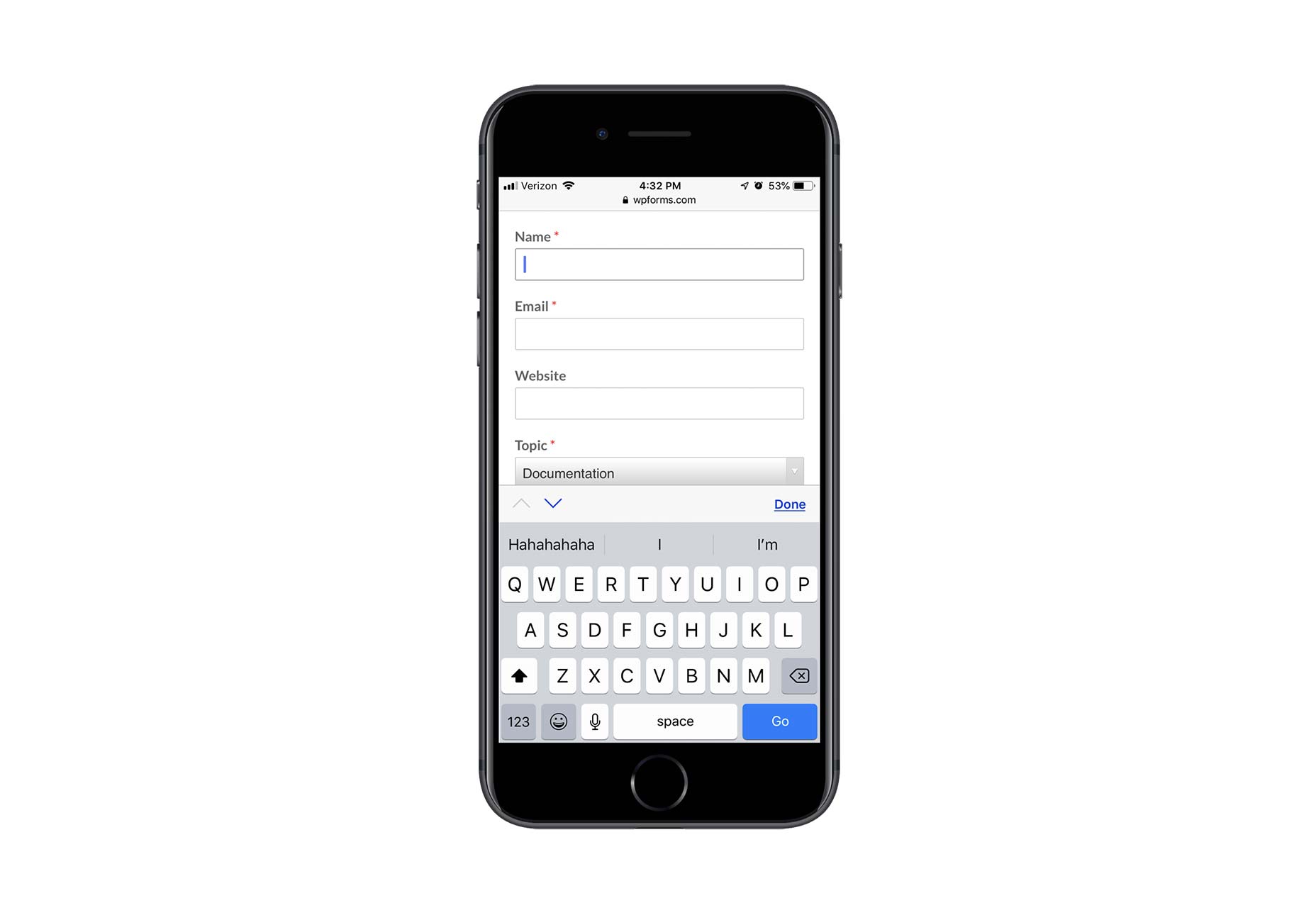 This attention to detail furthers user engagement by making the input process smoother.
Conclusion
Although conversion rates may be typically lower on mobile devices, optimized mobile contact forms offer a non-intrusive way for users to engage with companies. By ensuring that mobile forms are easy to complete, businesses can maintain communication channels with potential customers who prefer this method over direct entry of sensitive information. A mobile form completed is a step towards a relationship initiated—it’s essential to make the form worth their time. Featured image via Unsplash.