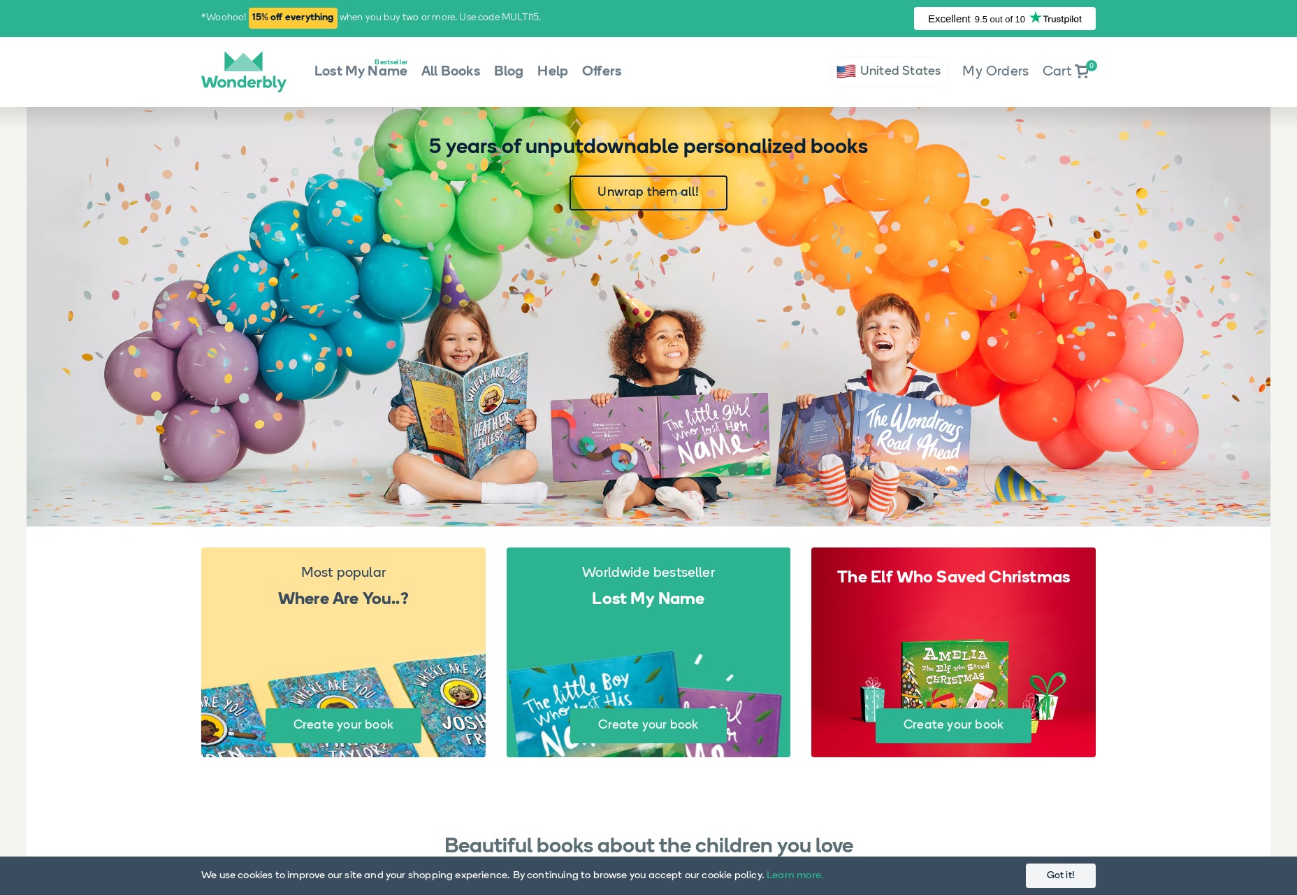
1. Charming Imagery
Utilizing adorable imagery feels a little like taking the easy route—simply incorporating something appealing into the design and declaring victory. Yet, underestimate this tactic at your peril; it’s straightforward but undeniably potent. As humans, we’re essentially hardwired to experience a rush of delight when we see little ones (especially our own) and creatures exhibiting juvenile characteristics (think puppies, kittens, and pandas). Starting with stock photography is a solid approach, but don’t forget that custom illustrations can also evoke those irresistible urges to cherish your website. In cases where unique imagery is necessary, hiring an illustrator can be a smooth alternative to the daunting task of posing infants or animals.
Example: Wonderbly harmoniously blends photos and illustrations.
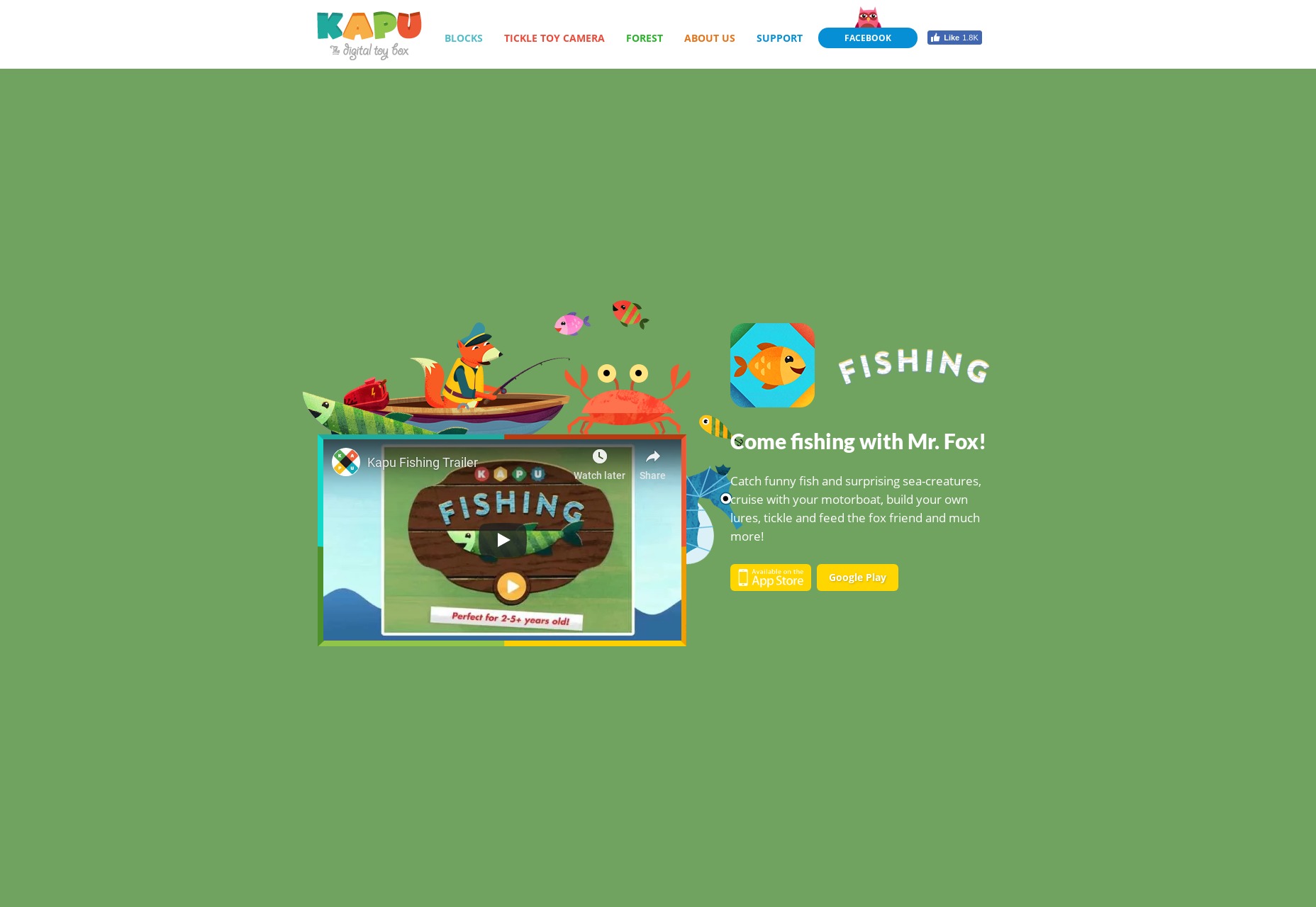
2. Enchanting Colors
While charming imagery is valuable, what if your goal is to weave that snug, affectionate vibe into the very essence of your design, not just its content? This is where color selection becomes crucial. Now, remember this: Pink is not the sole hue of cuteness. In fact, across various cultures, the concept of “cute” colors can differ significantly. It’s important to note that infants come in a kaleidoscope of shades. Generally, the rule is simple: think primaries and pastels. Globally, the “cute aesthetic” favors bright primary colors along with their more subdued pastel variations. When creating something for very young audiences, opt for vivid tones. Conversely, when the target audience is adults, pastels are much more soothing and comforting—which is a welcomed respite for exhausted eyes and minds.
Example: Kapu Toys isn’t shy about embracing bold primary colors.
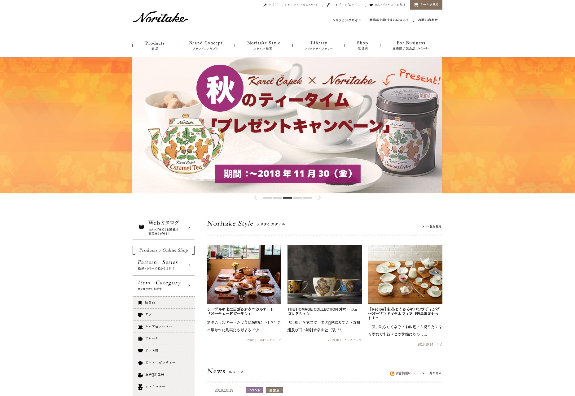
3. Alternative Cute Factors
Until now, we’ve explored cuteness predominantly through the lens of little humans and creatures alike. Originally, “cute” was a term reserved not for babies but for clever or astute individuals. Over time its usage expanded to describe attractive individuals and later, youngsters and items possessing youthful traits. Additionally, cuteness also touches on things that evoke a sense of coziness, contentment, and the feeling of being “home”. For instance, one might compliment a delightful table setting or an endearing piece of home furniture using the adjective ‘cute’. From floral décor to dining wares, “cute” can relate to everyday comforts.
Example: Noritake demonstrates how the notion of domestic cuteness transcends cultural boundaries.
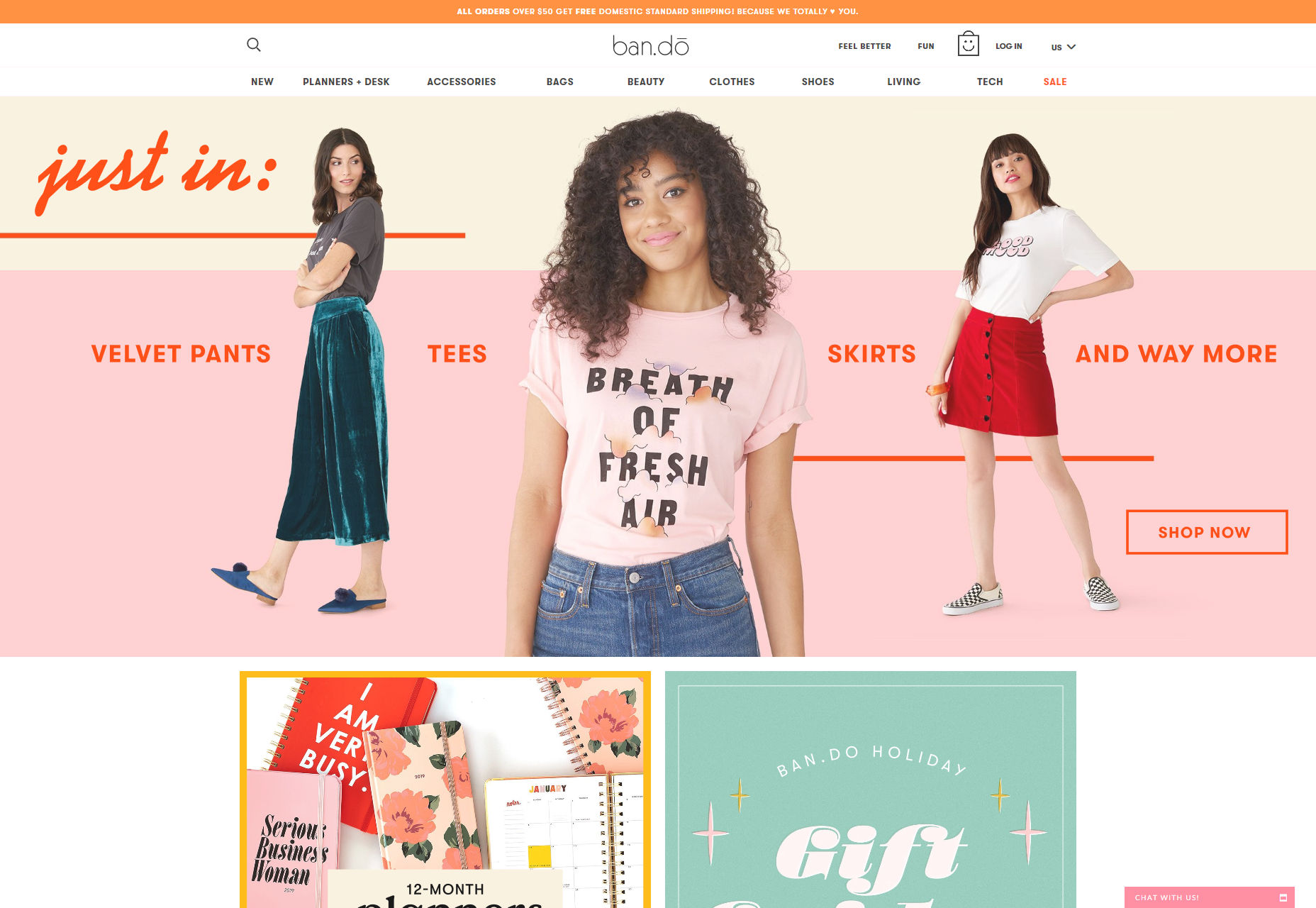
Cuteness extends into the realm of fashion as well. The sensation of coziness from knowing you are dressed to the nines exudes its own form of cuteness, reminiscent of the word’s historic use in describing appealing individuals.
Example: Bando showcases fashion cuteness at its finest.
4. Embracing Playfulness in the Text
So, we’ve examined how imagery, color, and a general aesthetic can contribute to cuteness. But how do we infuse web copy with that same endearing quality without venturing into “baby talk” territory? It all boils down to the desired emotional impact. While “cuteness” may encompass a range of topics, it is anchored to one primary emotion: warmth. Rather than overusing the word “cute” in an attempt to persuade visitors, aim to capture the homely warmth of a loving abode, the soulful gaze of a loyal pup, the accidental antics of a startled kitty, or the radiating confidence from donning an outfit that prompts a double glance in the mirror. Visual styles such as “elegance” are inherently visual, but “cuteness” is deeply emotional. Though visual characteristics can be adapted to give off a cute vibe, it is essential to mirror that complexity within your website’s textual content.
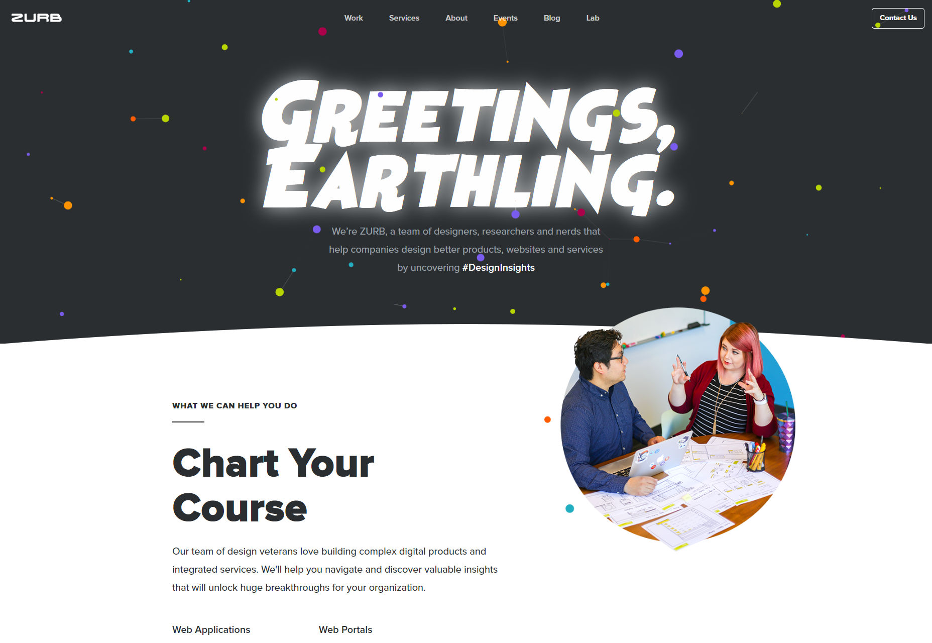
5. Delicate Cuteness in the Subtleties
Keep in mind that saturating your website with excessive cuteness isn’t always necessary. Many parents familiar with the Minions can attest, an overabundance of cuteness can become grating over time. For most sites that aren’t dedicated to children’s interests or home décor, it’s best to sprinkle in elements of adorability sparingly, so as not to overwhelm your visitors. A prime example of striking this balance can be seen in websites like Zurb, where the overall design is professional and standard yet features playful touches such as hidden illustrations, project mascots, and engaging microcopy. This subtle approach is just enough to make their site memorable and inviting.