Establishing a visual identity is akin to building a language without words.
Visual language, unlike verbal or written communication, leverages elements such as color, style, and imagery to forge connections within a community. This array of design elements coalesces to articulate the essence of a brand or organization, offering an intuitive and structured visual experience that resonates with audiences.
Incorporating both textual content and graphical elements, a visual language embodies every facet of a brand’s digital presence—from typography and imagery to logos and UI components—creating an instantly recognizable experience for users without them consciously noting its presence.
Here are guiding principles to craft a visual language that speaks volumes.
1. Cultivate a Signature Color Scheme
A well-chosen color scheme serves as a beacon to identify your brand amidst the vast digital expanse. Utilizing a set of purposeful and consistent colors associated with your brand helps users immediately recognize your digital space.
This scheme should be a consistent thread woven through all brand activities, from the website to social media, from merchandise to business stationery.
The colors chosen should resonate with the brand’s values.
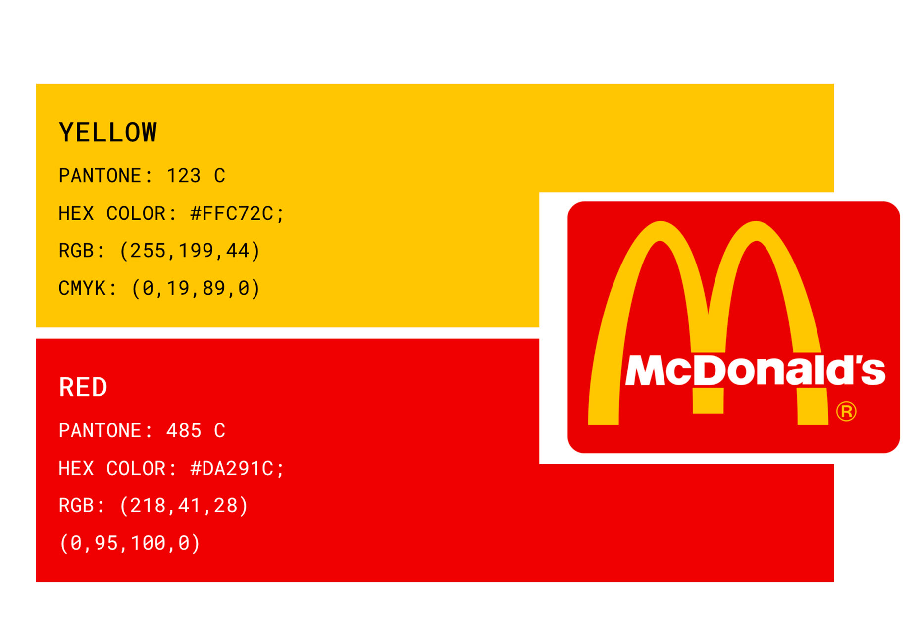
Consider McDonald’s iconic palette of yellow and red. These colors symbolize joy (yellow) and appetite (red). Can anyone picture the brand without its ‘Golden Arches’ or a pop of red on its packaging?
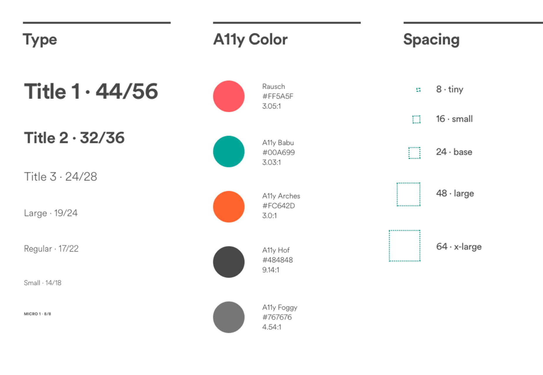
2. Construct a Typographic Structure
Selecting typefaces is just the beginning; defining their utilization is equally crucial.
A well-devised typographic hierarchy is like a conversational tone; it could range from a gentle whisper to an emphatic shout. The key lies in understanding how to communicate effectively with your audience.
Developing a typographic scale involves ensuring clarity at each level of the hierarchy, easily discernible to the user.
Airbnb exemplifies a well-implemented typographic framework, where size, weight, color, and spacing are calibrated to underpin a strong visual narrative.
3. Define Your Spatial Grid
The arrangement and spacing of elements is critical for conveying your visual identity. The structure of your grid can signal an ethos of organization or a flair for the avant-garde.
The architecture of your grid undergirds the core of your visual language and dictates the cohesion of the entire design ecosystem.
A modular framework enables seamless collaboration with engineering teams, expediting the creation of cohesive products across multiple platforms. Conceptual design rooted in a cohesive message benefits from an integrative approach.
In essence, your grid’s complexity echoes your brand’s communication style.
4. Assemble a Component Library
Compile a coherent kit of design elements, from buttons to icons, that adhere to a consistent aesthetic across the user interface.
Consistency is key—a button shouldn’t morph in shape or color from one page to the next, and icons should maintain a uniform style throughout the digital experience to avoid confusing users.
A well-constructed component library details the specific rules of usage, ensuring harmony across device types and operating systems.
Investing time in this library upfront simplifies the creation process for future design endeavours.
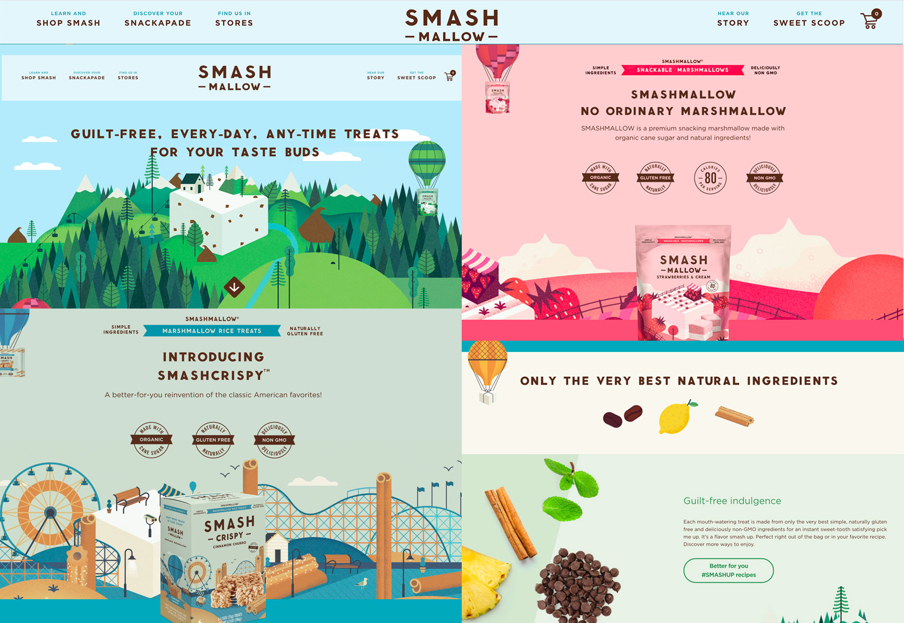
5. Showcase a Unified Imagery Style
Consistency in imagery, be it photographs, videos, or illustrations, is paramount. These visual elements are the signature of your brand that users will remember and connect with.
Establishing a style includes considerations such as cropping, filtering, video pacing, and composition.
Take, for example, Smashmallow’s visual array, where recurring design motifs tie together disparate images, fostering a consistent brand narrative.
6. Formulate Animation Principles
Animations should also follow defined guidelines. How they behave—quick or slow, autonomously or on interaction—contributes to the overall visual identity.
The use of motion can subtly enhance the brand’s story, contributing to a dynamic user experience.
The animation below, sourced from Dribbble, features a looping motion. In keeping with the brand’s visual language, similar animations would likely exhibit cohesive features like circular movements and pacing.

7. Align Verbiage and Visual Elements
Words and visuals must harmonize to cultivate an effective visual language. Discrepancies between them can lead to a disjointed and confusing user experience.
Each component should work in concert to deliver a singular message that enhances the overall brand narrative.
Steffany’s branding exercise demonstrates a harmonious blend of color, typographic femininity, and language, painting a coherent picture for her audience.

8. Stay Authentic
Authenticity is at the heart of a successful visual language. It must truthfully represent the brand’s ethos.
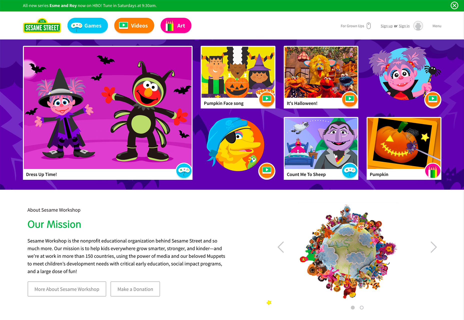
Sesame Street’s identity is inextricably linked with its iconic characters, seamlessly integrating fantasy and reality within their design to solidify the brand’s essence.
9. Uphold Consistency
Adhering to established visual guidelines is crucial. Inconsistency is the archenemy of a coherent visual language.
Maintaining consistency means routinely asking questions about color usage, logo placement, recurring patterns, current documentation, and component library fidelity.
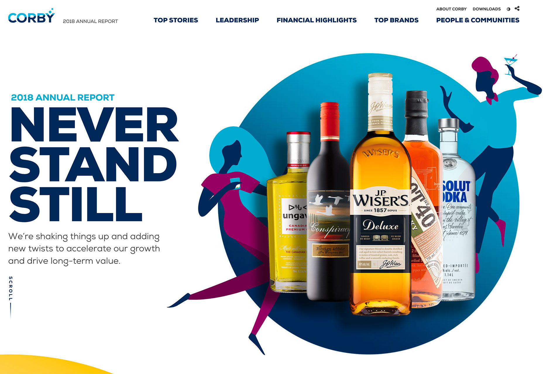
A look at Corby’s report emphasizes a steadfast adherence to these visual commitments, showcasing a consistent logo position and uniform color application.
10. Formalize a Style Guide… And Enforce It
Once you’ve delineated your visual language, codify it in a style guide.
Assign a steward to oversee adherence to this guide. With human beings wired to process visual information effectively, a robust visual language can be the linchpin connecting users to your brand or website.