Not so long ago, about three years to be exact, Uber underwent a transformation that leaned heavily towards a futuristic and somewhat abstract appeal. Their previous rebranding aimed at making the company more relatable to the general public, yet it had the opposite effect, disconnecting Uber from its users on a personal level.
In a much-needed change that perhaps came later than it should have, Uber has now revealed a new brand identity that exudes a sense of coherence and charm.
The rebrand, a collaborative effort by the “Uber Brand Experience” team and Wolff Olins, skillfully addresses and amends the shortcomings of its predecessor.

Uber has grown far beyond its start-up phase to become a household name; it’s referenced in Netflix shows and visible on the streets of Rome where signs caution against its use. The ubiquity of Uber contrasts starkly with its historically lackluster visual brand.
The greatest challenge in Uber’s scaling efforts was crafting an identity that resonated on a global stage. In contrast to its old strategy of localization, the current direction aims for simplicity that transcends local differences.

Uber’s emblematic global arrow
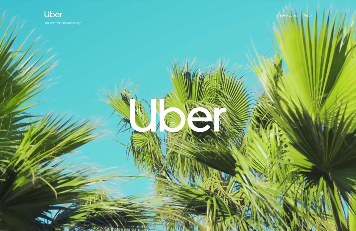
The centerpiece of the rebrand is the revamped logo. Embracing the popular geometric sans-serif trend—much like tech and finance giants Google and Mastercard—the new Uber logotype at first may appear slightly off-kilter, with its left side heavier than the right. Upon a closer look, the eccentricity seems to originate from the unconventional ‘U’ and ‘b’ stem proximity. An unexpected nuance includes a lowercase flourish on the capital ‘U’, inviting speculation that it might represent a pathway—although this might have been more apparent if the company were named “Uiber”.
After spending some time with the new logotype, it’s starting to grow on me. It may not exude an air of effortlessness, but its practicality marks a positive departure from the company’s initial air of exclusivity.
In tandem with the new logotype, a custom typeface called ‘Uber Move’, crafted by the LA-based foundry MCKL, effectively consolidates the brand’s visual presentations.

The proprietary ‘Uber Move’ typeface
Black remains the dominant hue in Uber’s design palette, resonating with its established branding. This is complemented by ‘Safety Blue’, a new color introduced to highlight key information, and which inadvertently recalls the game ‘Mirror’s Edge’. Other subtle colors are present, but they seem more like an appeasement for investors than a practical design choice.

The ‘Safety Blue’ color scheme of Uber
Beyond the color and typography, Uber introduces a distinctive u-shaped motif. Versatile in its application, it can be used as a solid white frame or as a cut-out for images, creating a subtle yet recognizable element across Uber’s branding materials.

The versatile new u-motif
As Uber expands its services to include bicycles, auto-rickshaws, and even aircraft, a straightforward, optimistic, and sturdy brand image is essential. This latest rebrand is a courageous and likely successful stride towards that goal.

