
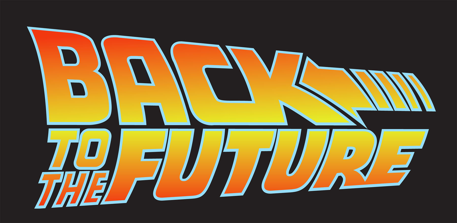
In my extensive years at a company specializing in user experience design, I’ve come to recognize the recurrent nature of design trends. What was once considered out of style will, given time, return to the forefront, be embraced by the masses, and eventually fade away again. A prime example is the ebb and flow of gradient usage in digital designs. Once a staple of early web design aesthetics (recall the ubiquitous gradient-filled WordArt headings?), this technique has woven its way back into the fabric of modern interface design, much like the iconic gradient of the ‘Back To The Future’ logo suggests:
Gradients have made a noticeable comeback in UI design, as evidenced by Instagram’s logo refresh in 2016 and Spotify’s dynamic playlist icons. They add a layer of depth and texture to interfaces and serve dual purposes: they reflect the varied hues we see in our environment and can also introduce unprecedented color patterns. However, there’s a fine line between gradient mastery and disaster. A poorly executed gradient can clutter an interface and frustrate users, while a well-designed one can lift your design to new heights. Let’s unravel the techniques for creating an exquisite gradient that enhances, not diminishes, the user experience.
Building on a Solid Color Base
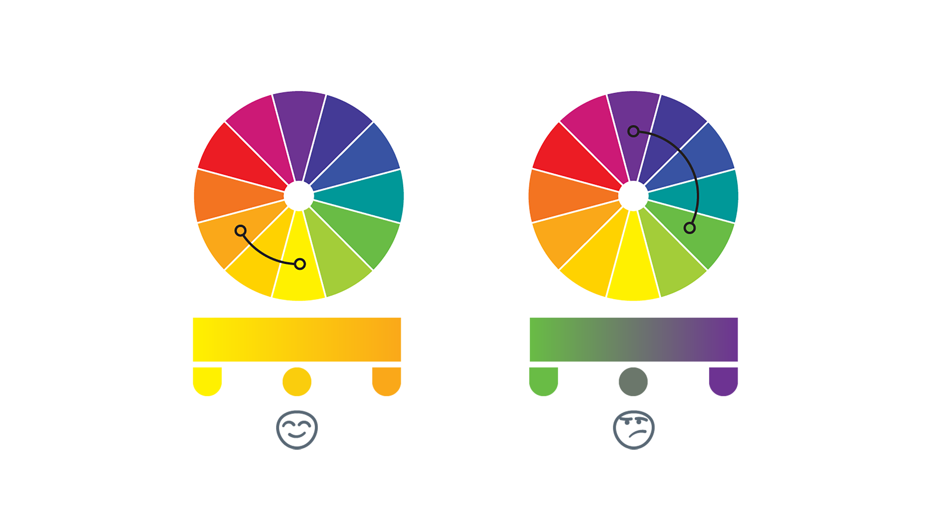
Whether you’re aiming for a simple two-tone effect or a more complex array, the success of any gradient is dictated by the underlying colors. Selections guided by the color wheel can lead to harmonious blends. Even those not versed in color theory can make smart picks; generally, colors situated near each other on the wheel merge effortlessly — take a gander at the following example from UX Planet:
Gradients found in nature often explain our predisposition toward certain color schemes. This is why designers sometimes look to the natural world for gradient inspiration — as the planet’s diversified palette never disappoints.
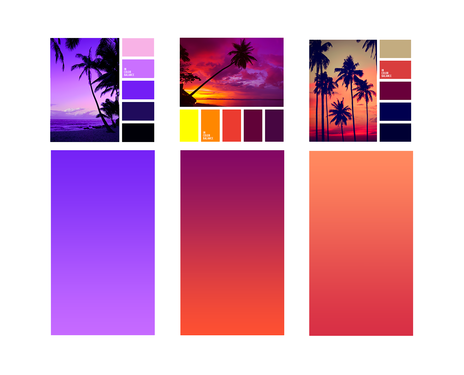
Natural World Gradients
Gradual transitions in color are a natural occurrence, from the gradient of a sky at dusk to the myriad colors of water. Nature provides a wealth of schemes that can elevate our design work. Designer Anna Grenn, for instance, displays stunning natural scenes with their constituent colors. Notice how flawlessly these colors blend, mimicking the beauty all around us:
Elevating the Gradient Game
Sometimes brand colors may not lend themselves well to gradients, or your existing designs could use something special. Fear not, adding extra shades can create a more intriguing and distinctive UI. To achieve cohesiveness, intersperse additional colors logically along the color spectrum. Let’s revisit UX Planet’s illustration:
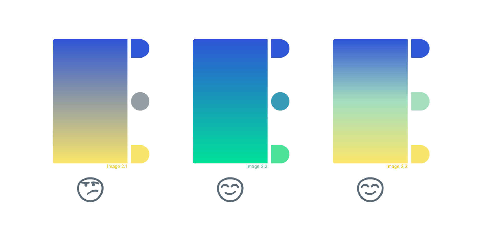
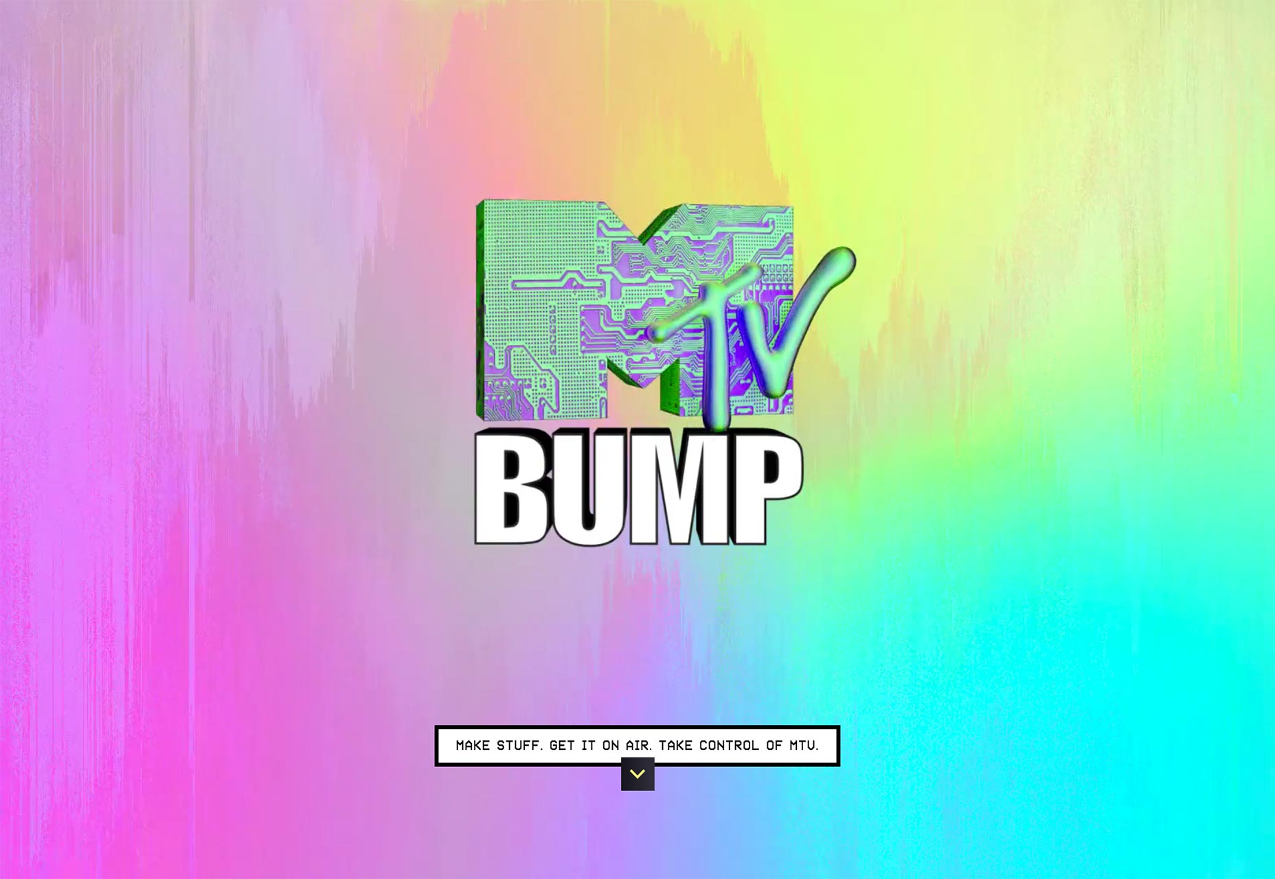
However, with more colors comes a more complex creation that requires a delicate design touch. Aim for balance — too much complexity can turn potential Instagram chic into MTV faux-pas:
Considering Light Source and Geometry
Choosing a dream color blend is only part of the process. Implementing gradients into design is dependent on the shape and orientation of the elements. Gradients should align with their containers, guiding the viewer’s gaze naturally. Linear gradients complement polygons well, while circular or irregular shapes may call for a radial approach. Consider an imaginary light source to help determine the gradient orientation, similar to how a painter establishes lighting in a landscape. This principle can unify the other aspects of your page and provide a focal point:
Well-conceived elements converge to form an enticing gradient that stands out, serving as a significant asset to the overall interface.
The Future of Gradients in UI
Incorporating a gradient into your UI is a straightforward method to rejuvenate and contemporize your platform. Here’s a quick recap:
- Pair the right base colors drawing inspiration from your brand and the color wheel
- Look to the ever-inspiring nature for color composition
- Enhance the mix by adding colors, but be mindful of the balance
- Opt for the appropriate form and setting within the UI for guiding visuals
Gradients, like all design trends, will inevitably give way to the next big aesthetic wave. Nevertheless, for the moment, they remain a
pillar of modern UI Design.
