 The prevalent trend of flat design has shone a spotlight on a glaring limitation in web composition: designers are primarily stuck crafting within the confines of rectangles. Freed from the distractions of bevels and gloss, it becomes evident that the structure of web design is tediously uniform.
Rectangular compositions on the web do offer a myriad of layout possibilities, yet considering textual content requirements and the necessity to accommodate various screen sizes, the design options are not as versatile as one might hope.
The reality that the physical world is not made up entirely of right angles and straight lines is not lost on anyone. Innovative designs of the past century often break away from conventional grids, instead embracing arcs and dynamic angles that instill drama and energy into the layout. This is a straightforward task for print design with tools such as InDesign—try drawing a circle and wrapping text around it. Easy, right? Now attempt achieving that in CSS and you’ll quickly realize the complications that arise.
Designing a circle on a web page might be simple enough, but wrapping text around such a shape reveals a rectangular boundary box that defies the circular illusion. The alternative, forcing text to conform to a curve through manual spacing and line breaks, wreaks havoc with accessibility and is a far cry from ideal.
As a response to this challenge, the W3C is crafting the CSS Shapes standard. Introduced with a first public working draft on June 20—the CSS Shapes Module Level 1—this standard spells out how to incorporate non-rectangular forms into the box model and manage text flow around them. The draft currently proposes to integrate various shapes like rectangles, inset rectangles, circles, ellipses, and polygons into CSS.
Initially, the implementation will focus on text flow around shapes using the ‘shape-outside’ property. Below is an example:
<div id='circle'></div>
<p>Nullam quis risus eget urna mollis ornare vel eu leo. Lorem ipsum dolor sit amet, consectetur adipiscing elit. Duis mollis, est non commodo luctus, nisi erat porttitor ligula, eget lacinia odio sem nec elit. Aenean lacinia bibendum nulla sed consectetur. Sed posuere consectetur est at lobortis. Fusce dapibus, tellus ac cursus commodo, tortor mauris condimentum nibh, ut fermentum massa justo sit amet risus.</p>

<style type='text/css'>
#circle {
 shape-outside: circle(-400px,-400px,400px); /* (center x, center y, radius) */
 float:left;
}
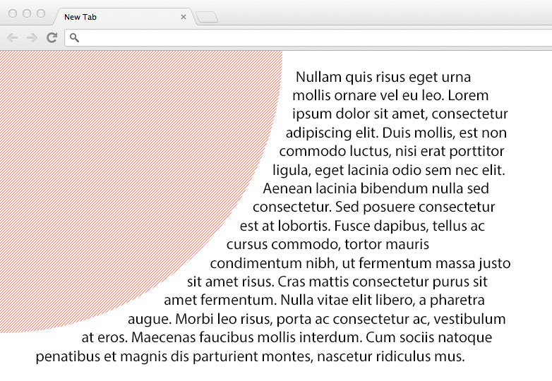
Employing that code will yield an 800 x 800 perfect circle (based on the radius), centered at 0,0. The paragraph text will then elegantly wrap around it in a manner depicted here:
What’s even more thrilling is the future promise of advanced image masking, akin to those in Photoshop, that allows the use of an image’s alpha channel to shape the surrounding content.
While it’s uncertain whether browsers will allow for adjustments of masks via SVG or other filters, even the fundamental usage opens the door to remarkable design possibilities—envision text wrapping seamlessly around the foreground of an image, with the background serving as backdrop imagery. The potential here is immense.
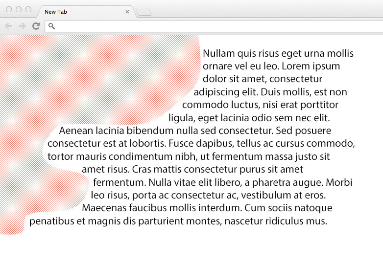
A basic demonstration of text wrapped around an unusual shape can be seen here:
Browser support
As it stands, browser support for CSS Shapes is nonexistent. This feature remains a proposal, not ready for practical implementation just yet.
But, with browsers increasingly honoring web standards and vying to be the first to adopt W3C specifications, the integration of CSS Shapes could be just around the corner. Widespread support for this feature could mark the dawn of a new era in web design—bursting beyond the bounds of the familiar rectangular layout and shaping up the future of the web.
What are your thoughts on the W3C’s nascent CSS Shapes Module? What are your aspirations for its evolution? Share your insights below.
Featured image/thumbnail, shape image via Shutterstock.