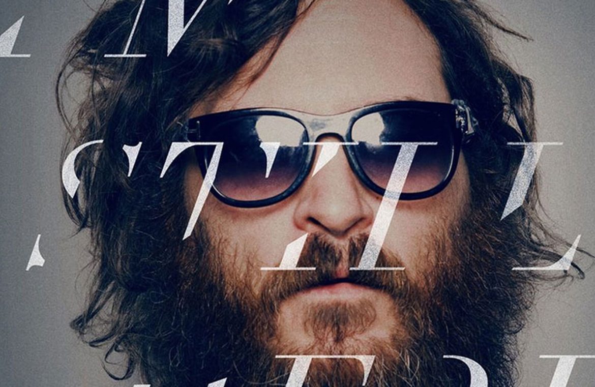
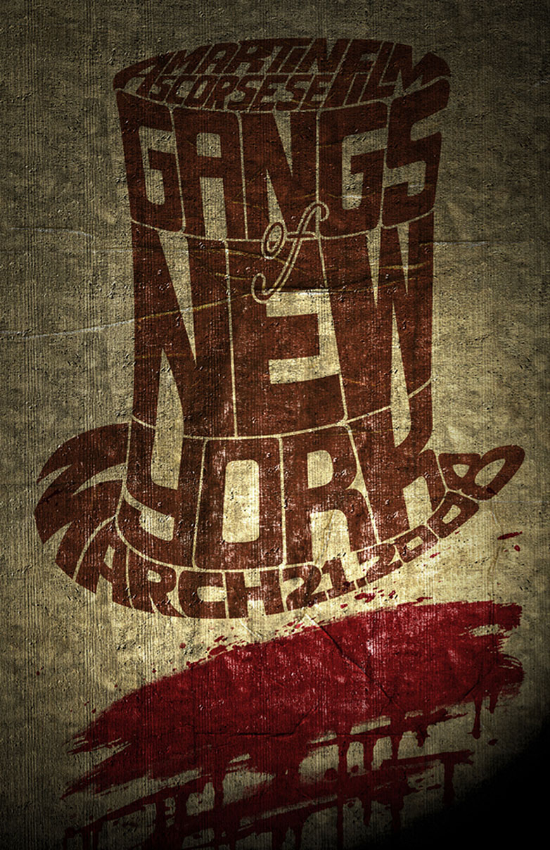
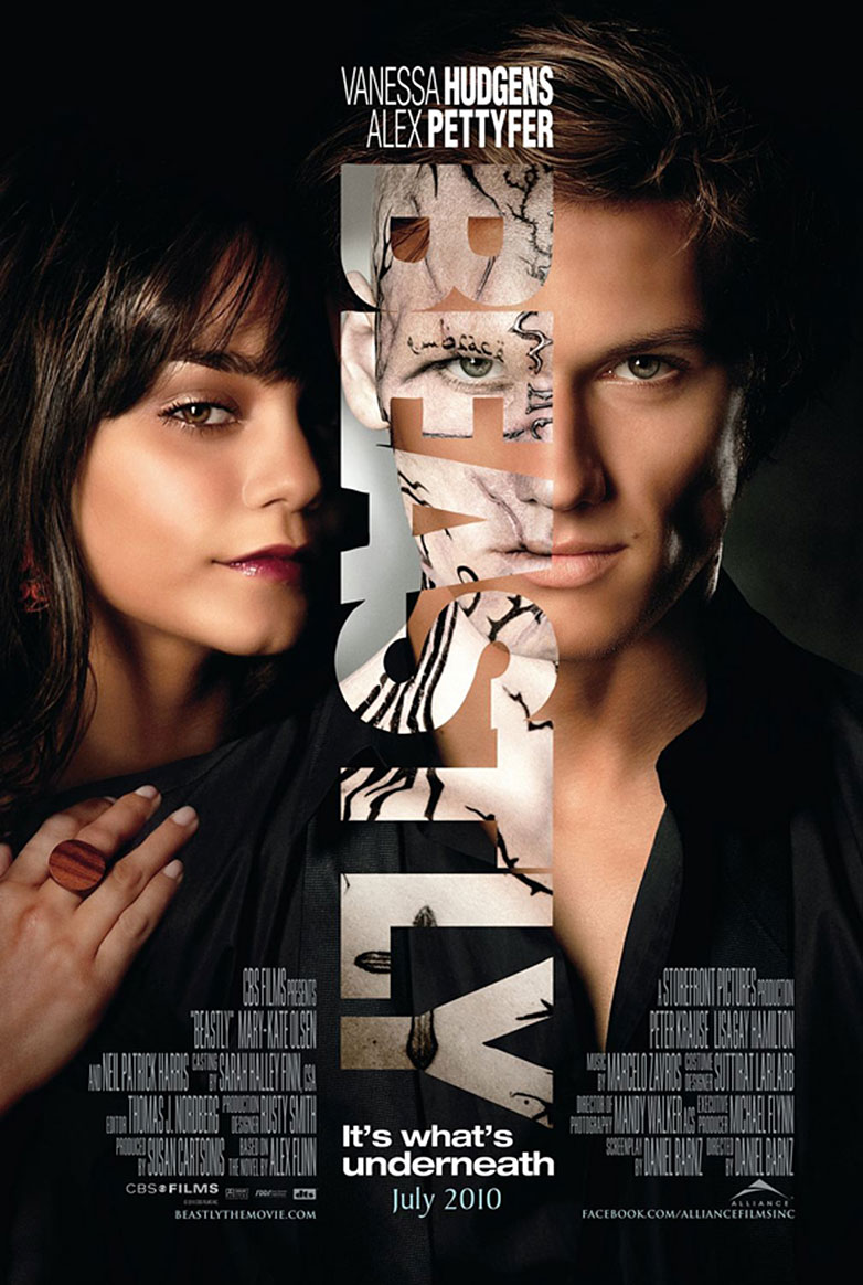
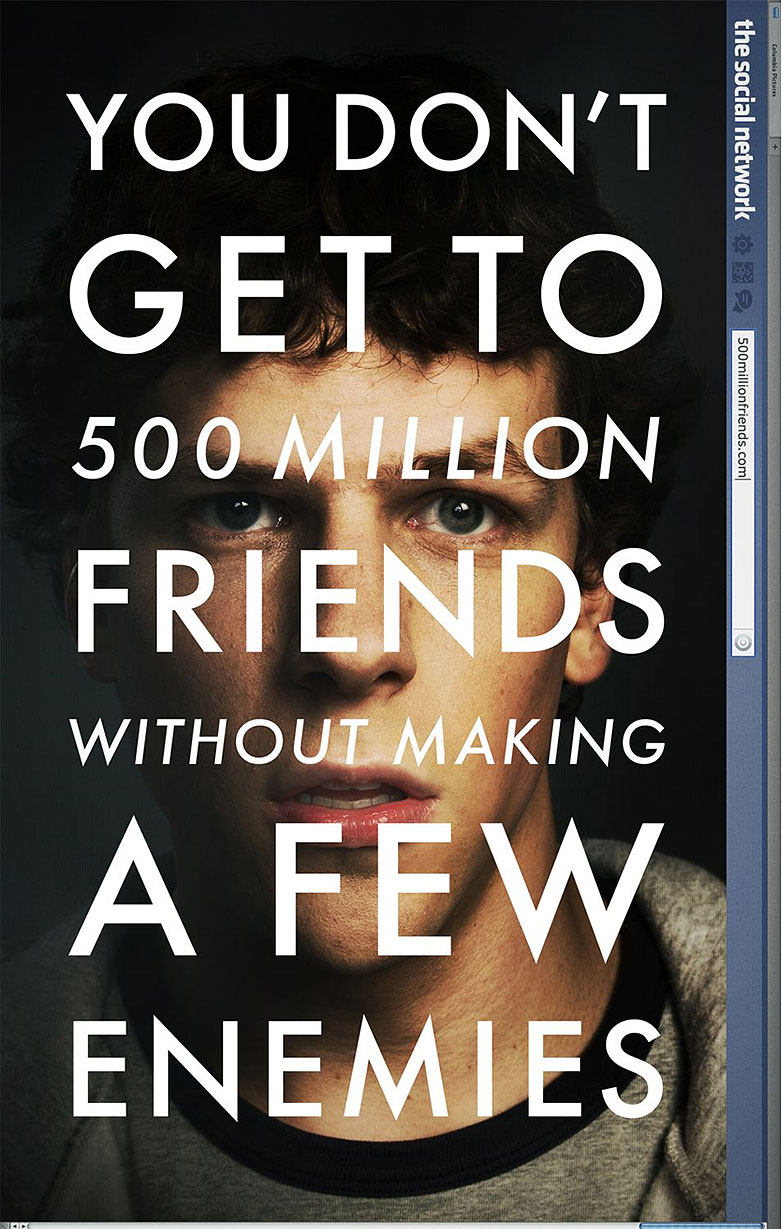
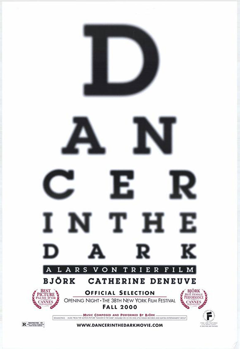
 The film sector amasses an impressive $87 billion in global revenue as of 2011. With stakes this high, it’s no small feat for marketing teams to effectively brand and promote their movies. Amid various tactics, one enduring strategy is the art of typographic film posters.
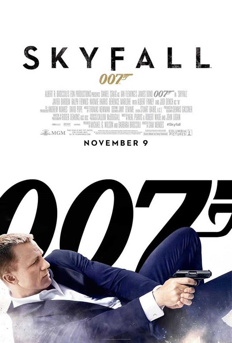
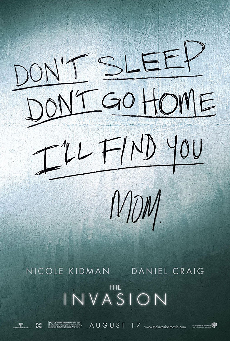
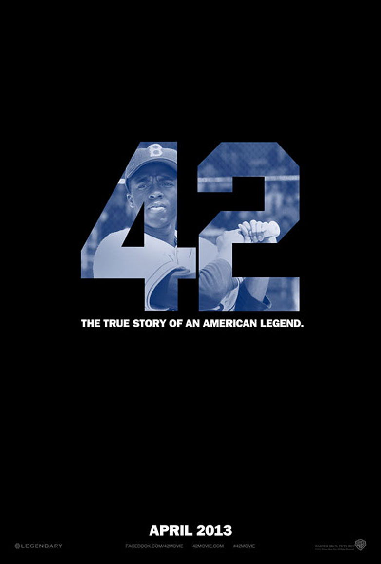
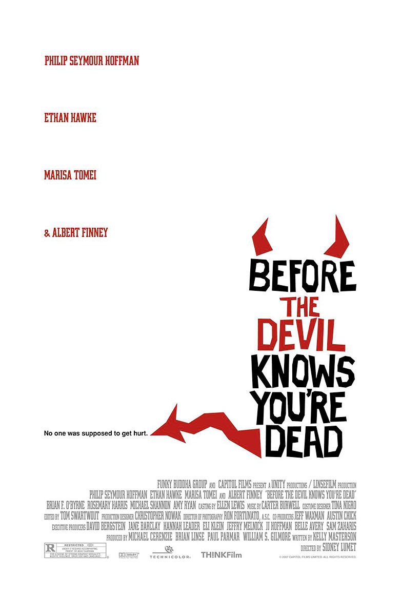
When typeface and design converge, they form an arresting visual that captivates and informs. There is a unique appeal to letters that are skillfully crafted on a poster, capturing the essence of the film and making a memorable statement. Images alone are powerful, but when they’re crafted from carefully chosen words, they can communicate on a much deeper level.
These striking examples of typography in film marketing date from classic cinema of the 1960s and 1970s, like “West Side Story” and “Taxi Driver,” to recent heavy-hitters like “Zero Dark Thirty.” This carefully curated collection of 30 posters not only showcases the work of official movie promotions but also includes imaginative renditions from designers who champion the potency of typographic design in storytelling. Enjoy this visual feast!
To our friends celebrating in the United States, have a wonderful 4th of July!
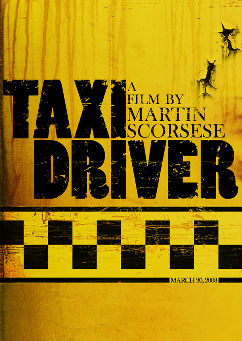
Taxi Driver
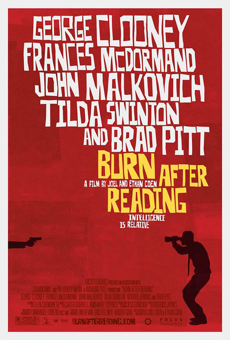
Burn After Reading
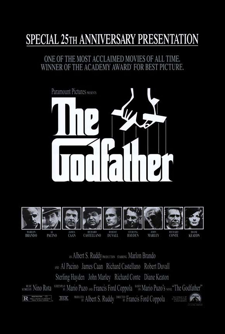
The Godfather
Zero Dark Thirty
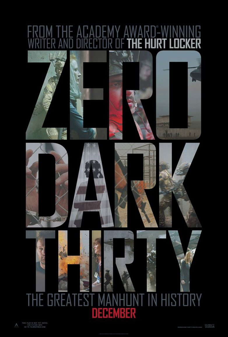
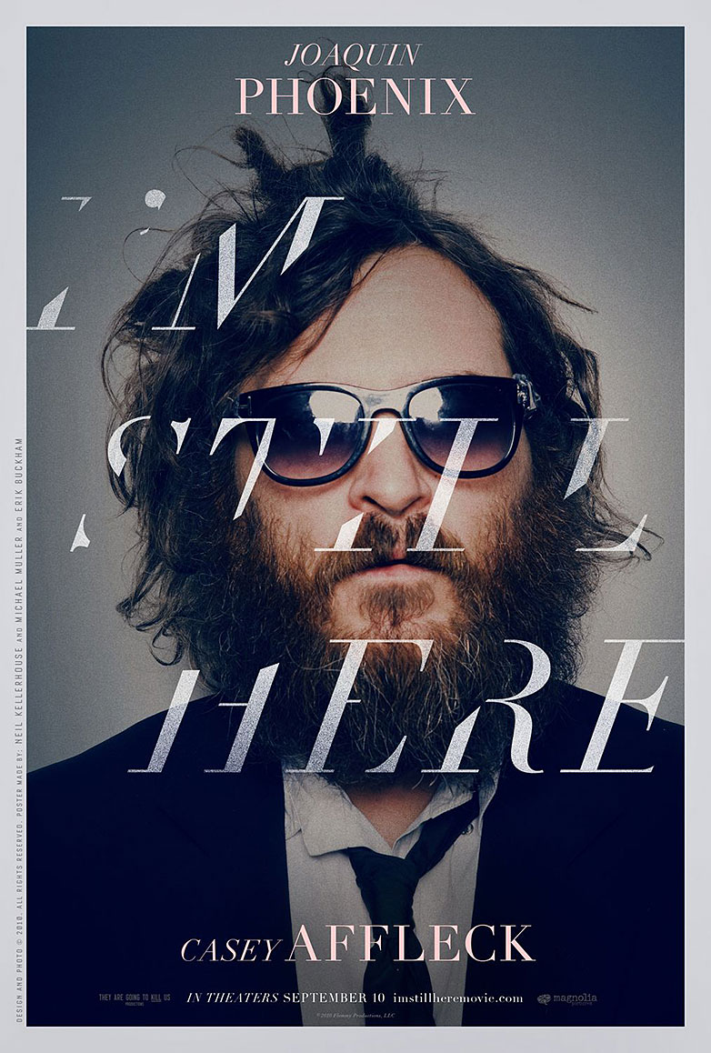
I’m Still Here
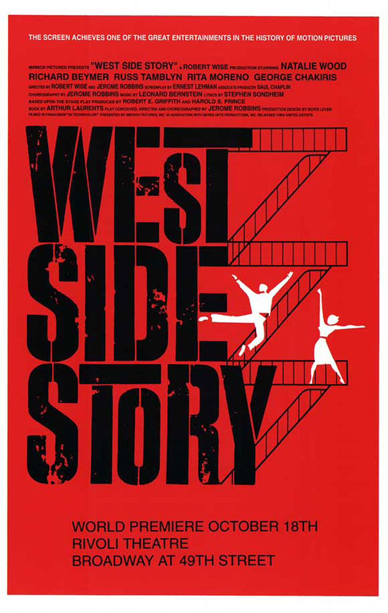
West Side Story
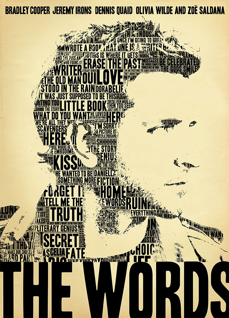
The Words
Bully
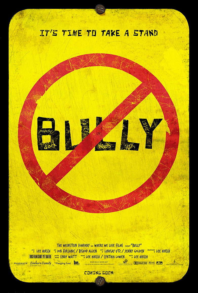
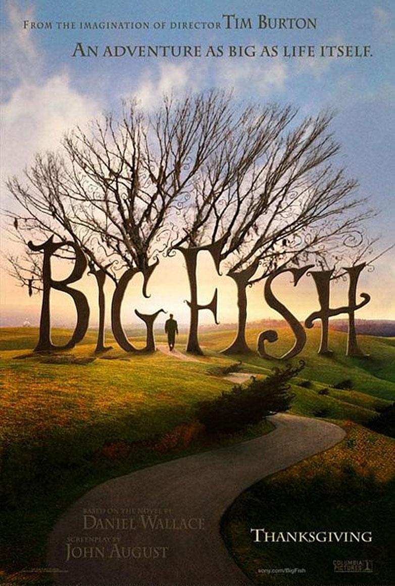
Big Fish
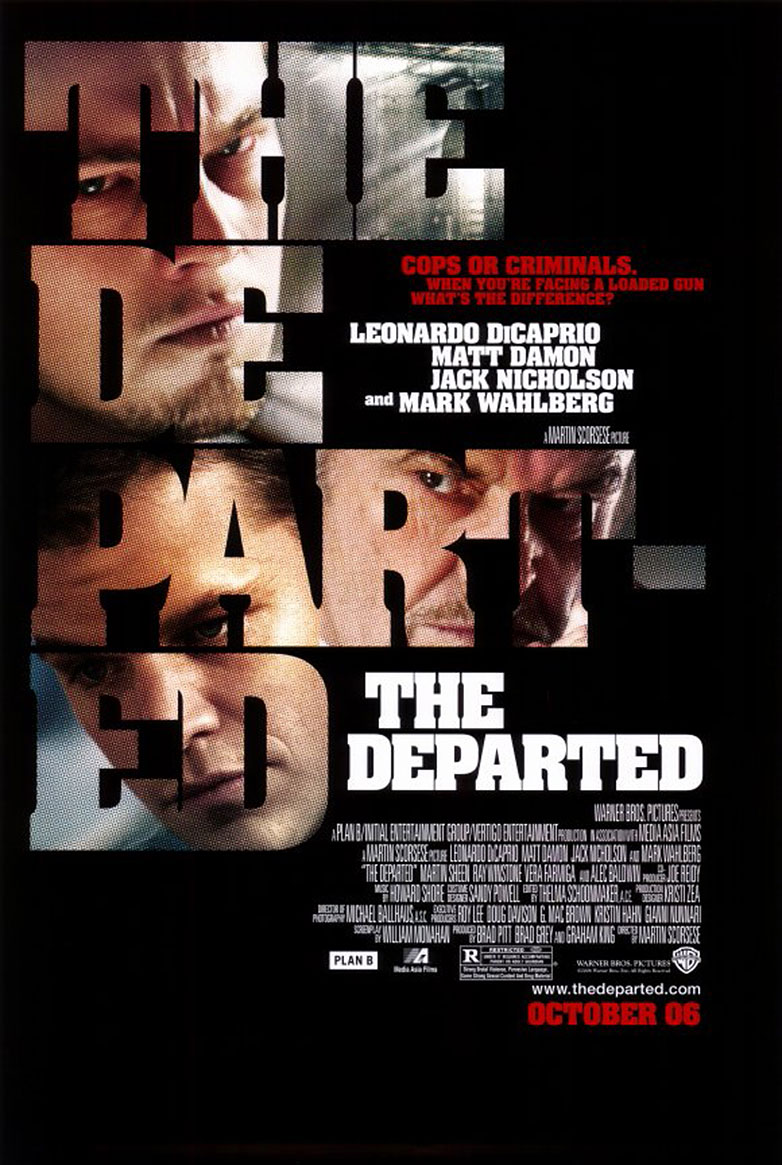
The Departed
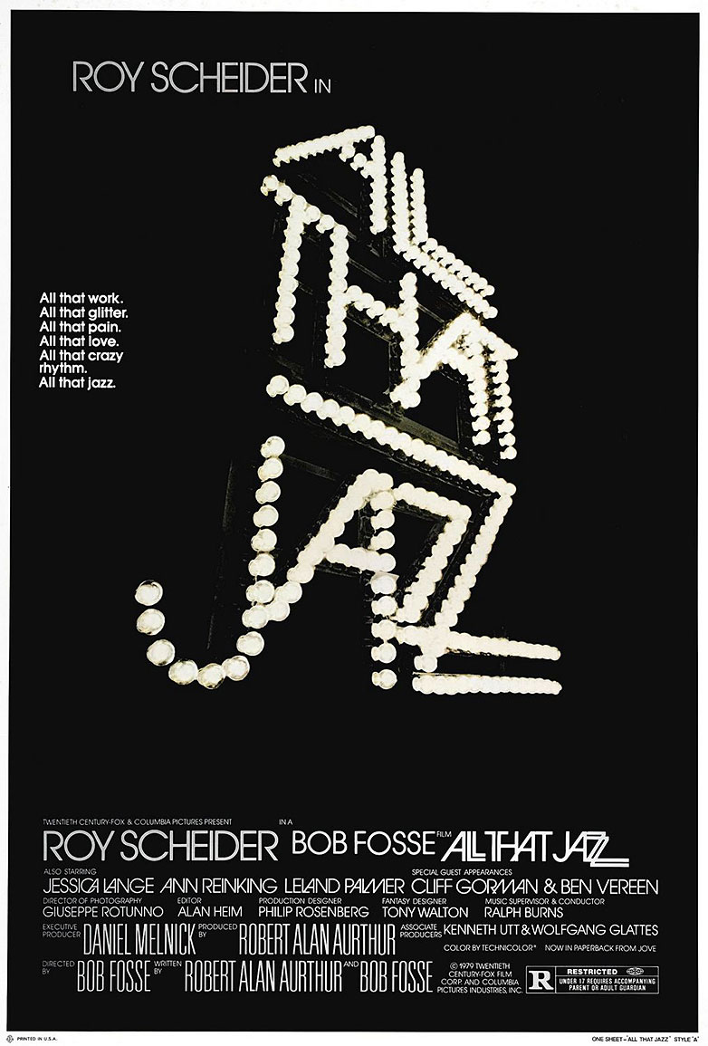
All That Jazz
Skyfall
Invasion
42
Before The Devil Knows You’re Dead
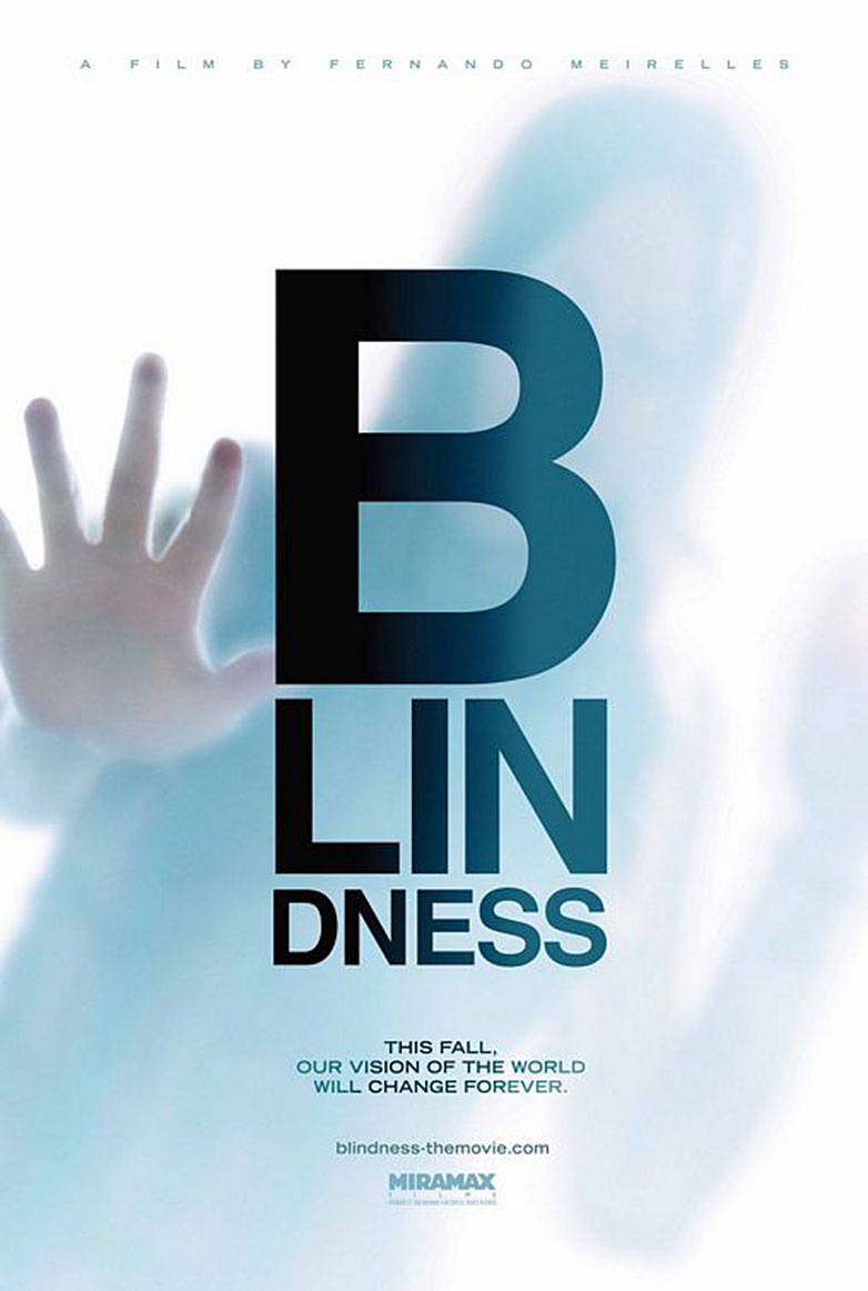
Blindness
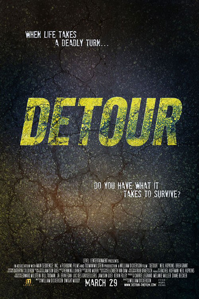
Detour
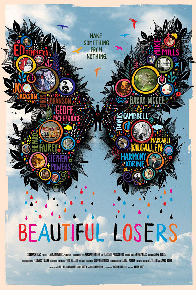
Beautiful Losers
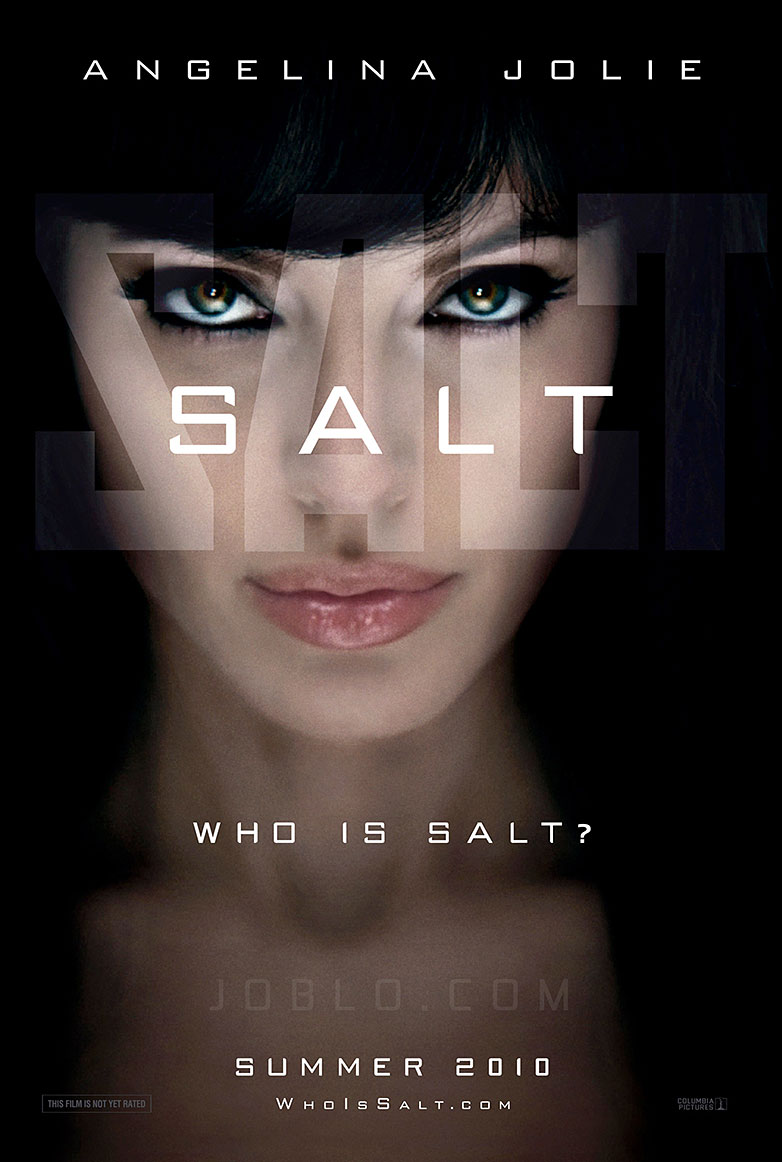
Salt
Gangs of New York
Beastly
The Social Network
Dancer in the Dark
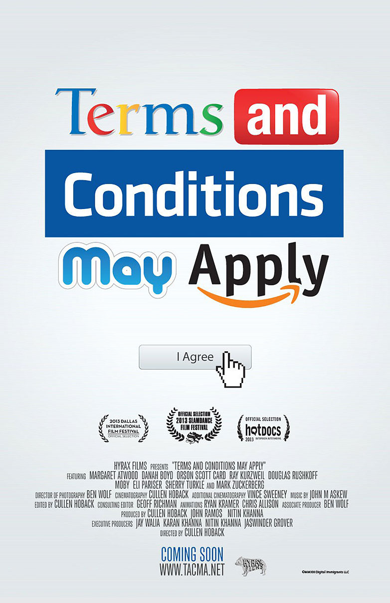
Terms and Conditions May Apply
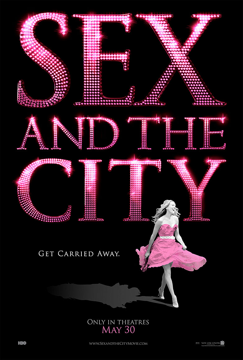
Sex and the City
Do you have a beloved poster from this lineup? Or is there another typographic treasure you feel deserves a spot in this gallery? Share your thoughts and finds in the comments below.
