 One of the more challenging aspects of transitioning from print to web design for many professionals is the ongoing struggle to achieve precise control over typography. Meticulous typographic decisions signal high-quality work, and the absence of such quality in the digital space is often conspicuous to those with an eye for detail. Thankfully, we’re gaining more control incrementally, and the support for refined typesetting is growing. Although it’s not yet feasible to individually fine-tune each character as one might in Illustrator, there are tools at our disposal to enhance text quality. The text-rendering property is among these lesser-known tools. This property isn’t part of official CSS specifications, as it’s an SVG property by nature, but it’s adopted in a CSS-like fashion. Its primary benefit is that with just a single CSS entry, we can smooth out various text imperfections, like undesirable spacing. The settings for the text-rendering property consist of:
- auto: allows the browser to decide
- optimizeSpeed: prioritizes rendering speed
- optimizeLegibility: prioritizes advanced text rendering
- geometricPrecision: ensures precise character rendering
Regrettably, when left to their default settings, browsers typically prioritize speed with the ‘auto’ configuration, a choice that reflects a developer’s priorities over a designer’s. Since most web pages don’t require the prioritizeSpeed setting for performance reasons, our attention turns to optimizeLegibility (and occasionally geometricPrecision, depending on the font). Implementing optimizeLegibility is straightforward:
.myClass { text-rendering: optimizeLegibility; }
To illustrate, here is a side-by-side comparison of optimizeSpeed and optimizeLegibility. Upon closer inspection, the latter displays two notable enhancements: the ‘ffi’ sequence in the top line transforms into a ligature, and the spacing, or kerning, is refined throughout. This is particularly evident in line five, where the gap between the ‘V’ and the ‘e’ has been adjusted.  Here’s a clearer view of the kerning adjustments via these overlay images:
 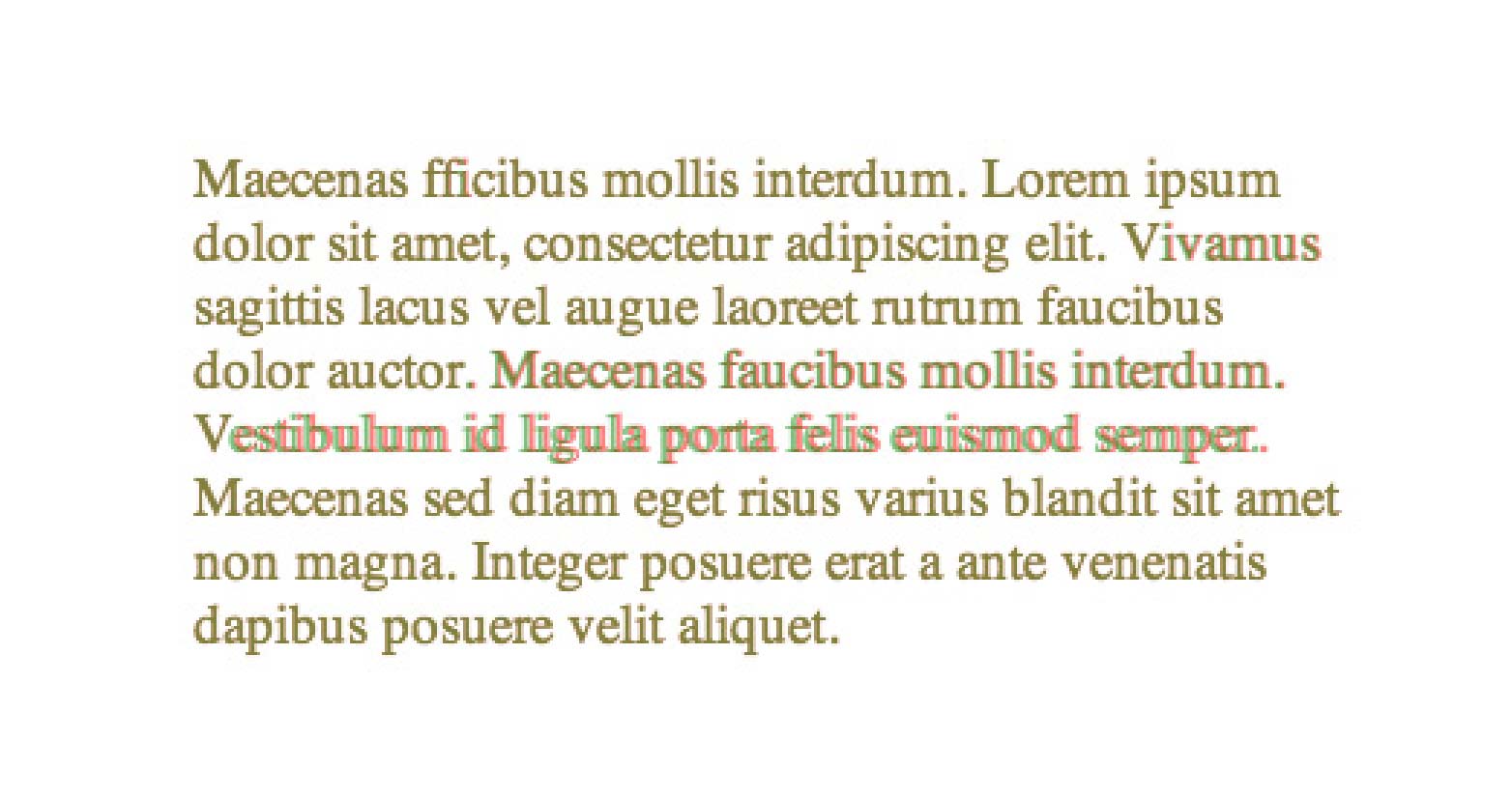 Chrome on Mac
 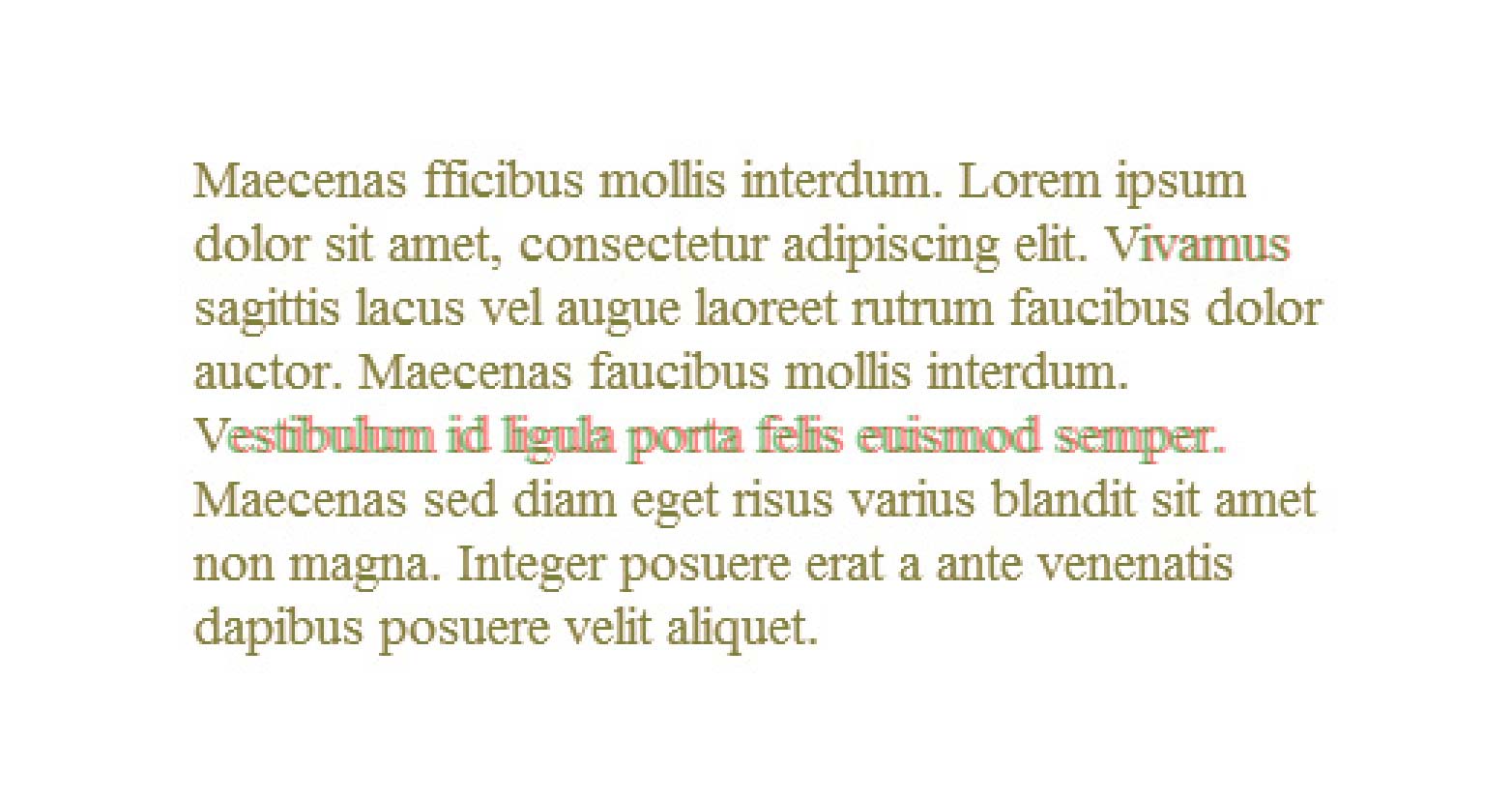 Chrome on Windows
 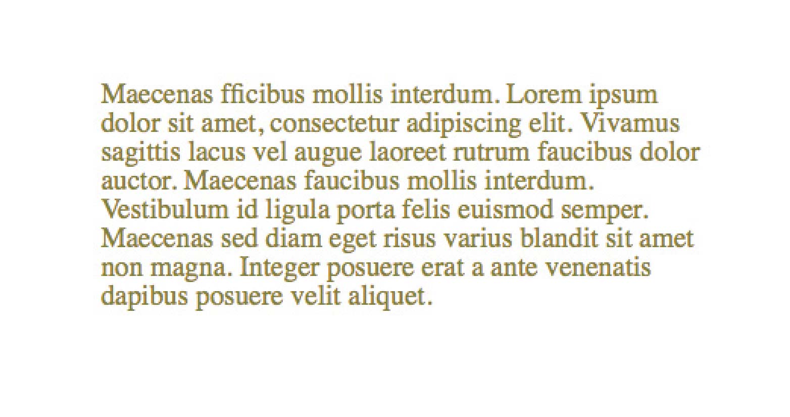 Firefox on Mac
 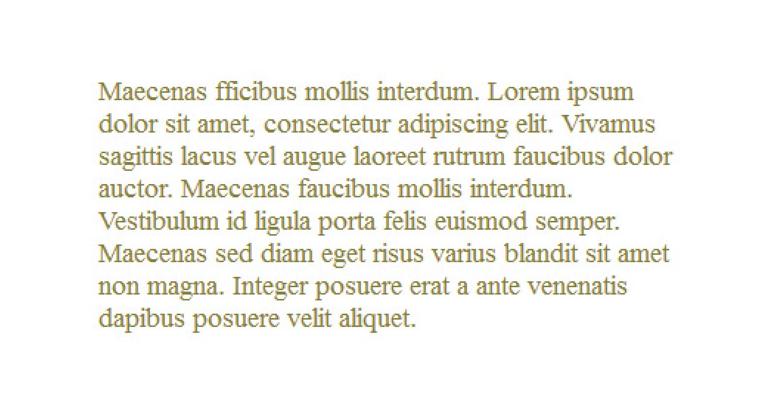 Firefox on Windows
 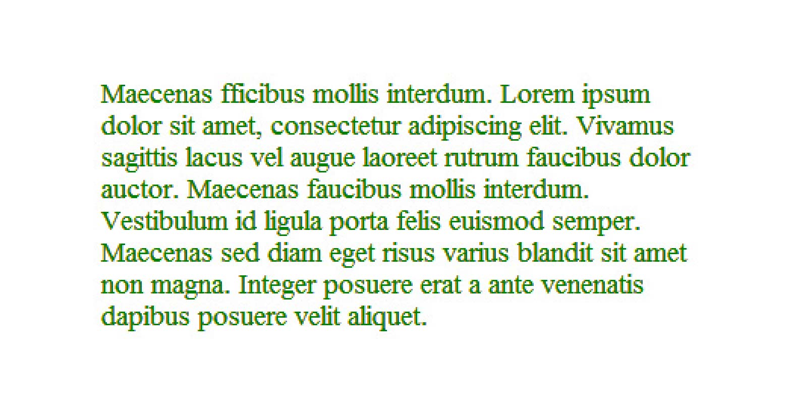 Internet Explorer 9 on Windows
 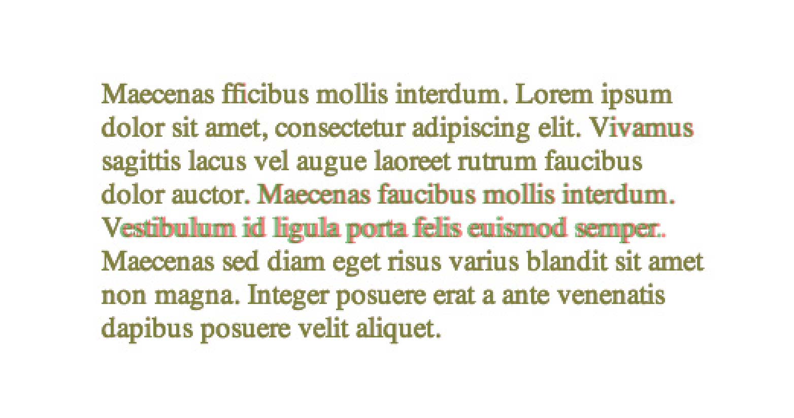 Safari on Mac The adoption of text-rendering among browsers is a mixed bag, but luckily, when unsupported, it doesn’t interfere and thus remains quite practical for immediate use. Have you integrated the text-rendering attribute into your stylesheets? Would anyone besides a typographer detect the disparity? Share your experiences in the comments. Featured image/thumbnail, fine-tune image via Shutterstock.

