Bill Gates, Steve Jobs, and other computing pioneers have ushered in remarkable advancements in communication and business over the past three decades, as well as significant contributions to design.
If not for their efforts, today’s design landscape and the platforms available to premier designers wouldn’t be as they are.
However, there is one aspect of their legacy we can critique: their font preferences. With the release of widely used software suites, tech leaders have inadvertently popularized some fonts to a fault, introducing them as default options in programs like Microsoft Word to an undiscriminating audience.
This dialogue is not aimed at vilifying the worst fonts in history; instead, it encourages novice designers and everyday software users to resist the temptation to overuse what could be considered some of the world’s most recognizable fonts.
Fonts like Impact and Comic Sans are fine in their own right, but their ubiquity in various applications is alarming. Below are ten fonts that have become tiresome and are best avoided—in order to preserve their integrity and your design’s originality.
1. Impact
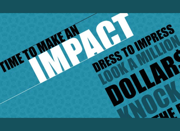
Impact, favored for bold headers and catching the reader’s eye, does possess notable strengths. Yet, its overuse has relegated it to obscurity among discerning designers. They now seek alternatives for creating visual impact.
Here’s the crux: Impact is now synonymous with office memos and amateur newsletters to such an extent that its use in professional branding or official documents is frowned upon. Sidestep it in favor of bolder, less hackneyed choices for your titles.
2. TheSans Basic
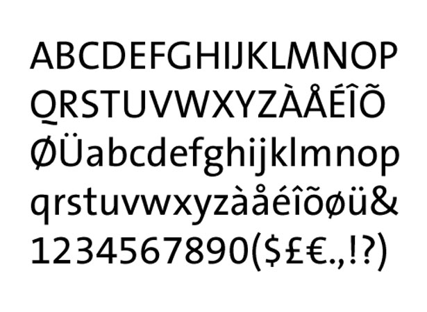
TheSans Basic attracts with its neat spacing and unobtrusive style, making it seem ideal for digital content and concise statements. However, its design stumbles with an incongruous uppercase “Q”, which clashes with an otherwise versatile font family.
While creativity in typography is celebrated for adding flair and focus, the “Q” in TheSans Basic is an unnecessary deviation that detracts from its otherwise standard appearance.
3. Trajan
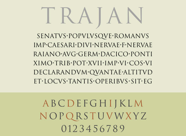
Trajan, used extensively in the film industry’s marketing, particularly on posters, has reached a saturation point that has dulled the luster of its elegant form.
Its proliferation is due in part to its inclusion in nearly every Adobe Creative Suite release, making it easily accessible. Trajan is commendable for occasional embellishments, but falls short as a go-to font for broad media use due to drawn-out overexposure.
4. Arial
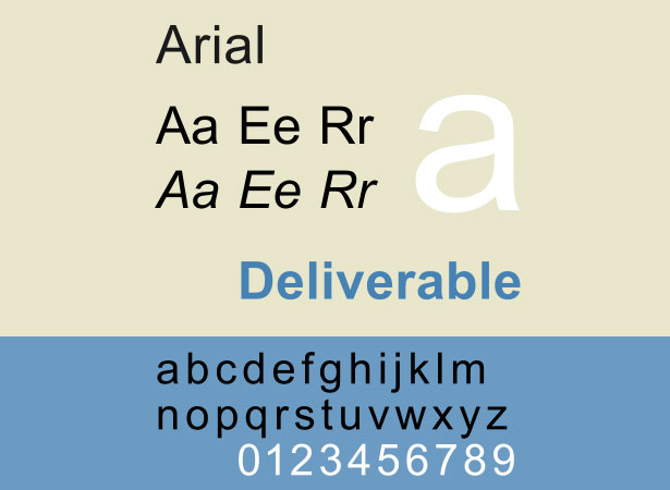
Arial, now replaced by Calibri as the default in Microsoft Office, was once a staple font due to its prevalence across Windows applications. It allowed Microsoft to bypass Helvetica’s licensing fees, achieving a near-identical aesthetic with subtle differences that mostly go unnoticed in text.
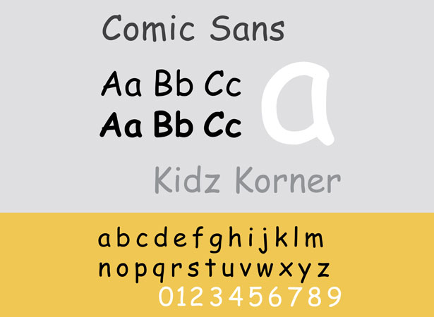
5. Comic Sans
Comic Sans remains a target of widespread scorn. While acceptable for informal uses like kids’ event invites, its misuse in professional contexts has tarnished its reputation. Comic Sans is a prime example of a decent font that has suffered from overuse and misapplication.
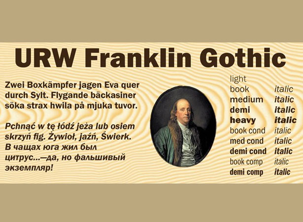
6. Franklin Gothic
Franklin Gothic’s traditional charm makes it a favorite for those seeking a newspaper-like vibe for their websites. Yet, when overdone, it can overshadow the content itself. Employ it sparsely, preserving its classic appeal without overburdening your visuals.
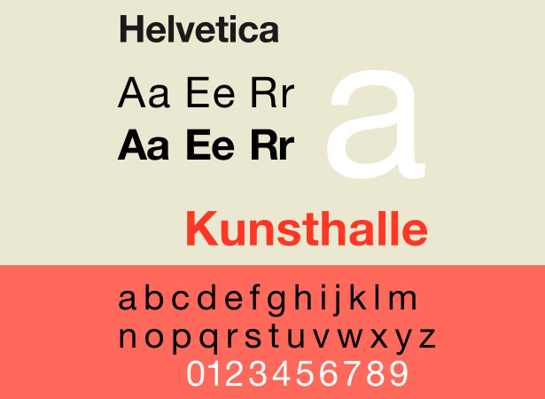
7. Helvetica
Helvetica is a typographic rockstar; adored by many and adopted by corporate giants. Yet, its omnipresence has transformed it from standout to commonplace. While it still excels in conveying clean, straightforward messages, for attention-grabbing needs, consider exploring other fonts.
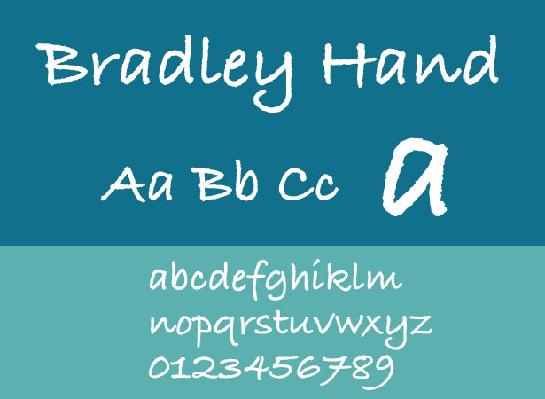
8. Bradley Hand and Similar Handwritten Fonts
Handwritten fonts like Bradley Hand, designed to infuse a personal touch, often come across as cliché and inexpressive. They fail to elevate the content as intended and instead can serve to detract from the professionalism of the design.
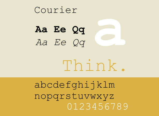
9. Courier and Courier New
Initially designating traditional typewriter text, Courier has found its niche in screenwriting and coding. For design purposes—particularly online—it lacks the refinement necessary to be taken seriously, often leaving an impression of amateur work rather than professional design.
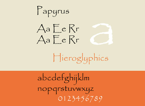
10. Papyrus
Papyrus is a notorious font, characterized by its overuse and the disdain it garners within the design community. It’s not just its prevalence that’s alarming, but also its intrinsically flawed aesthetics that make it unsuitable for thoughtful designs.
Insights provided by Mathew Carpenter, an 18-year-old Australian entrepreneur passionate about innovative online enterprises. Mathew is the engine behind Sofa Moolah, an educational portal guiding others to online monetary success. Stay connected with Mathew on Twitter: @matcarpenter and follow Sofa Moolah for more updates: @sofamoolah.
Are there other overused fonts that should be taken off our design palettes? Engage with us in the comments!
