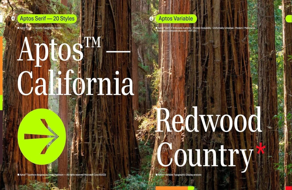
In a bold new chapter for its design aesthetic, Microsoft is turning a page by adopting Aptos as its new default font, a modern sans serif inspired by classic 20th-century Swiss design. For those in the loop about Microsoft’s search for a fresh typeface, this update isn’t exactly a surprise, yet for many who have grown fond of the company’s signature Calibri font, this shift might seem quite startling.
Transitioning fonts is a familiar move for Microsoft. It was in 2007 when Calibri took the stage, replacing the polarizing Times New Roman in Word, and Arial, which had been the standard in Excel, PowerPoint, and Outlook. Aptos, formerly known as Bierstadt, is the brainchild of prominent type designer Steve Matteson, and it’s arriving on the scene after a thorough period of testing and refinement. This move is part of Microsoft’s broader vision to cultivate a more welcoming and versatile software experience by adding a wider array of themes, colors, and backgrounds for enhanced user creativity.
Design aficionados are naturally curious: what’s the aesthetic verdict for the new typeface? Aptos is defined by its minimalist approach and sharp, clean lines that are the hallmark of a sans-serif. Nevertheless, Matteson has managed to imbue the typeface with a gentle humanist essence through subtle curves, but it remains primarily utilitarian, privileging legibility over ornamental flair.
In essence, while Aptos is fully functional and indeed competent, it doesn’t shatter existing paradigms in font design. Those who appreciate the flair of ornate scripts might find themselves patiently anticipating when such stylistic characters will grace Microsoft’s default font repertoire.

