In the current landscape, our designs are heavily influenced by the nomadic nature of our audience who traverse the outdoors with their handheld devices. These users dominate our demographics, and their screen size preferences have driven a mobile-first design philosophy. Mobile compatibility is undeniably essential, but large screens are as relevant as ever. They are the workhorses of office spaces, the centers of home entertainment systems, and the choice platforms for gamers and creative professionals.
These users often have to make do with experiences tailored for smaller screens, which, while functional, may not offer them an experience that fully leverages their large displays. So, why neglect the potential of all that additional screen real estate? Here are cutting-edge strategies for optimizing web design for larger viewports, with inspiring examples:
1. Embrace Spacious Visuals
One technique to fill the void of large screens is to introduce sizable visuals. It’s common to encounter numerous sites applying stock photos as full-screen backgrounds, notably in the homepage’s hero section. Though pervasive and at times effective, this can have bandwidth implications. To mitigate this, consider using SVG images—scalable vectors can be a significant resource saver. They maintain crispness regardless of scale while keeping loading times swift. Check out bebold for a prime demonstration of SVGs utilized to splendid effect. 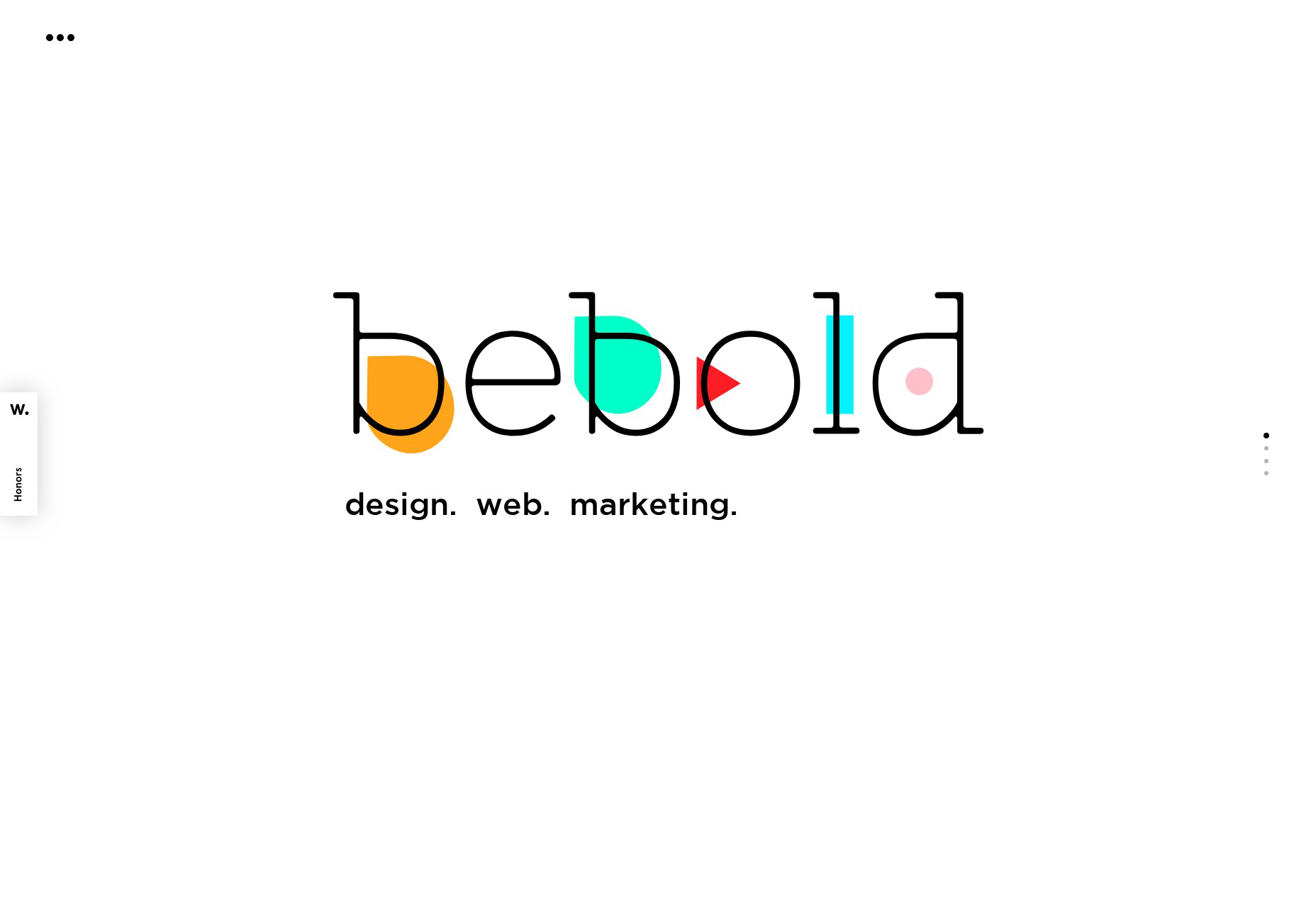
2. Expand Your Layouts
Responsive design is no stranger to most of us, yet the introduction of CSS Grid has revolutionized this space. For designers and developers, generating sophisticated, magazine-like layouts has become surprisingly straightforward. Consider pushing the boundaries of your central content wrapper beyond the traditional 1200-pixel width to see what creative layouts might emerge. For a breathtaking example (albeit with considerable bandwidth use), explore Seedlip. 
3. Adaptive Typography
While ample images can be captivating, sometimes what you seek is attention-grabbing text. With innovations in responsive design maturing, typography that responsively adjusts to the screen resolution is a design frontier that’s seen significant advancements. The CSS ‘calc’ function is a powerful tool for achieving scalable type sizes with minimal effort. If you’re searching for a practical guide, Mike Foskett’s Fluid-responsive font-size calculator is an invaluable resource, using ‘rem’ and ’em’ units to ensure a harmonious scaling of text across devices. Inspect any piece on CSS-Tricks to see this technique in action. 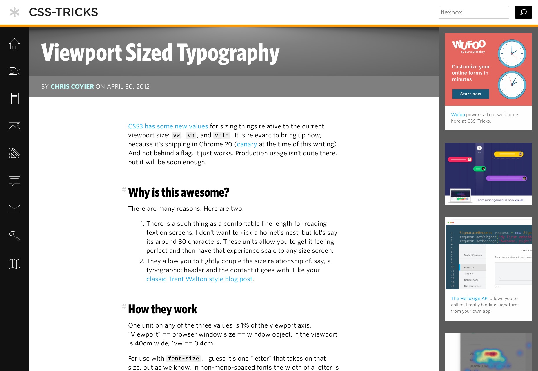
4. Information Density
The concept of adding more content to the screen might seem contrary to minimalist principles, but in the context of dashboards and e-commerce, it can significantly enhance user productivity. Not fully utilizing the available space can inadvertently slow down the user. Sites like Amazon exemplify this practice, though I’ll leave their discovery to your web surfing. In the realm of news, however, a balance is often struck by offering content that’s readable without overwhelming the viewport, encouraging more intentional consumption of media.
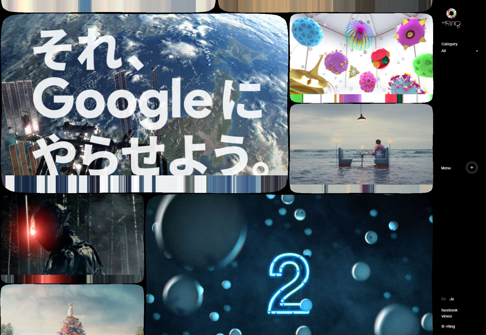
5. Immersive Video Experiences
Lastly, the use of video is a self-explanatory strategy where larger screens are concerned. Leveraging the medium to its fullest extent includes offering users the option to view content in full-screen mode. This not only provides an immersive experience but also respects the capabilities of their larger display. Explore any filmmaker’s website for excellent instances of video implementation. Here’s a standout: +Ring.