
- Aiming to prevent edge cases from occurring
- Accommodating scenarios where edge cases arise
When feasible, prevention is key. Simplifying a system – such as trimming the number of user actions and features within an interface – can reduce the likelihood of edge cases. Nonetheless, not all edge cases can be averted, and in those instances, it’s crucial to have provisions in place to support users:
1. Overcoming Delays in Loading
In an age where technology advances rapidly, user tolerance for waiting has plummeted. Google research indicates that for two-thirds of mobile web consumers, page load speed is crucial to their satisfaction. While it’s essential to optimize your product for quick loading times, there will be moments when adhering to speed recommendations isn’t feasible due to factors like poor internet connectivity. When actual performance can’t be improved, consider enhancing the perceived speed. Perception often trumps reality for users – they might feel that a process is faster than it actually is. Introducing skeleton screens can be a valuable tactic in this case. These temporary layouts, which display as the full content loads, can foster an illusion of speed, making users believe that the loading process is quicker than it is.  LinkedIn utilizes skeleton screens to create a seamless perception of quickness. Consider this Codepen demonstration of skeleton effects executed in pure CSS, where pulsation provides a vivid sense of activity and ongoing content loading.
2. Addressing Empty States
There will be times when certain pages within your app or website, anticipated to be teeming with data, will greet users with a void. Take, for example, a fitness app’s challenge page appearing barren to a new user. It’s here that considering the user’s reception to an empty page becomes important. Presenting an empty screen isn’t conducive to engagement. Rather, guiding users on populating data can yield a more productive experience. The Khaylo Workout app for iOS showcases how to effectively employ empty spaces to deliver context. 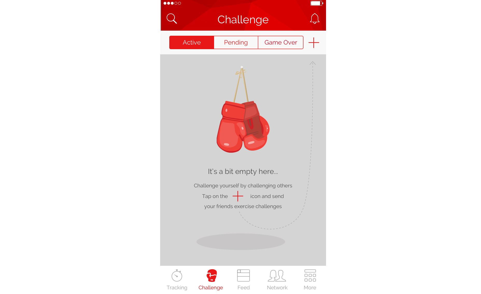 Strategic use of empty space can provide users with clear start-up instructions.
3. Handling User or System Errors
Every point of user-system interaction carries the potential for errors. Error states are notably prevalent when users are inputting data. My earlier emphasis on error prevention comes into play here, particularly for data entry. It’s critical to address two areas of concern:
- Invalid data provided by the user, such as an erroneous credit card number during checkout, should be met with targeted error messages that help identify the issue.
- Technical hiccups preventing system processes should be distinguished from user errors to avoid repeated data submission.
In both instances, prioritizing a graceful error handling approach is vital. Errors should be communicated in layman’s terms, stripping out jargon, and coupled with actionable solutions or guidance.
4. Navigating ‘Zero Results’ Findings
The ‘no results’ scenario is a recurring challenge within e-commerce platforms, often leading to user frustration, especially after several failed search attempts. When crafting search features, two techniques can greatly enhance user experience:
- Spell-check and suggestions help users avoid zero results from typographical errors. Implementing an autocomplete feature can further minimize typing efforts and preempt incorrect inputs.
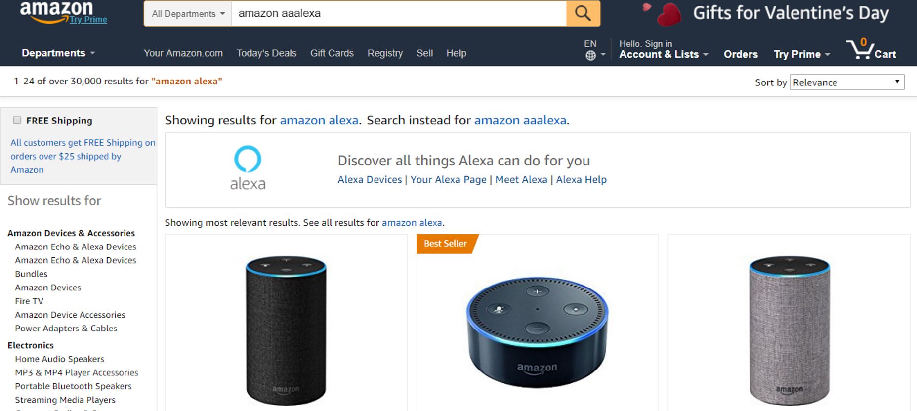 Amazon adeptly redirects from mistyped searches to intended products.
- Promoting alternatives or featured content fends off the feeling of a dead-end when no results match the search, thus, fostering continued engagement.
 Contrast the zero-results pages from HP and Amazon: HP’s version leads nowhere, while Amazon suggests related products and additional search possibilities.
Finding Oddities Before They Emerge
Design for edge cases isn’t tantamount to preparing for the unforeseeable. Most can be predicted prior to release. Identifying these cases can be facilitated by:
- Design review: Engage proactively in searching for edge cases. Conducting design reviews early in the product process, with a cross-functional team, can unearth potential issues.
- User testing: While internal team assessments are valuable, they don’t guarantee all edge cases will surface. Real-world user testing grants a clearer picture of genuine usage and challenges. However, it’s essential to ensure that such testing allows for experimentation, rather than rigidly guided usability studies.
Wrap-up
Designing products often involves prioritizing majority needs, employing the 80/20 rule for most probable interactions. This typically ensures a satisfactory user experience. However, meticulous attention to detail is what distinguishes outstanding design from the merely good. Taking into account edge cases exemplifies this refined attention to every detail.
