Understanding the Display
The iPhone X introduces a stunning, rounded, and expansive Super Retina display with an impressive resolution of 1125×2436px. The increased screen real estate is exciting for designers, but there are vital considerations to bear in mind:
1. High-Resolution Image Scaling
Given the 3x image scale factor on the iPhone X, incorporating both 2x and 3x image resolutions into your graphics catalog is crucial. For high-res scale-agnostic graphics like icons and certain artwork, vector formats such as SVG are preferred.
2. Make the Most Out of the New Dimensions
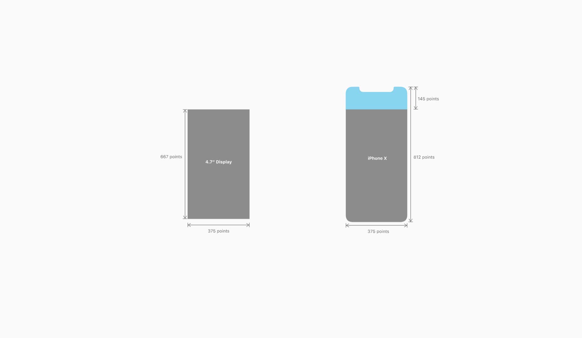
With dimensions of 375pt by 812pt, the iPhone X offers 20% more vertical space than the 4.7″ screen iPhones, which share its 375pt width but have a shorter stature. It’s essential to adapt designs to this new height for a fuller display of content.
3. Respect the Aspect Ratio
The iPhone X boasts a unique aspect ratio distinct from the 4.7” iPhones. To adapt, design background images that keep the focal points flexible and within view, regardless of aspect ratio variances.
4. Keep Clear of Edge Corners
The device’s rounded corners and the sensor housing at the top of the screen makes it critical to maintain a safe distance from the edges when placing elements to avoid clipping.
5. Utilize Safe Area for Content
The Safe Area layout feature on the iPhone X ensures that content doesn’t get obscured by the phone’s UI. It is crucial for non-scrollable elements. Scrollable content, however, can extend beyond these bounds for an edge-to-edge experience. 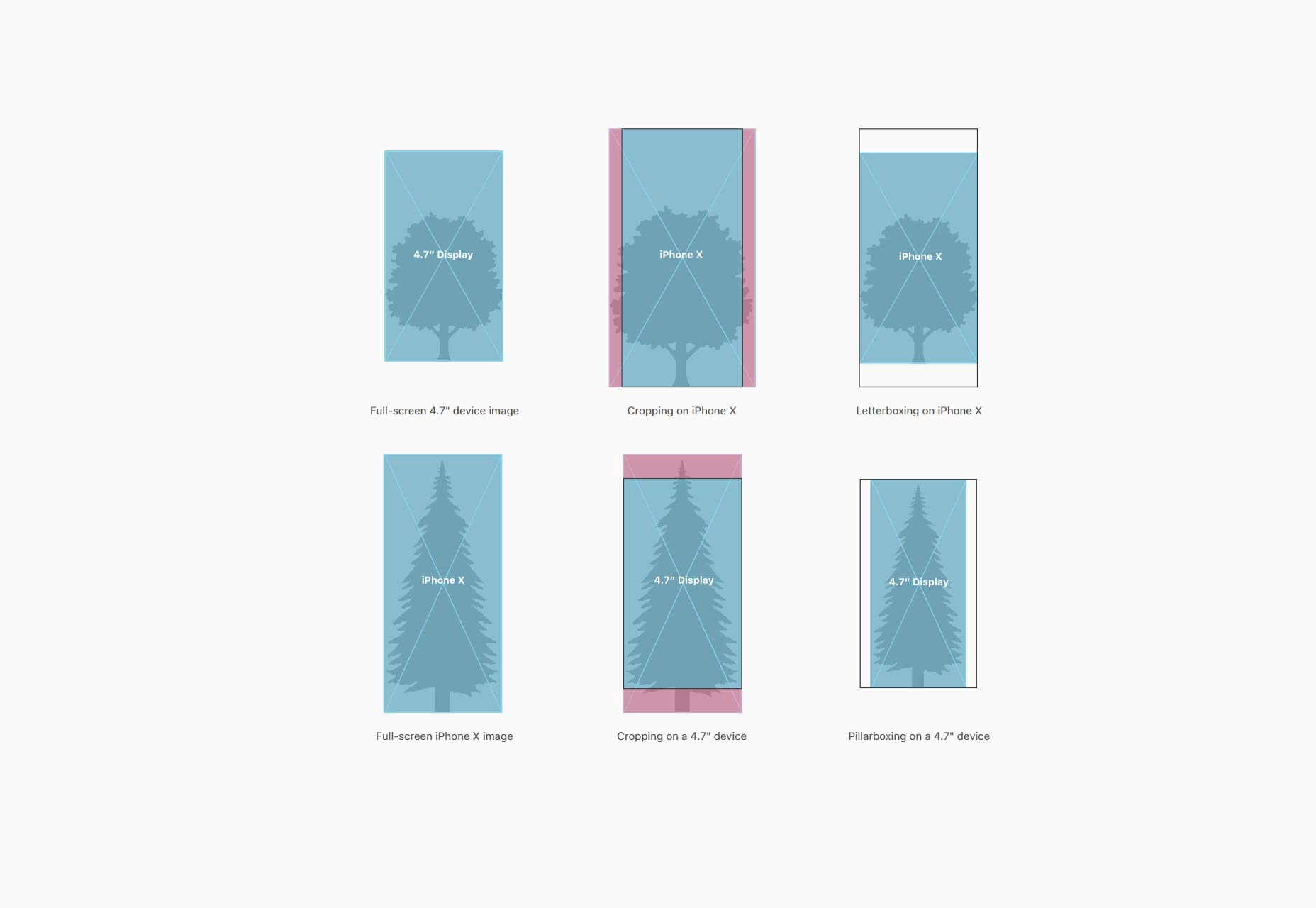
6. Trust in Native Components
iOS native components like navigation bars and tab bars are automatically adapted by the system to fit within the safe parameters of the iPhone X screen.
Navigating with the Home Indicator
The traditional home button has been replaced with a swipe-up gesture on the iPhone X, denoted by the home indicator at the bottom of the screen. This small line is always visible to prompt users about the swipe action.
7. Keep Interactive Elements Away from the Home Indicator
To avoid overlap with the Home indicator, it’s wise to ensure interactive elements have adequate space from this swipe-up area.
8. Don’t Highlight the Home Indicator
The Home indicator serves a functional purpose and should not be accentuated or camouflaged within the app interface.
9. Consider Auto-Hide for Immersive Experiences
For full-screen display of content like videos, the Home indicator can be temporarily hidden to maintain a complete visual experience. 
The Notch: Embrace Its Presence
The notch, a unique characteristic of the iPhone X, has stirred a mixed feeling. Designers have the opportunity to employ this space effectively rather than masking it, ensuring consistency with the iPhone X’s design.
10. Don’t Obscure the Notch
Steer clear of forcing a conventional look by adding black bars at the top. Instead, allow your app to fill the full display area.
11. Don’t Neglect the Status Bar
If you’re used to hiding the status bar, it may be time to rethink that strategy, especially with the added vertical space provided by the iPhone X’s status bar area. Utilize this space to benefit your users with additional valuable content.