 As mobile internet usage continues to soar, the importance of designing adaptive, responsive websites is more critical than ever. One area that is sometimes neglected, yet can cause significant user frustration, is the contact form. Contact forms are a pivotal touchpoint – they’re used during logins, sign-ups, and when finalizing online purchases. Therefore, ensuring they function seamlessly on mobile devices is a crucial aspect of enhancing user experience.
Tweaking your contact forms to be more accessible and appealing for mobile users can be easily accomplished with a few HTML and CSS adjustments.
Tailoring Form Elements for Touch Interactions
Ensuring that form elements are optimized for touch interactions by introducing touch-friendly CSS styles can significantly improve the user’s experience with buttons and input fields.
Enlarging touch targets for input fields is a good starting point:
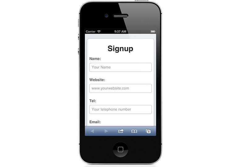
input[type=text], input[type=url], input[type=email], input[type=password], input[type=tel] {
-webkit-appearance: none; -moz-appearance: none;
display: block;
margin: 0;
width: 100%; height: 40px;
line-height: 40px; font-size: 17px;
border: 1px solid #bbb;
}
Other types of controls can also be stylized for better touch interaction:
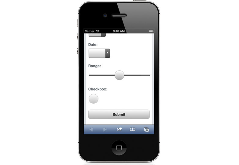
For instance, making checkboxes more accessible with touch:
input[type=checkbox] {
width: 44px; height: 44px;
-webkit-border-radius: 22px; -moz-border-radius: 22px; border-radius: 22px;
border: 1px solid #bbb;
}
Styling for buttons can also be enhanced for a better finger-friendly experience:
button[type=submit] {
-webkit-appearance: none; -moz-appearance: none;
display: block;
margin: 1.5em 0;
font-size: 1em; line-height: 2.5em;
color: #333;
font-weight: bold;
height: 2.5em; width: 100%;
/* Background and border styling omitted for brevity */
border: 1px solid #bbb;
-webkit-border-radius: 10px; -moz-border-radius: 10px; border-radius: 10px;
}
Even specific input types like range sliders can be visually improved for touch access:
input[type=range] {
width: 100%;
}
/* Other range input styles omitted for brevity */
Leveraging HTML5 Input Types for Mobile Keyboards
Utilizing HTML5’s new input types can greatly enhance the mobile browsing experience by triggering context-appropriate keyboards. This is particularly useful for mobile browsers which often present different soft keyboard layouts depending on the type of data input required.
For example, here’s how the iPhone soft keyboard adapts to different HTML5 input types:
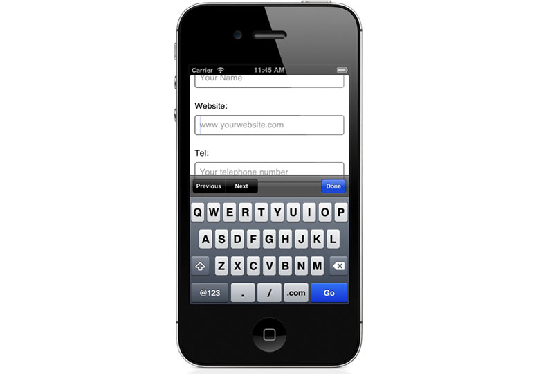
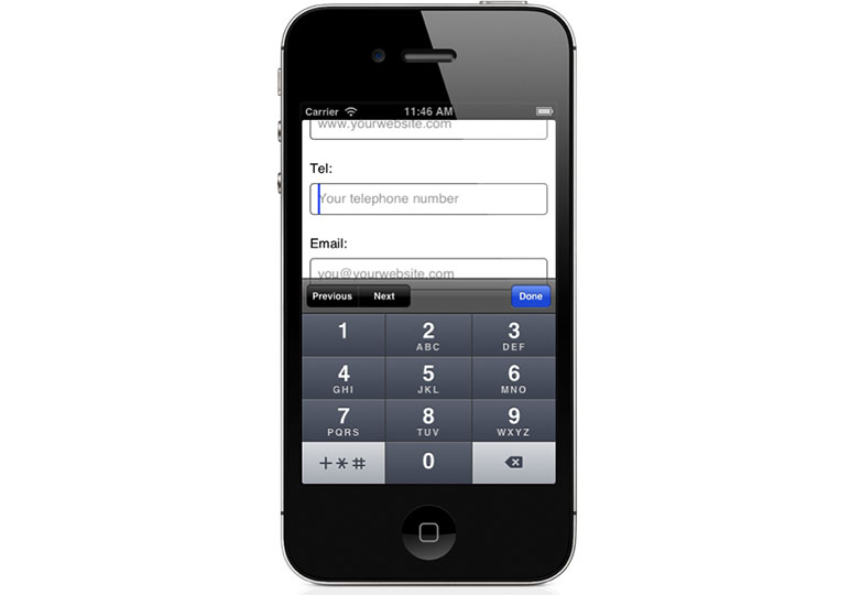
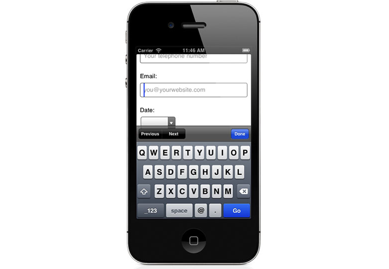
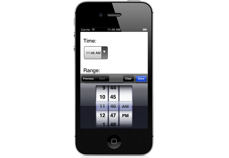
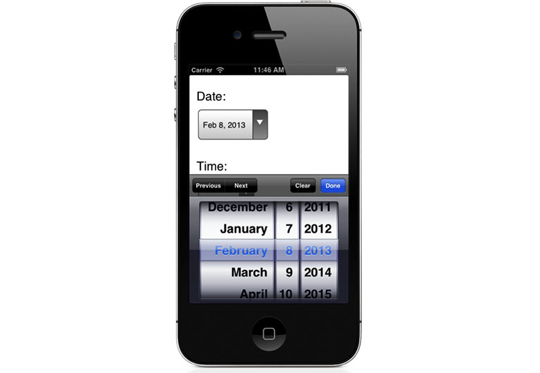
In these instances, we are also utilizing placeholder text to show users an example of what they should input.
Improving Tap-to-Call Links
Auto-detection of phone numbers is helpful but not infallible. You can take control of this by disabling auto-detection using the following meta tag:
<meta name="format-detection" content="telephone=no" />Now you can manually define phone links, ensuring accuracy and custom styling:
Tel: <a href="tel:14085555555">1 408 555 5555</a>You can apply specific styles to these links:
a[href^='tel:']:link, a[href^='tel:']:visited {
color: #333;
font-weight: bold;
text-decoration: underline;
}
a[href^='tel:']:hover, a[href^='tel:']:active {
text-decoration: none;
}
It’s a good idea to use media queries to apply these styles selectively, depending on the device used to view the site:
/* Default styles omitted for brevity */
/* Mobile-specific styles */
@media screen and (max-width: 600px) {
/* Styling for mobile tel links */
}
Managing Auto-Correction and Capitalization
Mobile operating systems often auto-correct and capitalize input text in helpful ways, but this can sometimes lead to user frustration. Thankfully, this can be controlled with certain properties:
<input type="text" name="username" autocorrect="off" autocapitalize="off" />Different autocapitalization settings, including words, characters, and sentences, are available and should be used thoughtfully.
<input type="text" name="full-name" autocapitalize="words" />
<input type="text" name="country-code" autocapitalize="characters" />
/* Additional examples omitted for brevity */
Compatibility with Web Browsers
Although many examples in this article focus on iOS Safari, some tips are also applicable to Android and other mobile browsers. The beauty of HTML5 form enhancements is that they offer progressive enhancement, which means that browsers with capabilities for these features will utilize them, while others will simply ignore them without causing any issues.
Are mobile-friendly forms crucial for mobile sites? What other recommendations might you have? Share with us in the comments.
Cover image, contact image provided by Shutterstock.

