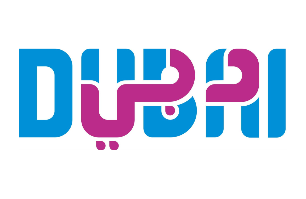
Dubai’s innovative approach to a universal marketing challenge shines through in its tourism emblem. This clever design presents the city’s moniker in the familiar Roman script side-by-side with the graceful swirls of Arabic calligraphy.
Dubbed ‘Dubai’ in a serene shade of blue represents the name most recognizable to the global audience. Parallel to it, in a vibrant hue of pink, is the Arabic script rendition of the city’s name.
The fusion of these two scripts comes together effortlessly, creating an emblem that transcends language and cultural barriers, effectively resonating with audiences from Europe, the Middle East, North America, and beyond.

The emblem of Dubai’s tourism made waves on Reddit’s r/DesignPorn subreddit, garnering widespread acclaim for its clever use of color to delineate the two alphabets. Its unanimous reception hailed it as an epitome of diversity and cultural inclusion.
With tourism as a vital artery pumping economic prosperity into the heart of the United Arab Emirates, this emblem is anticipated to be a beacon, drawing visitors from all corners of the globe to the nation.
Of course, any design subject to the discerning eyes of the internet will encounter diverse opinions. While some critics might question the readability when scripts overlap, others might muse over the color scheme’s resemblance to a certain ice cream franchise’s branding. Alas, the court of public opinion is nothing if not varied.

