 Floating Action Button in Android app
1. Spotlight Key Functions
The FAB should accentuate an app’s most important or commonly used functions, encapsulating the essence of an application’s purpose. For instance, a music app may display a FAB that toggles between ‘Play’ and ‘Stop,’ while one akin to Instagram could feature a ‘Capture Photo’ FAB. This calls for meticulous design considerations that zoom in on a singular, standout function to enhance user interaction.
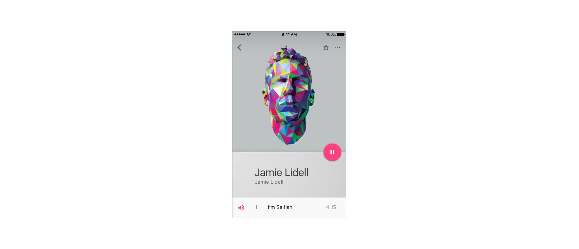 A floating action button signifies the primary function of an application, such as playing or pausing music on this interface.
Studies by Steve Jones indicate that initial encounters with FAB might pose slight usability challenges. Nonetheless, once users complete a task with FAB, their future interactions become more efficient compared to traditional action buttons.
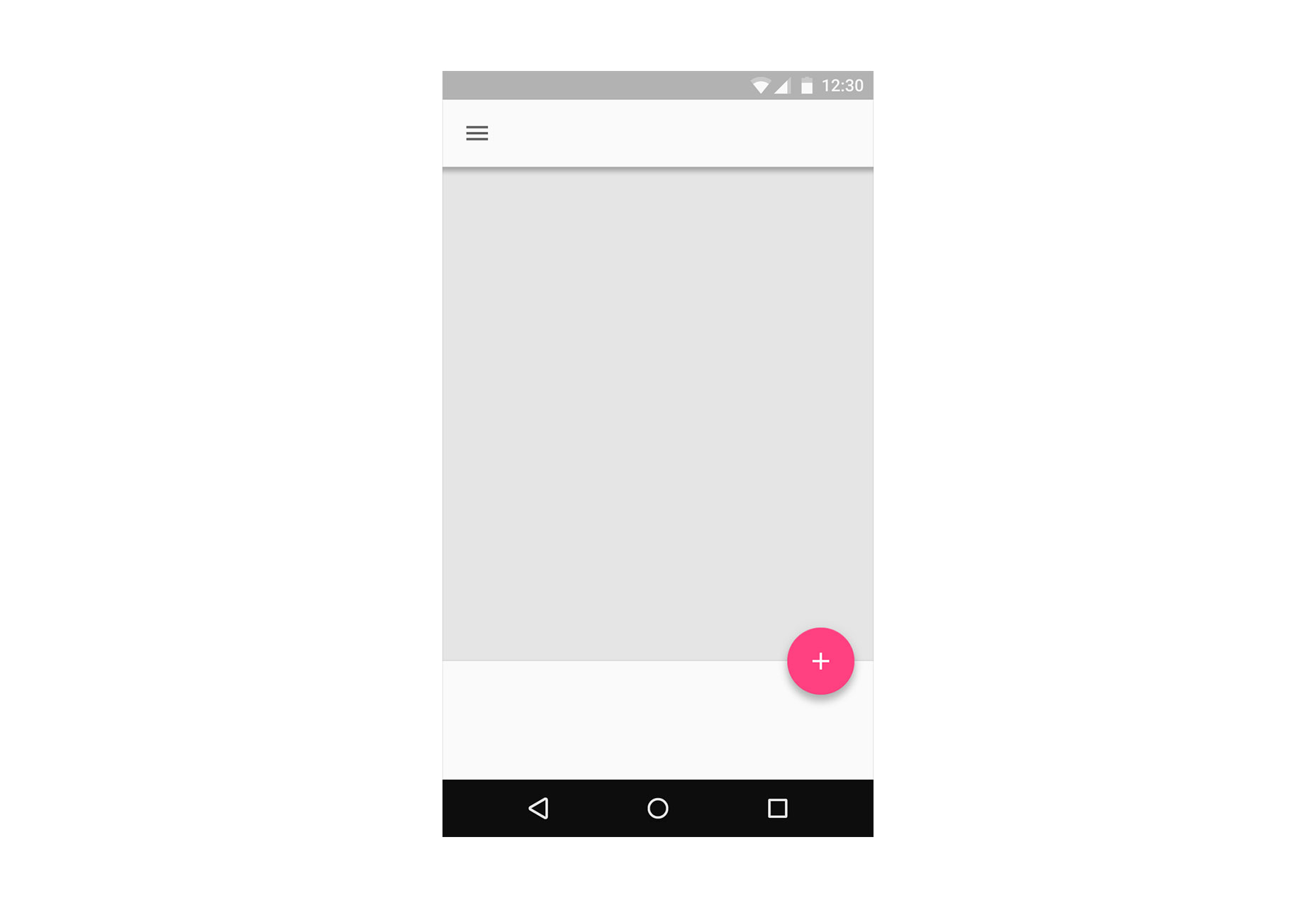
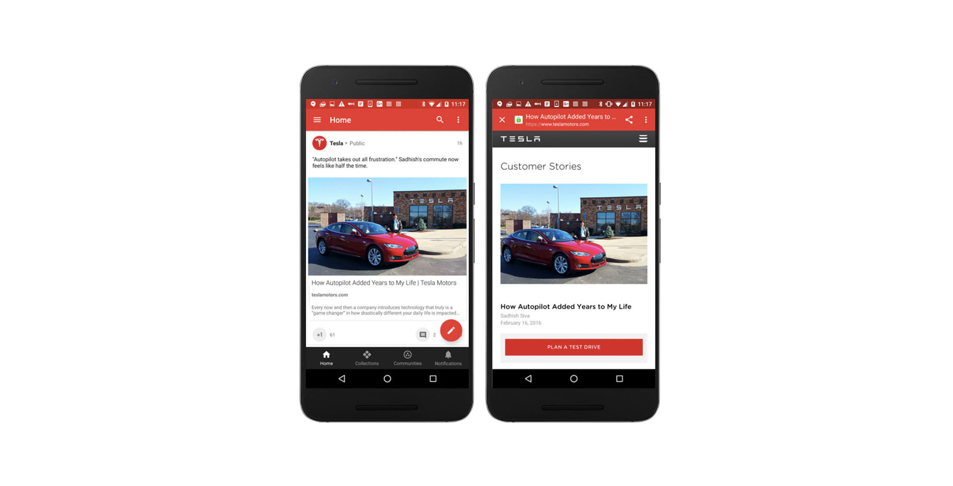
2. Assist in Navigation
FAB also acts as a directional guide, prompting users on the next course of action, especially in unfamiliar interfaces. Google’s research emphasizes FAB’s role in helping users navigate through content, proving its value as a digital guidepost.
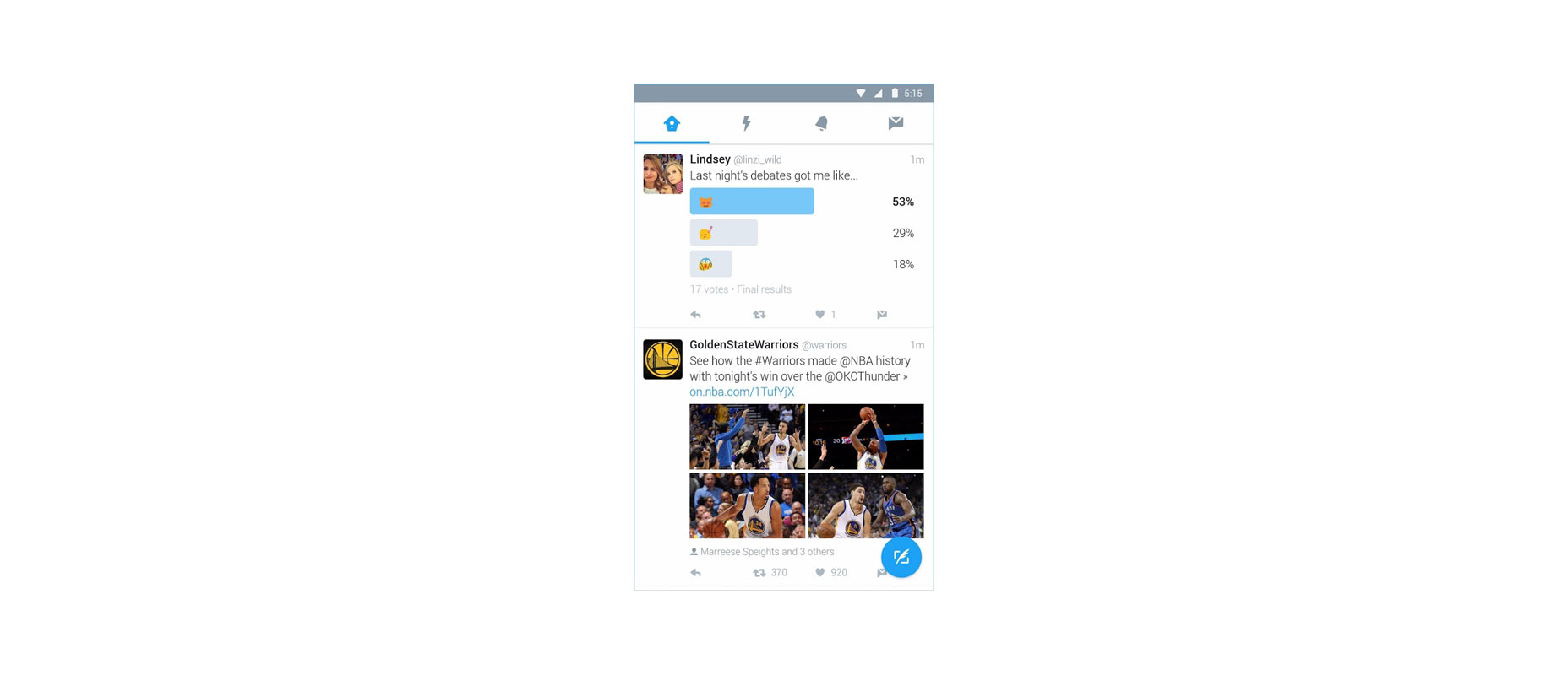 The Floating Action Button on Twitter propels users toward content creation.
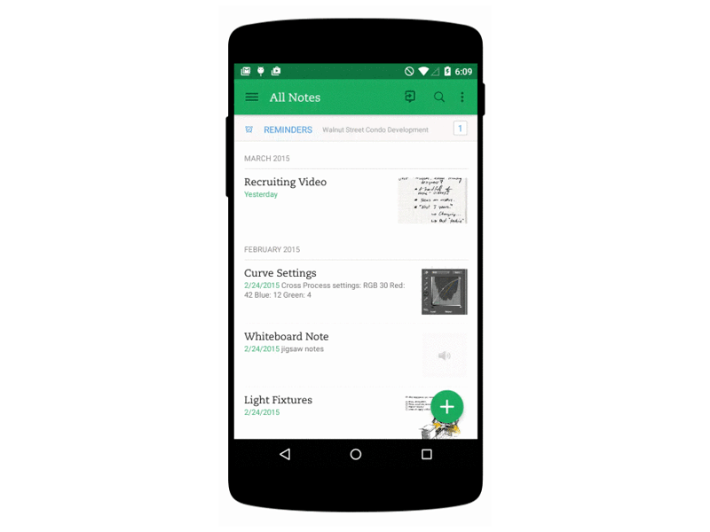
3. Unveil Multiple Options
A well-designed FAB can segue into an array of additional choices, as exemplified by the Evernote app. It’s advisable to unveil a minimum of three and no more than six related options upon interaction. These selections should be inextricably linked to the FAB’s primary function and to one another, steering clear of the randomness that might ensue were they placed on a toolbar.
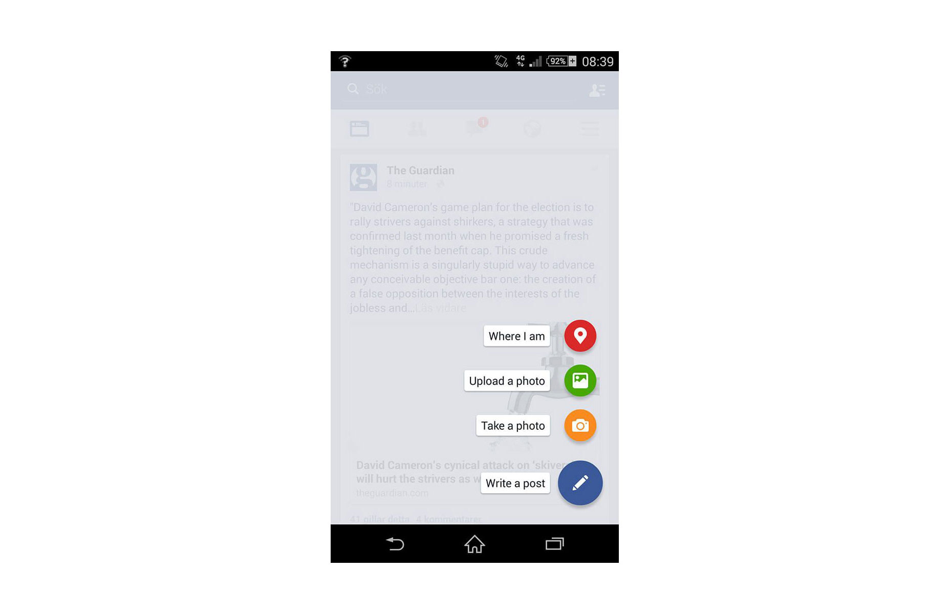 Don’t: Offer unrelated actions like ‘Where I am’ amidst content creation options.
4. Stay Context-Sensitive
The FAB interacts with user intention and situational context. Taking Google+ as a case in point, it reveals the button during active user engagement with the social stream but retires it during inactivity, adapting to the changing context of user behavior.
5. Seamlessly Transition Between States
Going beyond a simple round button, the FAB incorporates transformational qualities that facilitate smooth transitions from one screen to another. Through logical and intuitive animations, it maintains users’ spatial awareness, clarifies the shift in the layout, and guides them on revisiting these changes if needed.
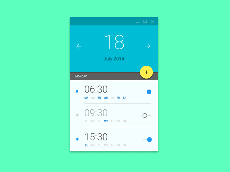 Image credit: Ehsan Rahimi
 Image credit: Dribbble
Conclusion
While some may critique FAB as troublesome for UX, it’s often because it’s unfamiliar territory for both users and designers alike. In time, as we adapt, it’s clear that the FAB, if implemented correctly, holds the potential to significantly streamline and enhance user interactions within an app.