
With the continuous growth of information sharing online, presenting data through visual formats has become increasingly popular. These visual presentations, utilized in diverse fields such as business analytics and digital journalism, make grasping complex information simpler. Humans are naturally better at processing visuals as opposed to raw figures in spreadsheets and reports. The key to an impactful data visualization is to tap into our innate visual processing capabilities and present the data in a digestible and compelling manner. As visualization tools evolve, it’s important to remember the foundational elements that make visual data representation effective. Below are essential tips that can guide you in creating visuals that provide insightful and meaningful data experiences.
1. Tailor Your Design to the Audience
The essence of visualization is to uncover patterns, context, and relationships in data. While designers have no control over the data itself, they can influence the presentation by considering the audience’s needs. Visualizations for beginners should be simple, clear, and instructive, directly explaining key takeaways. 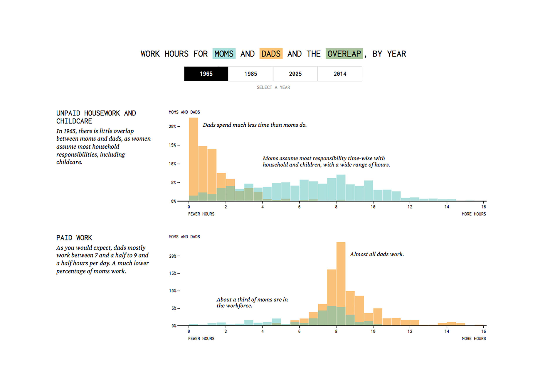 On the contrary, visualizations targeting experts may focus on detailed and data-rich visuals to promote exploration and discovery.
2. Enhance, Don’t Rely on Interactivity
Even the best interactive visuals by top news outlets see low interaction rates. This indicates that while interactive design can enrich the exploration process, it shouldn’t be mandatory for understanding the data. Interactive elements can also serve as a fun entry point, inviting the audience to engage more deeply from the start. The goal is to strike a balance where interactivity adds to the experience but isn’t essential for comprehension.
3. Draw Focus with Strategic Visual Cues
Visual salience can direct viewers’ attention to key data within a visualization, preventing cognitive overload. Through the careful application of color and scale, designers can emphasize important information while minimizing distractions.
4. Apply the Right Visual Encoding
Cleveland and McGill’s research provides a ranking of visual encodings by people’s perceptual accuracy. They suggest prioritizing position and length to represent quantitative data, while color is better suited for categorical distinctions.
5. Keep Supporting Elements Subtle
To spotlight the data, minimize non-essential visual elements like backgrounds and gridlines. Essential components such as axes or tick marks should be clear yet understated to prevent them from overshadowing the data itself.
6. Label Data Points Directly
Every graphical data element should be labeled for immediate comprehension. Avoid relying on legends that can cause unnecessary back-and-forth for the viewer.
7. Narrate the Data Journey with Messaging and Hierarchy
Top-notch visualizations narrate a story inherent in the data, augmented by a well-crafted hierarchy of wording and annotations to help guide the audience through the facts and findings.
8. Overlay Information Contextually
To enhance narrative flow, thoughtfully integrate annotations directly within the visualization, providing immediate insight into the relevance of the depicted information.
9. Be Mobile-Friendly
With static visual formats often failing to translate on small screens, creating responsive visualizations or tailored versions for different platforms is essential for accommodating mobile users.
10. Mix Complexity with Clarity Judiciously
In the end, balancing the intricacy of your data presentation with unambiguous delivery is key, shaped by the audience’s knowledge and objectives. Thoughtfully include and curate the data that best suits the story you’re trying to convey.
