 Good heavens, what were they thinking? Fortunately, the portrayal of web design hasn’t suffered as much as the cybersecurity field. Yes, there’s a plethora of poorly designed fake websites in TV and films, but things are looking up. Perhaps surprisingly, the spread of ready-made templates could be a factor since they make it more straightforward to craft a decent-looking fictional website. I’ve taken a stroll down memory lane (with a little help from Google) to compile a roundup of the most memorable web design instances in our fictional landscapes. These vary from blink-and-miss-it screen grabs to fully interactive mock-ups you can explore online. Presented here for your delight, some of these may be vintage and there’s a chance not all support HTTPS. (Just a gentle heads-up.)
1. Chumhum
The Good Wife strikes a balance between melodrama and sparkling dialogues, portraying web tech as crucial to the plot. Cue Chumhum, the show’s Google analogue, with a minimalist design and an adorable mascot. Here’s the mock-up version of the website teamed up with DuckDuckGo’s own mascot-fueled search engine. My verdict: Can’t really critique the UX or design – simplicity has its virtues, especially in a search engine. 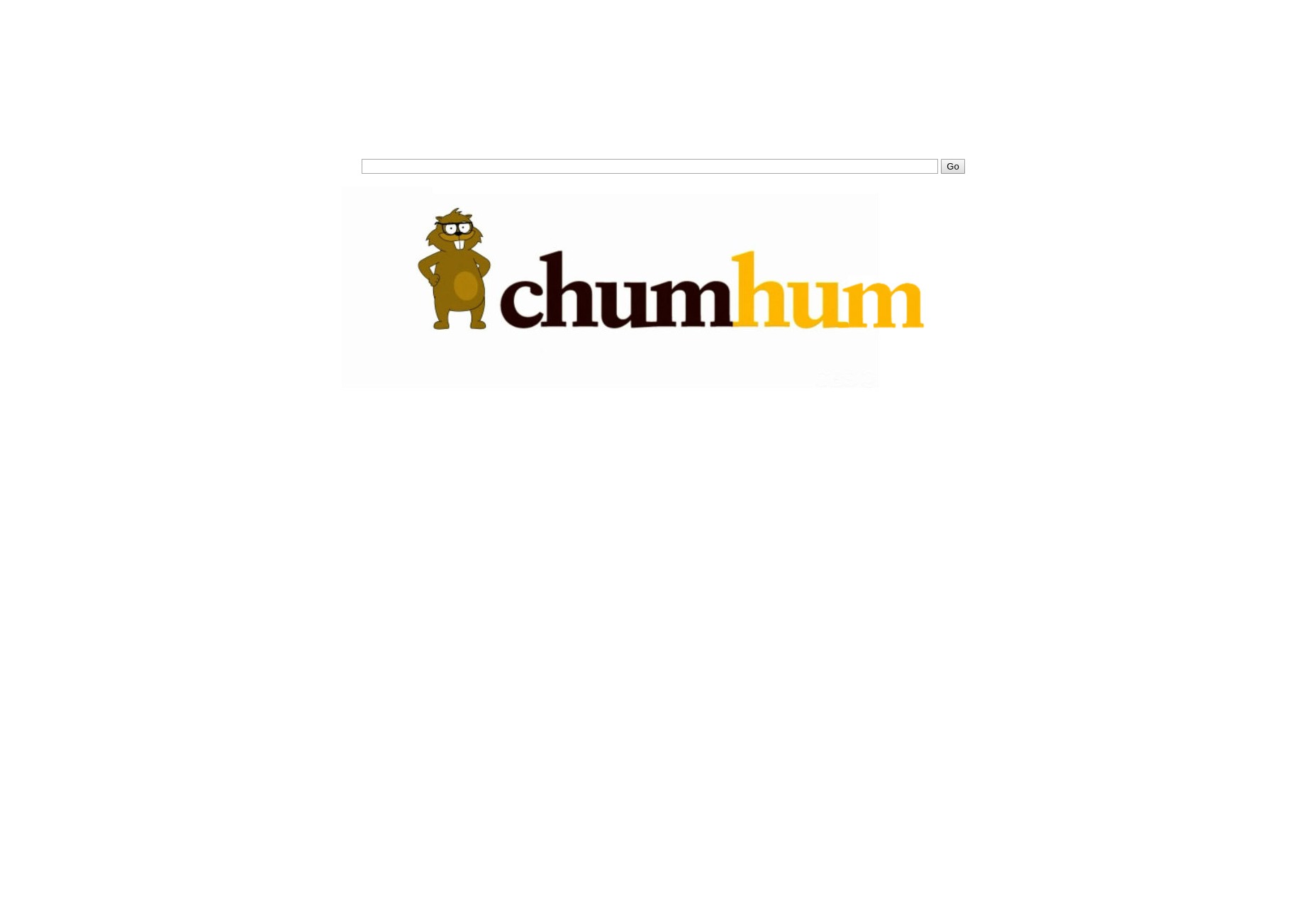
2. Trask Industries
Featured in X-Men: Days of Future Past, Trask Industries deals with the “mutant problem” and boasts a website that exudes typical corporate style. Clean animations and background videos abound. My verdict: A touch heavy on the JavaScript for my taste, but composed and sophisticated overall. Peter Dinklage’s presence in the visuals gives it bonus points. 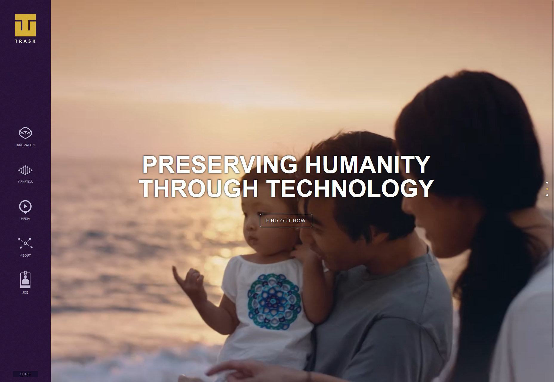
3. Masrani Global Corporation
The Masrani Global Corporation from Jurassic World mirrors Trask in its low-key presentation, though it has fewer digital bells and whistles. My verdict: It’s acceptable but not exceptional—it’s like they invested as much in this website as they did in dinosaur safety protocols. The intro video is an unnecessary flourish. 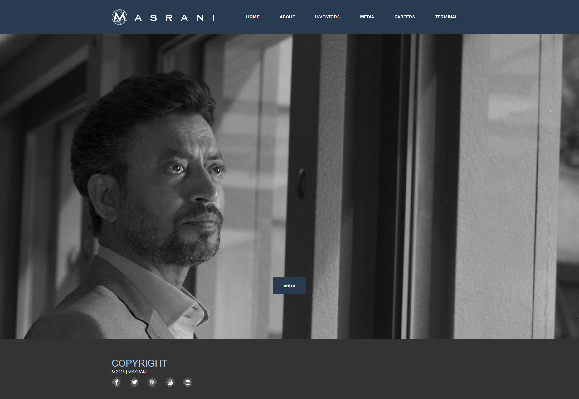
4. Pawnee
Pawnee’s municipal website (Parks and Recreation) appears to be cobbled together with limited public funds and an HTML 4 template that’s seen better days. My verdict: Aesthetically it’s a disaster, which makes it a flawless fit as a set piece—a quintessential early-internet small-town website. 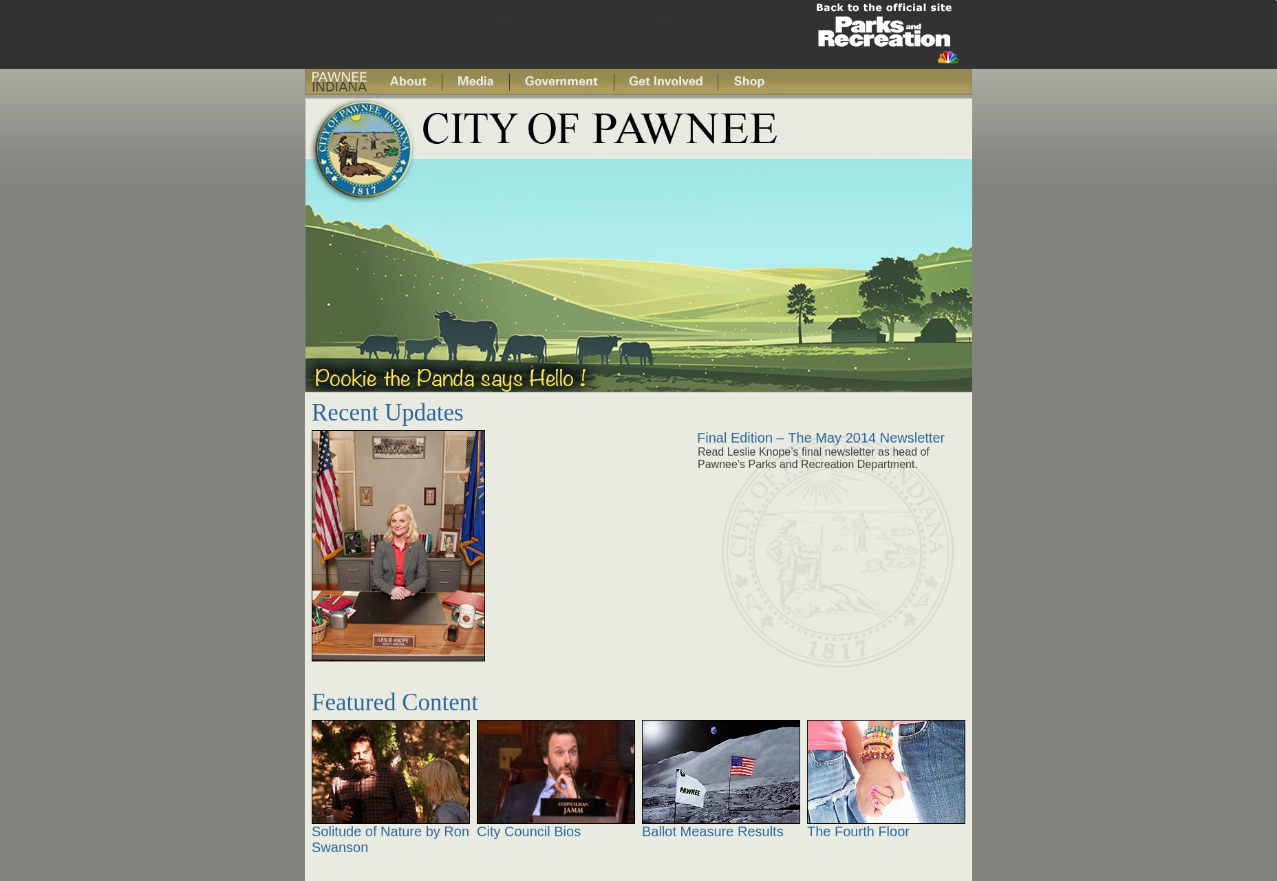
5. Pied Piper
Hailing from Silicon Valley, Pied Piper’s website screams developer-designed—a practical approach with tech-centric simplicity. My verdict: Adequate for its purpose, the typography betrays an amateurish touch, hinting at functionality over flare. 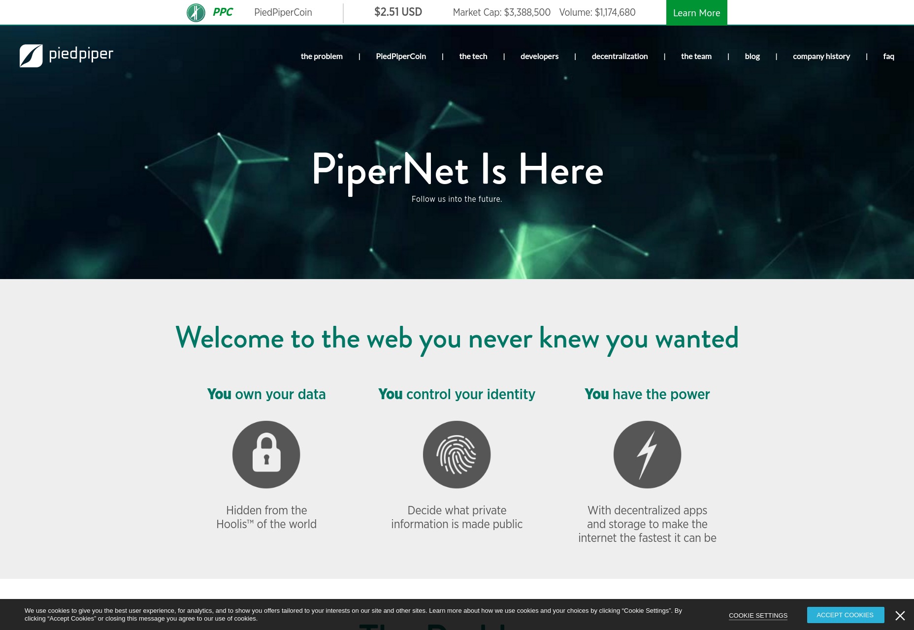
6. War of 1996
The marketing site for Independence Day 2 provides a modern if slightly dated look. Contextually, a war-torn world might not prioritize web aesthetics. My verdict: Deducting points for intrusive background audio even if it includes iconic speeches. It’s otherwise passable. 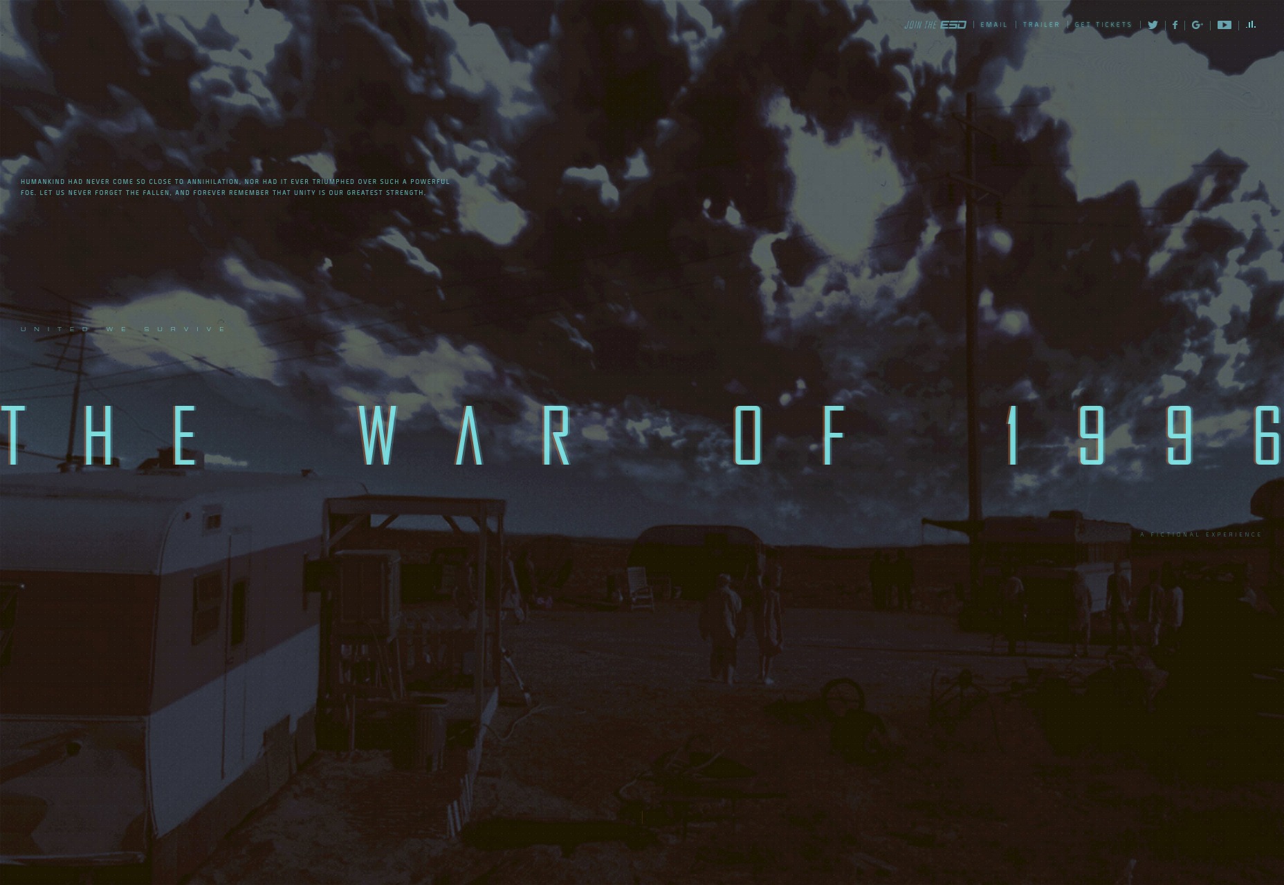
7. Save Walter White
The fundraising website from Breaking Bad has the heartwarming amateurism of a site built by a concerned son with no web design experience. My verdict: Hideous, but fittingly so, preserving the authenticity of the narrative. 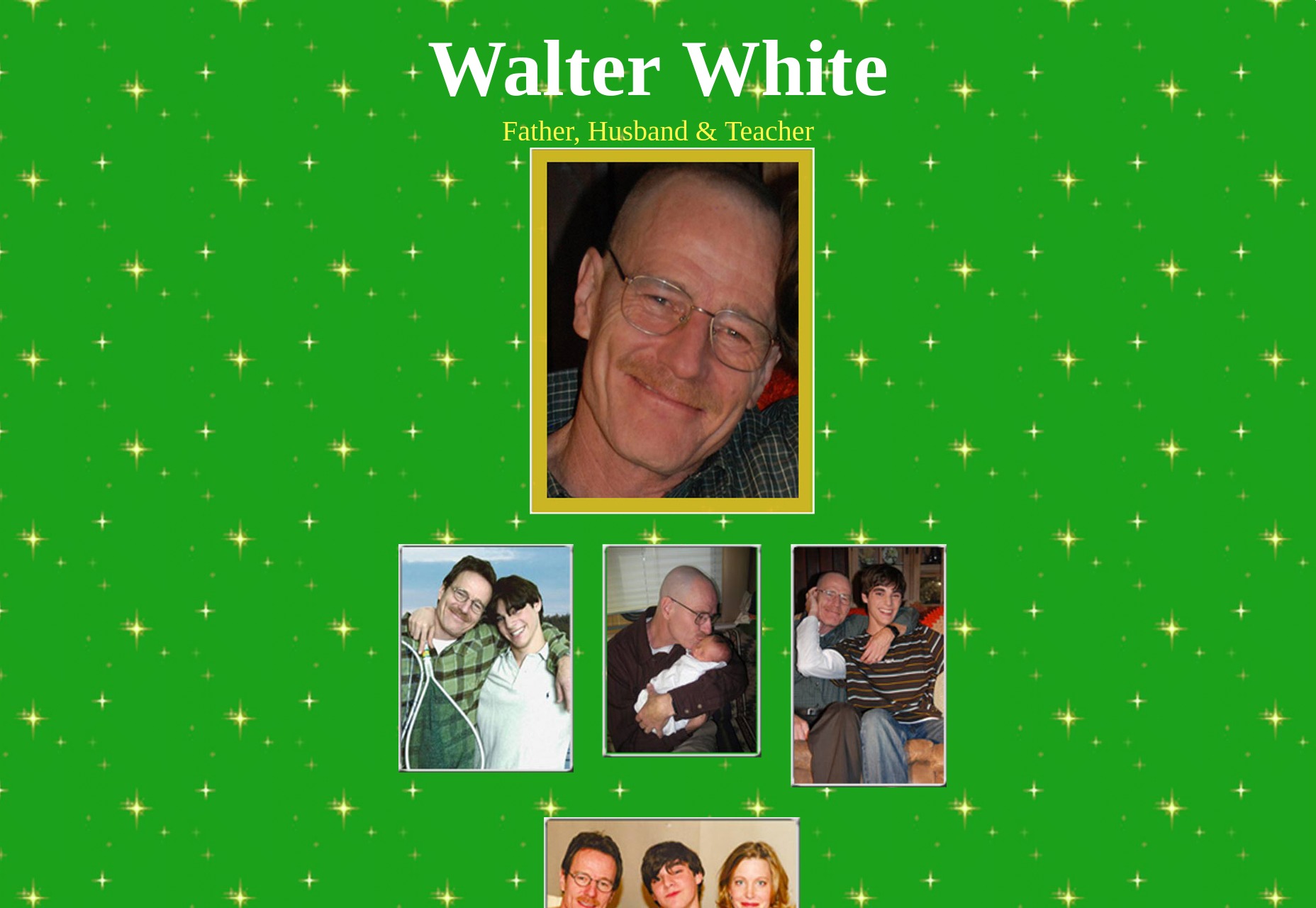
8. John Watson’s Blog
John Watson’s Blog, tied into the BBC’s Sherlock, is built with meticulous care typical of the series. It’s a conventional blog template, nothing more. My verdict: It might not win design awards, but it serves its purpose well, with clarity being its foremost merit. 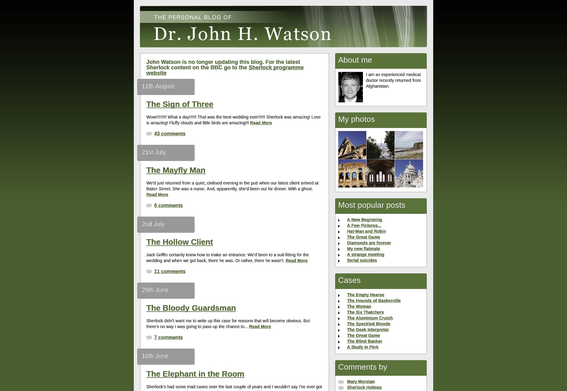
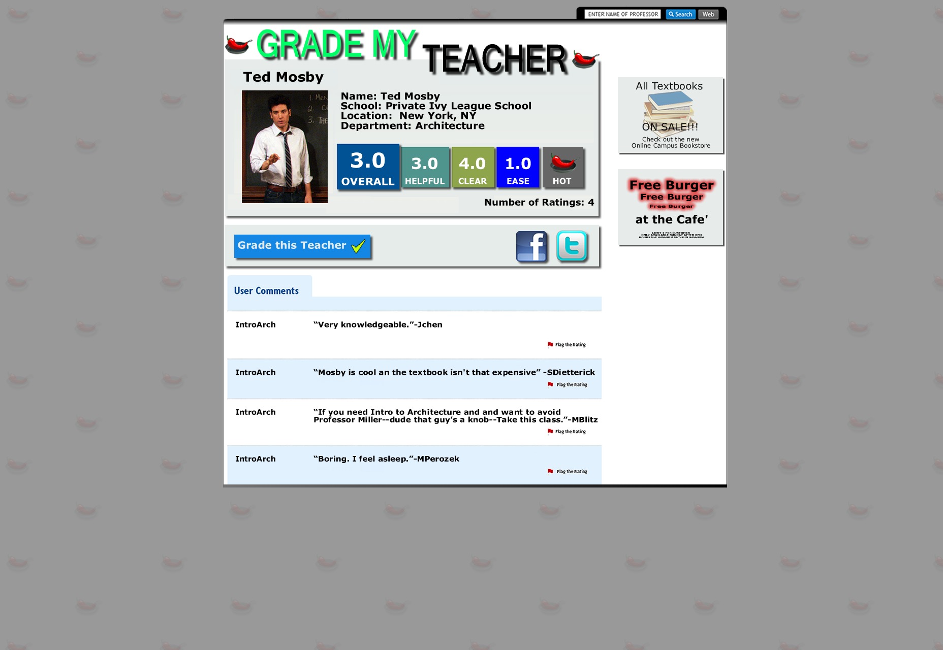
9. Grade my Teacher
Lastly, we have the prop website Grade my Teacher from How I Met Your Mother. Bluntly put, it’s a disaster—barely worth a glance. Too much like half-hearted Photoshop filler than an earnest attempt at web design.