- Matt Chwat, the seasoned Director of User Experience at ThinkGeek, fuses front-end development skills with UX design expertise.
- At Shopify, Montreal’s purchase experience design team leader Kevin Clark oversees a checkout system honed to facilitate user-friendly transactions.
- Catherine Ho, blending UX research and design at REI, has contributed significantly to user-centric projects ranging from in-store gadgets to mobile apps.
Below are the five cardinal rules they all agree on for creating a flawless checkout process.
1. Shopify’s Checkout Motto: Clarity, Simplicity, and Speed
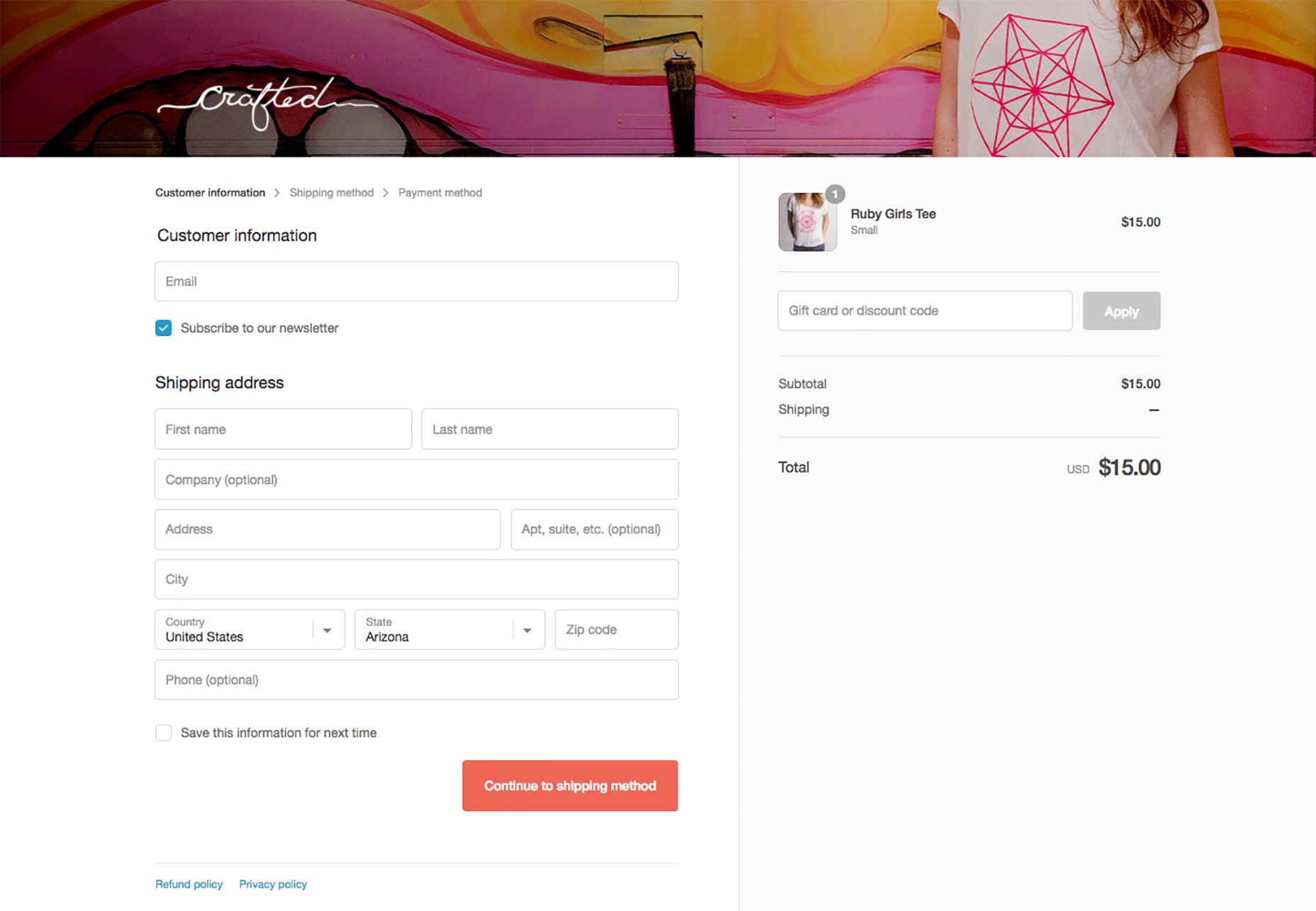
Kevin Clark led an ambitious redesign of Shopify’s checkout across a myriad of stores. His goal? To provide a universal, hassle-free checkout experience. By conducting extensive testing—including analyzing one-page versus multi-page checkouts—the Shopify team discovered that a three-page flow feels most intuitive. Customers proceed through Customer Information, Shipping Method, and Payment smoothly, thanks to the logical grouping of information. Shopify also allows store owners a degree of customization to align with their brand while ensuring a consistent experience through controls like a contrast algorithm for text readability.
“Create a checkout flow that’s recognizable and uniform across all e-commerce sites for a sense of security and comfort,” says Clark.


2. The Pursuit of a ‘Frictionless’ Experience
Steven Sinofsky, the tech luminary, underscores the significance of a checkout that minimizes user effort—dubbed a ‘frictionless’ checkout. The approach involves six principles, with emphasis on default choices and creating a singular path to features or tasks. REI’s implementation of a sign-in modal exemplifies this philosophy, maintaining the shopping flow on-page.

3. Smart Data Usage
A nuanced understanding of data can enhance the checkout experience. For instance, leveraging customer data to pre-fill forms—as Amazon does with its One-Click purchase feature—streamlines the process and reduces user hassle. This principle entails understanding and remembering customer information to minimize unnecessary data entry.

4. Embracing Forgiveness in Design
Providing a forgiving user interface allows customers to interact without the fear of making mistakes. This entails enabling functionality like pasting discount codes without format restrictions, keeping submit buttons always active, and allowing freeform entry of phone numbers, later to be formatted for system needs.

5. Watch Out for Checkout Pitfalls
Common checkout design errors can derail a smooth user experience. These include neglecting an order review step, providing unhelpful error messages, and not optimizing for mobile devices. Steer clear of these mistakes to keep your checkout user-friendly.
Actionable Insights
The journey to a successful online purchase calls for meticulous attention to the checkout flow. By learning from industry leaders, apply these proven principles to your site: ensure consistency and security, strive for a frictionless process, smartly use customer data, design forgivingly, and regularly review the checkout experience to eliminate any friction. Commit to improving your checkout, and watch your conversion rates climb.

