
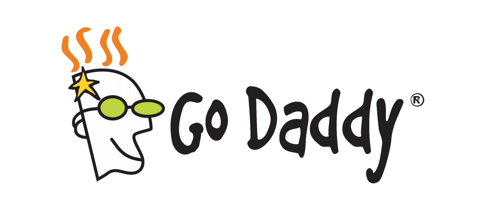
Back then, the brand aesthetics of Internet companies were a colorful mix of playful irreverence and understated corporate vibes, reflecting the creativity of engineers rather than designers. Those times have since slipped away, along with the initial utopian ideas of technocracy. GoDaddy first modernized their logo in 2016 with a refreshed text design, but now they’ve taken a more dramatic step. The familiar mascot, affectionately known as “Daddy,” has been retired. This marks a definitive shift from an old era.
For visual context, these images from Logopedia, which I’ve recently discovered, offer a glimpse into the logo’s evolution. Here’s what the original logo looked like, encapsulating that quintessential ’90s flair.
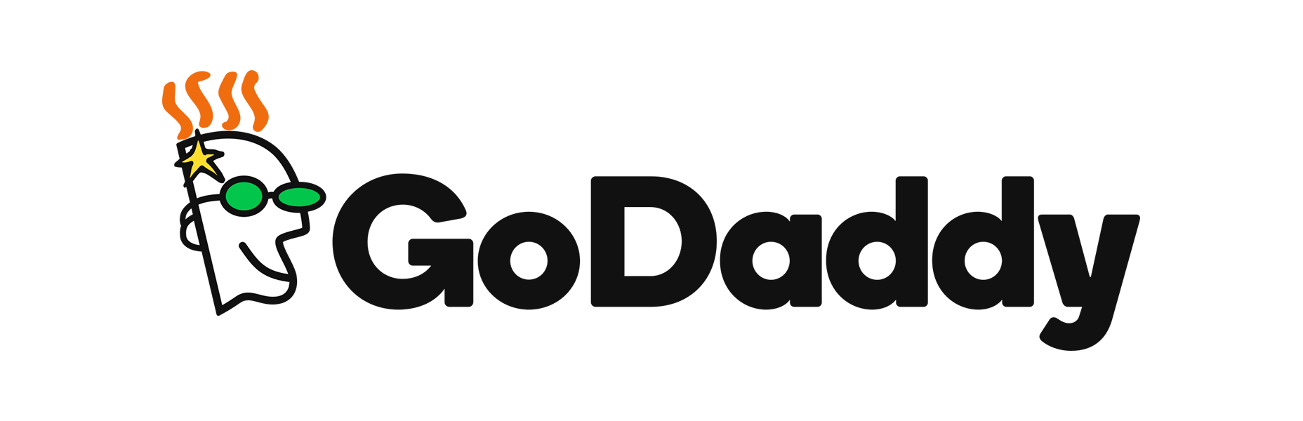
The 2016 logo refresh introduced a more playful typeface, seemingly balancing professionalism with a touch of whimsy, aligning with the image of a major corporation.
And now, the latest iteration presents a stripped-back aesthetic, focusing solely on the name without the mascot that was once synonymous with the GoDaddy brand.
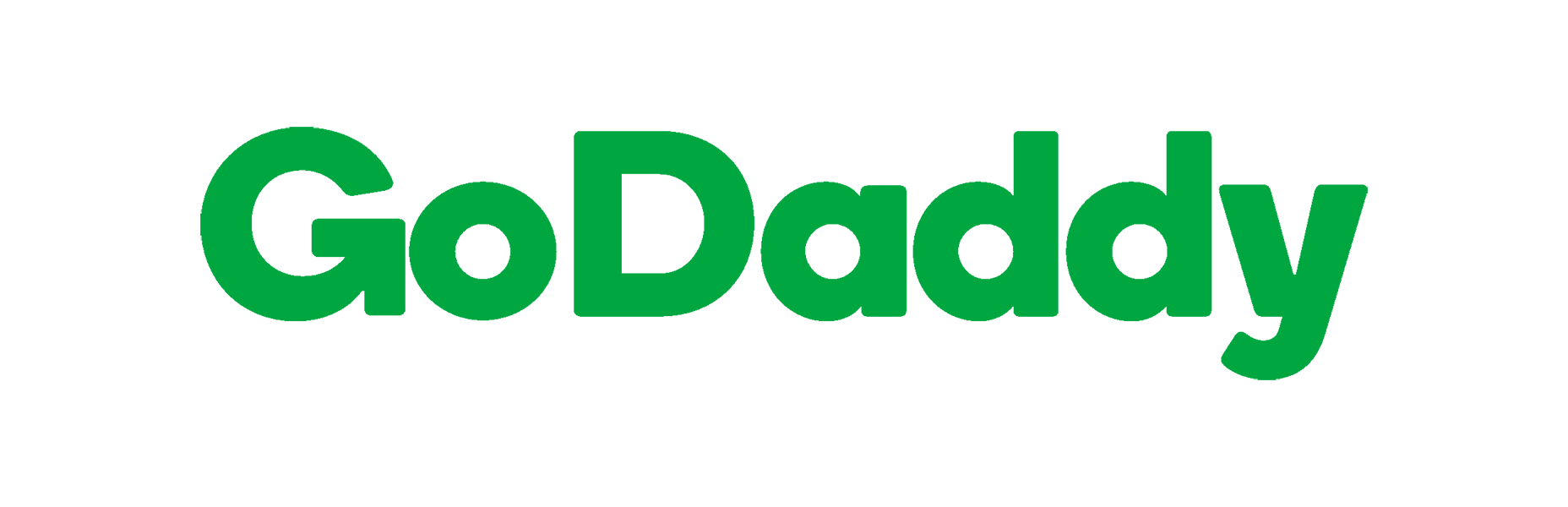
This rebranding reflects a wider trend among major Internet entities, adopting streamlined, sans-serif logos. While this shift may appear to some as a loss of character, it possibly points to companies adapting to a new standard set by contemporary startups—which favor more polished, corporate branding—or to established businesses seeking to project stability to their shareholders.
The new GoDaddy image could be read as a savvy adaptation to current trends or a nostalgic departure from a more vibrant past. Whatever the case may be, it’s a testament to the brand’s desire to maintain relevance in today’s fast-paced digital landscape, for better or worse.
