 In today’s tech-savvy era, the terms ‘mobile web design’ and ‘content marketing’ resonate strongly across the digital landscape.
However, is it possible to merge an exceptional content marketing plan with mobile-friendly design without compromising on quality or aesthetic? Or does a website’s message get lost in translation on the smaller screens?
In reality, exceptional content can thrive within the confines of mobile-friendly design, even benefitting from the modern capabilities of mobile devices. A well-executed responsive design coupled with an engaging content marketing strategy can culminate in an outstanding experience for your client’s site visitors.
As web professionals, how do we convey the significance of mobile responsive design intertwined with content marketing to our clients? Most clients observe the escalating use of mobile devices amongst their own customers and comprehend the value of top-notch content. What often misses the mark is their realization that a universally accessible website can be a significant channel to tap into the mobile market. This is achieved through a design that adapts seamlessly to every handheld device.
Illustrating the appearance of their website across different mobile devices and utilizing tools like Google’s GoMo Meter can help underscore the need for responsive design. When clients hesitate over losing content on small screens, introduce them to the possibility of combining media queries and responsive design within their content strategies—ensuring vital content remains visible no matter the device size.
To convince clients that responsive web design paired with content tailored for handheld devices can provide an enriching web encounter, stick to the following industry best practices.
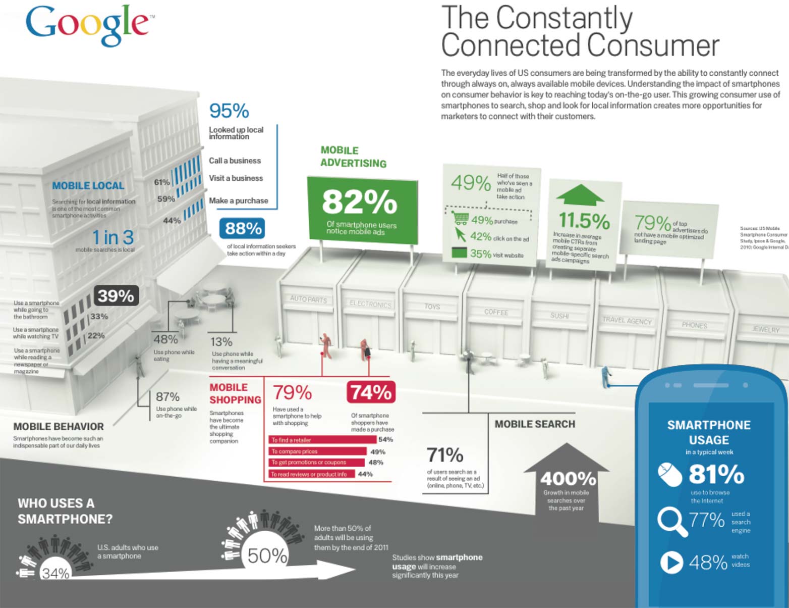
Google’s Mobile Movement infographic emphasizes the value of integrating adaptive design in a content initiative.
Collaborate and Conquer
To effectively intertwine responsive design with a content strategy, adopt a team-oriented approach. Web designers, developers, and marketing strategists must engage in symbiotic cooperation. Aim to craft content that aligns with the goals of the website while heeding responsive design constraints.
Divas in the realm of web design need not apply; the content is undeniably the mobile world’s centerpiece. For instance, a user in a rush to make dinner reservations via their smartphone won’t appreciate ornate graphics as much as straightforward functionality that swiftly connects them to the restaurant.
Marketing experts typically set the content tone, dictating the need for design to support rather than overshadow it. Even without a marketing team, don one’s marketer hat and excel as a content connoisseur.
Strategy Roadmap
Examine, Analyze and Predict Each Device’s User Needs
Collaboratively, pinpoint content that caters to user needs and tailor the mobile experience accordingly. This involves delving into critical queries like:
- Who is the target audience for the site content?
- Which information are users principally interested in?
- What devices are in use and how can the experience be enhanced?
- At what times are they likely to access the site?
Consider a person ordering a pizza during a commute: mobile marketing can present them with immediate, relevant content while responsive design guarantees accessibility and ease of use.
Exploit Device Features to Uplift the User Experience
Leverage device features – such as GPS, mobile browsers, touchscreens, and phone functionality – to deliver content creatively and engagingly.
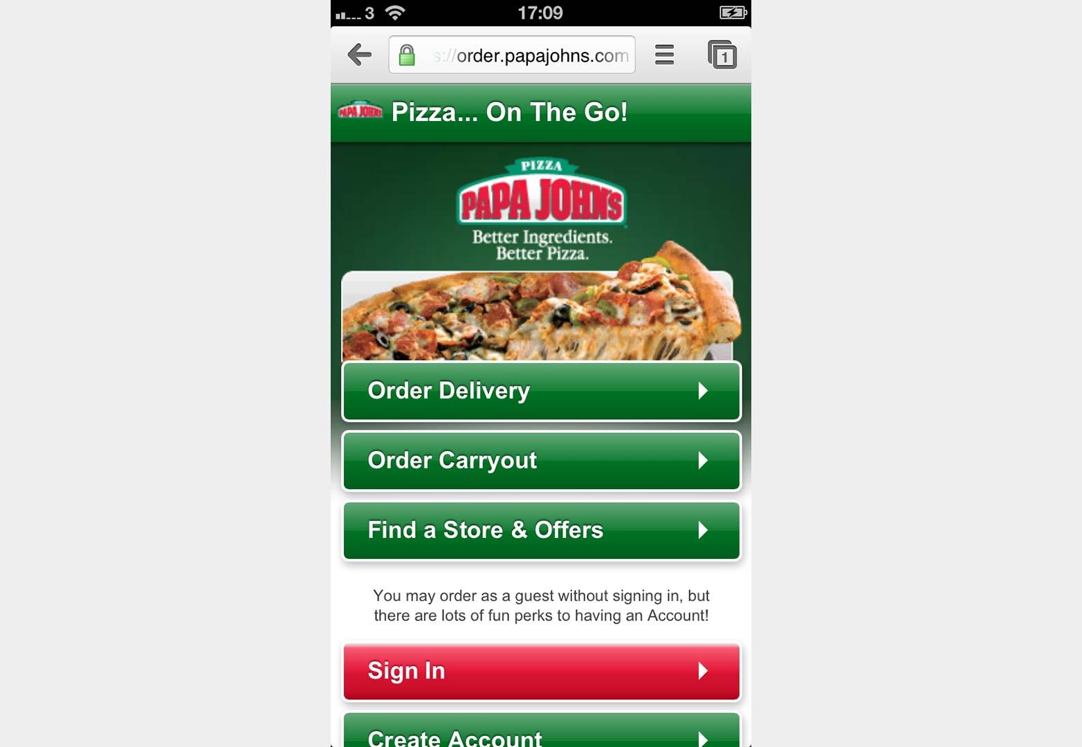
Imagine our commuter could find the nearest pizza outlet via GPS, order directly through his phone, and even call the store to add last-minute toppings, all thanks to his smartphone’s integrated features.
Papa John’s mobile-optimized site simplifies pizza ordering on the go.
Develop Device-Specific Content to Satisfy User Needs
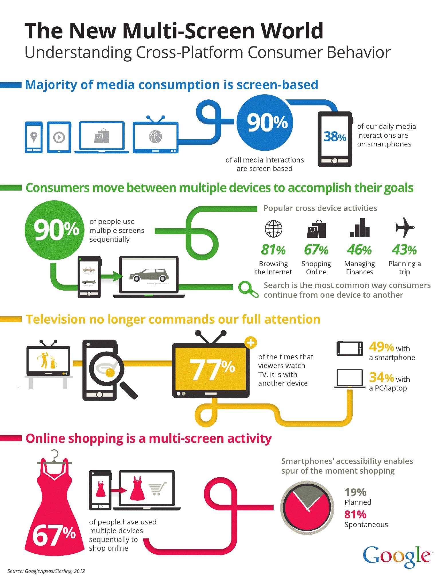
As with any web design, user preferences should steer the content and design decisions. However, the difference here lies in the variable requirements based on device type. Google reports that consumers often use multiple screens in succession for tasks like shopping, presenting new prospects for cross-platform content initiatives.
Multi-screen behaviors now provide fertile ground for a robust, diversified content marketing approach.
Stay on course in content development and responsive design by considering:
- Recognizing that consumers utilize various devices, hence adjusting the content to meet that behavior.
- Extending content reach across platforms and media, since many users engage in media multitasking.
- Considering mobile content development as a form of responsive marketing, curating content to match device usage patterns.
Adapt to Restrictions Imposed by Device Characteristics
Integrating responsive design with content marketing demands shedding superfluous content and focusing on what’s crucial to consumers. Without this, frustration might lead users to competitor sites with smoother navigation.
Start by synchronizing the primary concerns of your clients with data about common user search patterns on various devices. Then, prioritize two or three key content elements.
Immediate Satisfaction Fosters Brand Loyalty
Smartphones naturally cater to our yen for prompt information. Businesses should tap into this by bridging handheld capabilities with online and offline promotional endeavors. For instance, QR codes can link offline print media to online social interactions, providing a seamless cross-channel marketing experience.
Final Thoughts
With the evolving ways in which people access the internet, so too must our content delivery adapt. Mobile design constraints lead us towards more efficient and compelling content, free of the excess found on conventional sites.
Mobile users seek concise and digestible information. They also value the option to delve deeper into topics via larger screens at their leisure. The most effective content strategies employ responsive design and leverage mobile features to proactively address user needs demonstrated through analytics. With meticulous planning and an integrated mindset, design and marketing can merge into a pioneering and impactful campaign, enriching engagements and amplifying sales leads—for blissful clients in the web design sphere.
Does responsive design diminish the impact of great content, or can they coexist in harmony on mobile devices? Share your thoughts in the comments below.
Featured image/thumbnail, mobile imagery via Shutterstock.


