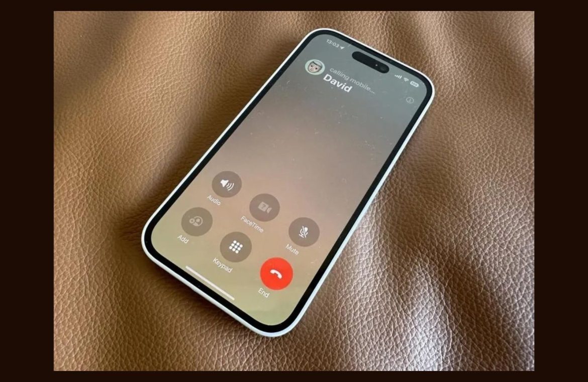
Amidst the suite of enhancements that come with iOS 17, Apple’s redesigned call interface has left many scratching their heads. Is resistance to change the culprit, or is the update truly unsettling?
Long-time iPhone enthusiasts are programmed with certain navigational reflexes. The array of social platforms from YouTube to LinkedIn are second nature to access. These automated swipes and taps are akin to a daily ritual, leading us into the abyss of endless scrolling when our focus should be directed at pressing deadlines.
The iPhone call interface has maintained its familiarity since the inaugural iPhone in 2007. Its consistency has garnered no complaints, with users priding themselves on their ability to dismiss unwanted calls with a swift touch. The philosophy “don’t fix what isn’t broken” rings true here.

An in-depth look comparing iOS17’s new calling interface (right) with its predecessor (left). Credit: Apple
Enter the debate: why has Apple uprooted the ‘end call’ button, moving it from its central home to the bottom-right corner of the screen in iOS 17? Despite seeming trivial, long-standing iPhone users accustomed to the original layout may find this tweak uneasy to assimilate.
The real irony? If your thumb slips in the process, you might inadvertently launch a Facetime call in your attempt to disconnect, adding insult to injury.
Regrettably, this modest modification tends to overshadow iOS 17’s notable advancements, like instant audio message transcripts and missed FaceTime call responses with video or voice. Nevertheless, it’s likely just a matter of time before the new interface becomes second nature to us all.
Remember, design is all about intent. Any modification should have a clear rationale. If not, it seems like a change for change’s sake – unless Apple has a master plan we’re yet unaware of. Are they steps ahead in a game we’re only just keeping pace with?


