This edition of our web design series boils down to one major focal point: the artful use of typography. We are highlighting a trio of typographic styles that are rapidly gaining favor in the digital space.
Let’s dive into the top design inclinations for this month.
1. Embracing Bold Typography
While ‘typography-centric’ might be an expansive concept, it’s unmistakable in practice. We’re seeing more creative projects where typography takes center stage.
This trend encompasses a spectrum from oversized, audacious headers to intricate, varied typefaces, pronounced disparity in text dimensions or colors, subtle type-based motions, and a departure from dominant imagery on screens. The results are often less pictorial, granting ample room for typographic expression to shine through.
In this burgeoning trend, typography ranges from avant-garde to prominently weighted styles. (Take a peek at the typographic animation greeting visitors on this site’s home banner for a fresh example.)
Here are a few divergent exemplars illustrating this style:
IGZIST melds a colossal slab serif with a cursive font, commandeering the entire viewport in stark monochrome and fervent red highlights. A quirky glitch animation adds a layer of dynamism to the mix, ensuring visual engagement.

Contra Bureau features a head-turning ‘CONTRA’ headline, flanked by vertical texts, underscored sub-headlines, and a melange of typefaces set against a striking red and beige palette. It masterfully plays with extreme contrasts in typography to captivate the reader.

Readymag grabs attention with a unique typeface infused in a chromatic animation, contrasting with a less familiar green-on-white schema. Navigation buttons and minute text brackets are the noticeable graphical elements here.

2. Minimalist Headers with Sparse Text
In stark contrast, some are experimenting with barely-there textual content in hero headers, leaving just the essential navigation intact.
Skepticism arises about user engagement in the absence of reading material. The onus is on the visuals to captivate the audience sufficiently. Contemplate the following instances and ask whether they deliver enough intrigue to prompt interaction.
Mathijs Hanenkamp introduces his portfolio with a prominent photo and minimal heading. An overlay with interactive animation ticks the curiosity box, merging seamlessly with the context of a photographer’s portfolio.

AB Yachts opts for a video hero area devoid of text apart from the brand’s name. For those acquainted with the brand, this might suffice, but newcomers might need more to stay invested.

Edlewerke engages users with an atypical image and a hint of animation, complementing the streamlined navigation. It’s visually impressive, but the real test lies in its ability to maintain visitor attention.

3. A Renaissance of Serif Fonts
A delightful surprise for those with roots in print design: the resurgence of serif fonts is giving web spaces a more sophisticated feel.
Although serifs are making their presence known online, they still trail behind the omnipresent sans serifs. However, with the right choice of serif, readability is enhanced, and websites begin to emit a certain elegance.
It’s a balanced trend that offers a typographic emphasis without overshadowing the other design elements. Below are examples:
Momset puts forward a contemporary, condensed serif font across headlines, complemented by color dynamics and strategic whitespace for legibility.

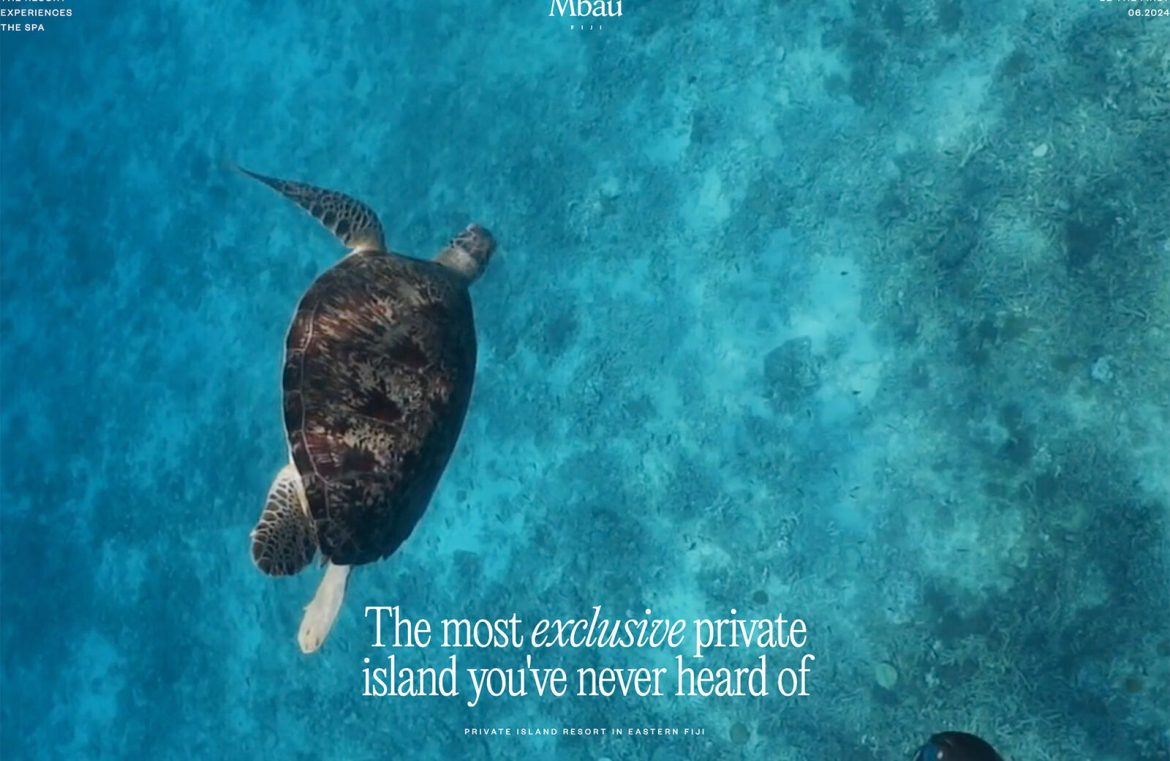
Mbau radiates elegance with a simple serif header overlaying a tranquil video background. The use of ‘exclusive’ in italics pops against the backdrop, reflecting the site’s upscale essence.

Caddis Eye Appliances pairs a robust serif header with subtler sans serif body text, celebrating their ethos of individuality through typographic interplay.

Conclusion
Typographic trends add a pulse of modernity to designs, yet how you integrate them with your brand’s identity can be a puzzle. The balance between embracing a trend and upholding your unique branding is a subtle dance, one that calls for a nuanced understanding of your brand’s guidelines. The key lies in finding ways to refresh your look while staying true to your core essence.

