Defining the essence of digital wit, Mailchimp has always been the epitome of a tech firm that harmoniously blends imaginative flair with straightforward functionality. Originating as a modest side project in the infancy of the 2000s, Mailchimp has consistently approached the digital marketing playground with a nonchalant swagger, sinking shots from the half-court that swish perfectly through the net every time.
In their most recent evolution, executed with the creative input of branding company Collins—and including the collaborative efforts of their internal team—Mailchimp has nailed down nearly every aspect. Almost all of it, at least.

Devotees of the brand’s simian mascot can breathe easy knowing that Freddie, the iconic logomark, has made it through the rebrand relatively unscathed, presented now with a more streamlined redesign. The mascot has shed his “M”, streamlined his silhouette, and simplified his ear, ending up as a more flexible, globally understandable icon.

One of the most eye-catching aspects of the rebrand is the vibrant new primary color. Yellow, known for its design challenges, shines when executed correctly, and, in this case, it’s a resounding success. It acts as a unifying thread throughout the brand identity, offering a dash of boldness that would fall flat with a lesser choice of color.
A decision that might raise a few eyebrows is the move away from the beloved crafted script by Jessica Hische, which has been a well-recognized part of the brand. It’s been swapped out for a unique, retro-inspired sans-serif that lacks fluidity, spaced out by an overly conspicuous “c”. This is particularly odd given the brand’s efforts to downplay that very letter—opting for “Mailchimp” rather than “MailChimp”. The provided rationale for parting ways with the script appears somewhat unfinished, stating a mismatch with the Freddie logomark. My initial reaction to the new logotype was aversion; it transformed into admiration within an hour, and then reverted back to disapproval. It’s a polarizing element, to say the least, but thankfully, it’s not another geometric sans-serif.
Alongside the new logotype, Mailchimp has chosen Cooper Light as its brand font, giving all its material an unmistakable 1970s vibe.

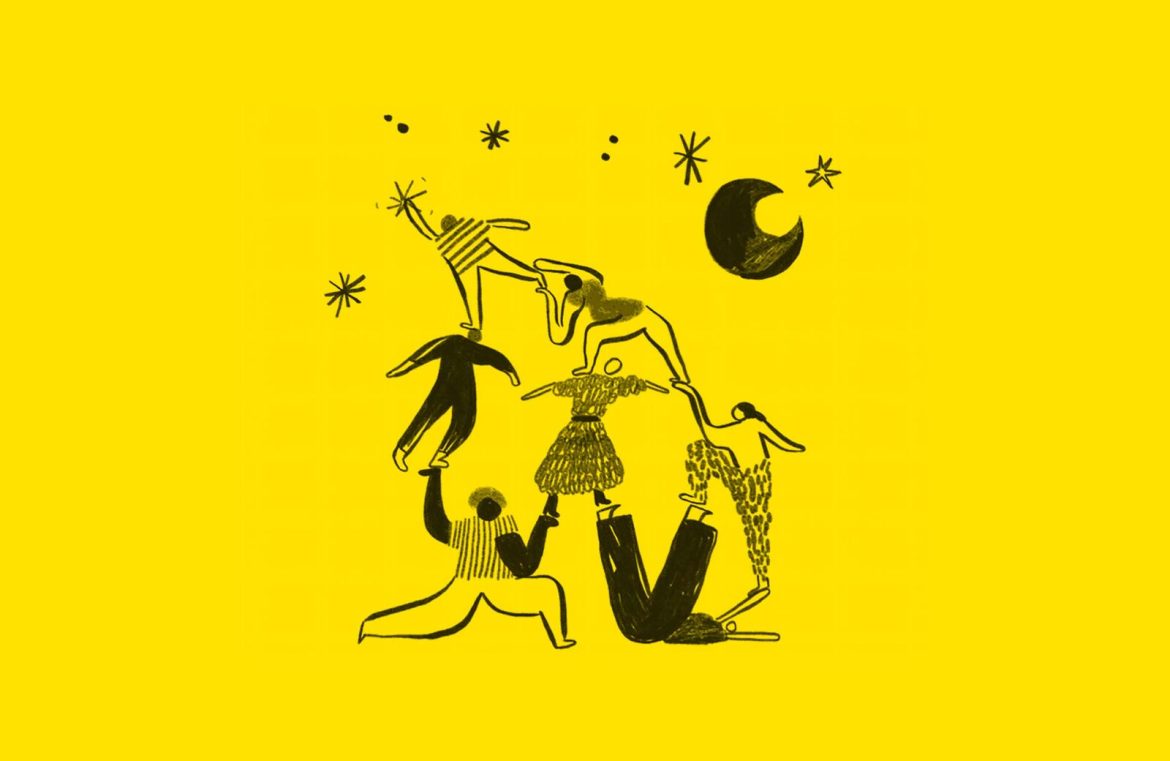
It’s hardly shocking that Mailchimp has gone to great lengths to preserve their distinctive quirky charm—that’s what made them memorable, after all (the name has “chimp” in it!). However, the extent of the quirkiness may take some by surprise. The illustration style is whimsical, evoking the works of Dr. Seuss and Quentin Blake, with a hint of Tove Jansson. The monochromatic imagery with splashes of brand yellow is the collective effort of talented artists from around the globe. Although no specific attributions are made, several pieces bear the unmistakable style of Amber Vittoria.

Mailchimp has also introduced a distinctive style of brand photography which, while overshadowed by the exuberant illustrations, provides high-quality imagery that somehow feels unnecessary within the overall brand context.

Nonetheless, the rebranding endeavor is commendable. The boldness of the quirky elements works well, the color choice is captivating, the typography opens up debate, and the role of photography warrants a second thought. Overall, the result is undeniably amusing. Perhaps the brand’s greatest accomplishment is that despite its exponential growth—delivering over 1 billion emails daily, gaining 14,000 new users every day, and chalking up an annual revenue of $525 million—Mailchimp has not lost touch with the charming and approachable qualities that initially drew us to it.


