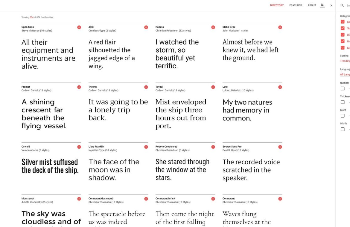
An Air of Simplicity
The revamped platform boasts a reduction in on-screen navigation complexity. In the previous layout, a comprehensive navigation bar enabled designers to preview typefaces across various contexts such as words, sentences, paragraphs, and poster samples—this feature has since been scaled down in the revamp. Now, users experience a more streamlined process, encountering display options directly within the font cards themselves upon hovering. The array of preview text and styles manifests as neat drop-down selections, while what was once a standalone size-selection dropdown has been integrated as a sleek slider within each card. Moreover, tools for filtering and sorting the font library have transitioned from the left to the right of the screen, favoring a more intuitive sidebar arrangement.
A Palette of Possibilities
In alignment with the principles of Material Design, vibrant color infusions are a standout addition to the Google Fonts experience. Moving away from the monochromatic blue and white palette, Google Fonts now presents users with an interactive color selection tool. By utilizing the “change background color” feature, users can personalize their backdrop with a choice of pink, black, blue, or yellow, each presenting a clear contrast and enhancing the overall aesthetics. [pullquote]A sight for sore eyes for designers seeking simplicity and efficiency[/pullquote] The introduction of these color schemes echoes the brand’s desire to offer a user-focused, visually appealing platform.
User Experience Above All
Ultimately, the essence of any design update lies in its ability to refine the user experience (UX). Google Fonts has accomplished this with aplomb, streamlining the UX for optimal efficacy. Should designers wish to delve deeper into a font, they are now directed to a “see specimen” page brimming with details about the font and its creator—replacing the old system’s less user-friendly popup windows. Additionally, the new design gives users the capability to conceivably conceal the search bar, which was a fixed element in the previous design. The array of enhancements included in the Google Fonts redesign heralds a new era for designers in search of a fluid, user-friendly experience when choosing the ideal web font for their projects. This refined navigation aids in delivering a superior UX that prizes uncomplicated browsing.

