Appropriate Tooltip Scenarios
The essence of using tooltips lies in enhancing your site or app’s user experience (UX). They should ease the user process in one way or another. Implementing them suitably and consistently can be challenging but is essential for optimal utility.
Deciphering Unknown Icons or Buttons
At times users stumble upon icons or buttons that are not self-explanatory or lack labels. Under these circumstances, integrating a descriptive tooltip could be immensely beneficial. Consider a cogwheel icon on a dashboard; it may be recognizable but still warrants a brief introduction to acclimate new users swiftly. 
Dispensing Supplementary Info
Remember, if the information is crucial, don’t relegate it to a tooltip—make it a permanent fixture in your interface for easy access. Tooltips are ideal for offering additional insights that are not essential, keeping interfaces clean and uncluttered. A prime example is the quick appearance of the webpage title when you hover over a browser tab—it’s handy but not vital.
Limitations of Tooltips
When misapplied, tooltips can ironically degrade UX. Being overzealous with their usage can overwhelm users, negating the usefulness they are intended to offer.
The Pitfall of Reliance on Tooltips
If your design is so non-intuitive that users constantly need tooltips to navigate, then there’s a fundamental flaw in your design. Over-reliance on tooltips indicates an unspoken deficiency that requires attention; tooltips are meant to assist, not become a crutch.
Interactive Tooltips: Handle with Care
There might be instances where interacting with content inside a tooltip, like clicking a button, is necessary. However, if the tooltip vanishes when the user attempts to engage with its content, it leads to aggravation. Actionable items should be well-defined within the interface, not hiding within ephemeral tooltips. 
Crafting Excellent Tooltip Designs
The efficacy of tooltip microinteractions depends significantly on their design. Considerate design choices can offer a seamless and satisfying user interaction rather than a source of frustration.
Embracing Minimalism
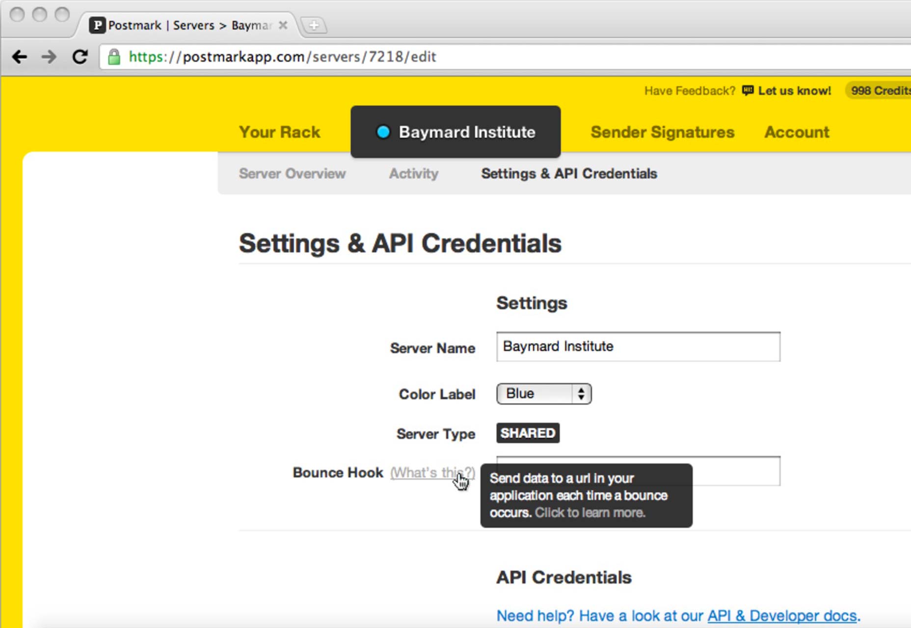
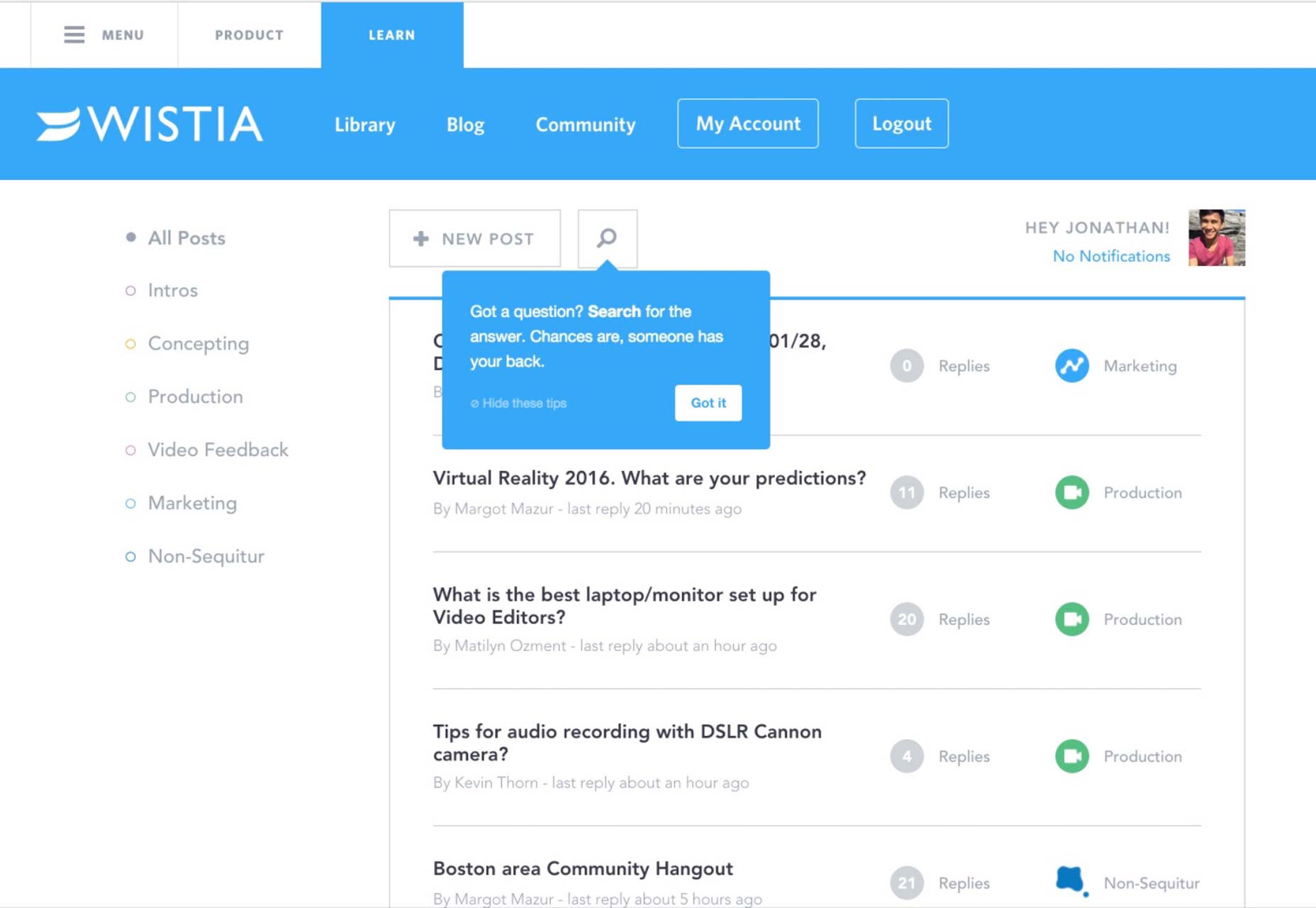
The elegance of minimalism in web design cannot be overstated. Simple colors, clear copy, and straightforward language reduce misunderstandings and contribute to a positive microinteraction.  Source: Appcues
Consistent Utility
A well-designed tooltip should aid the user just as effectively on the hundredth occasion as it did the first. Steer clear of gimmicky designs, and stick to what is proven to work.
Visibility and Accessibility
Tooltips need to be easily identifiable and accessible. Utilizing clear visual cues like directional arrows can help users spot them instantly.
Concise and Relevant Content
Tooltip information must be comprehensible at a glance, necessitating brevity and clarity. Avoid redundancy and ensure that the tooltip complements, rather than repeats, what’s evident in the interface.
The Quintessence of Tooltips in Microinteractions
Tooltips are a microinteraction archetype, aiding task accomplishment or process manipulation within a designed interface. The difference between an effective tooltip and a troublesome one lies in the design and implementation. By understanding the true purpose of tooltips and what constitutes good design, you can furnish users with the essential guidance they require to navigate your interface with ease and convenience.

