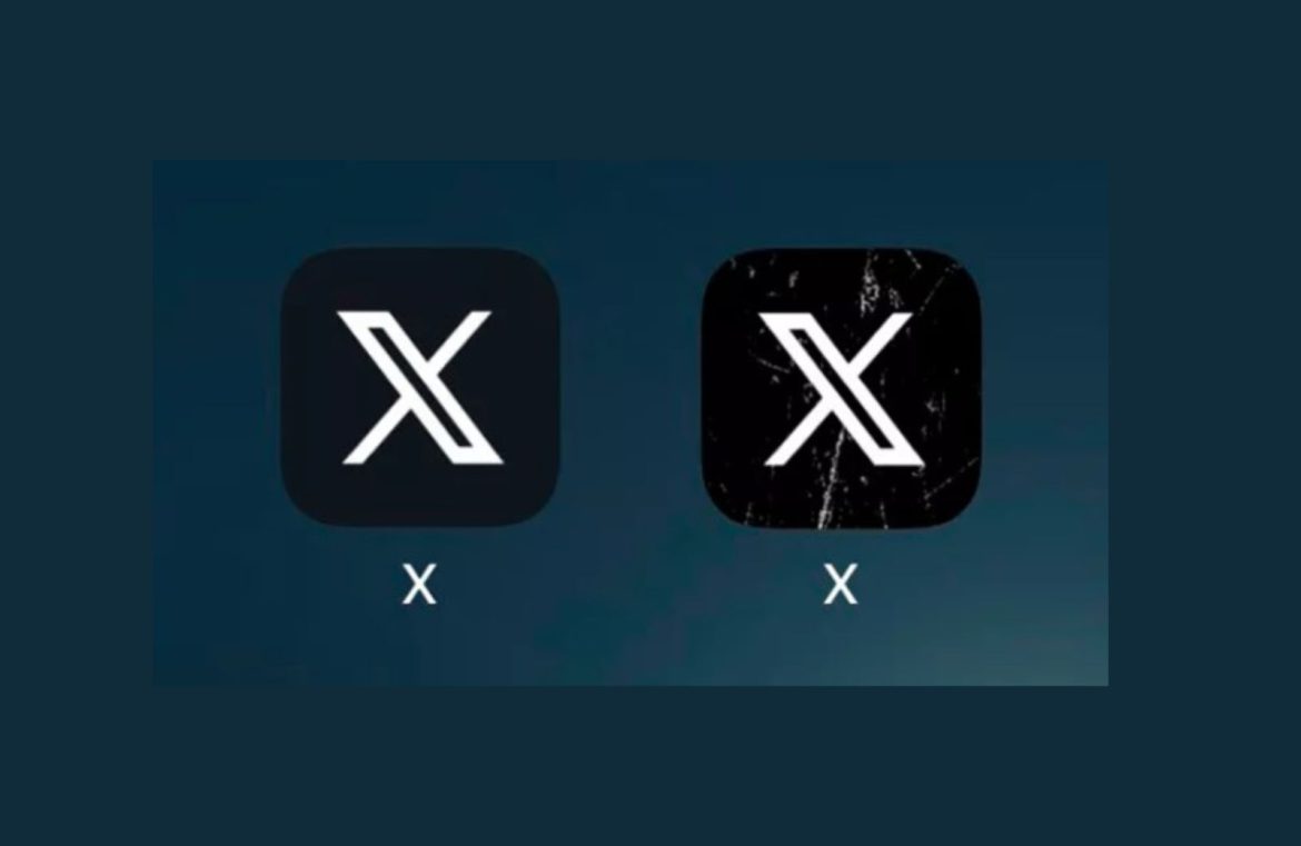
It appears that Elon Musk has revamped the X symbol, now accentuating it with stark white splotches. It’s anyone’s guess as to how enduring this iteration will be before it’s back on the drawing board.
The familiar cycle is upon us again. Our last discussion pointed to Musk’s unpredictable reshuffling of the ‘X’ logo. Well, he’s at it once more. Genuine shock has become a thing of the past.
What’s the earth-shaking metamorphosis this time? What grand design will the maestro of Twitter showcase now? Prepare yourselves.
Rugged streaks. Specifically, weathered white streaks sprawled across a dark canvas.

Indeed. We’re seeing the ‘X’ emblem reimagined as daring and rough around the edges. The fresh design made its appearance on iOS and Android just today.
If you’re thinking this reinvented logo bears more resemblance to something you’d find on a second-rate app than an international social media giant, rest assured, you’re not alone in that sentiment.
A flurry of users have flocked to X humorously critiquing the updated look. Many concur that the emblem is an indelible mark of Musk’s characteristic boldness. Whether that’s commendable is up for debate.
Musk’s explanations for his frequent visual shake-ups are equally as obscure. Facing the latest update, he stated that the “cracks & scratches more accurately convey the product that I hold dear.”
Could it be that Musk is subtly hinting at ‘X’ being a battered and bruised operation? The new marks might symbolize the cumulative toll his leadership has taken on a global social platform.
Is that just fanciful thinking? It very well could be. Without an insider’s glimpse into Musk’s ever-shifting consciousness, we’re left to navigate the realm of conjecture.

