
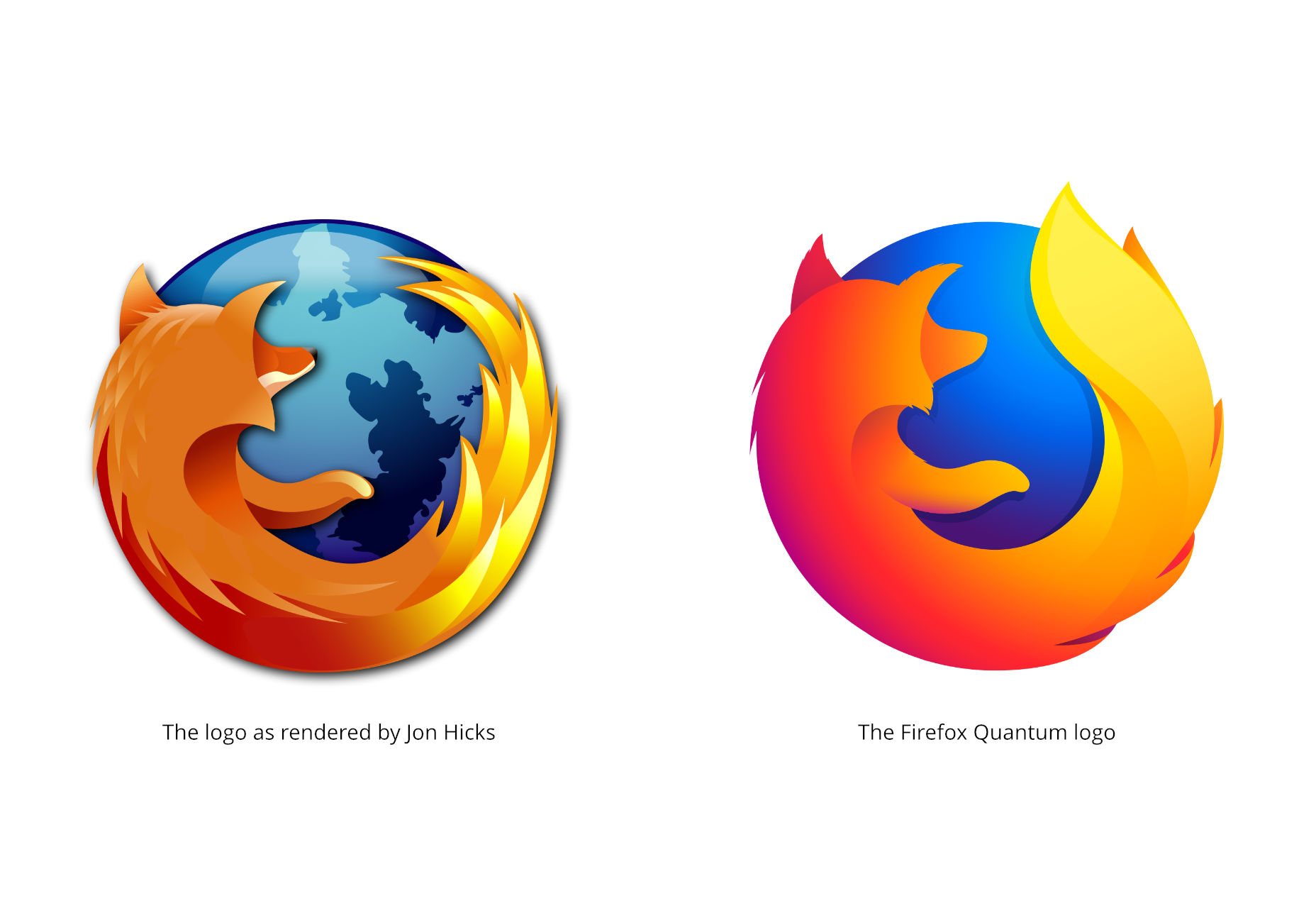
 To achieve a coherent look across the product family, the Firefox emblem is set to evolve for greater versatility and adaptability across various platforms. Addressing this, Mozilla’s branding team has developed two potential brand architecture options and is actively soliciting feedback. If you wish to contribute your thoughts, drop a note on their blog. It’s worth noting that the proposed designs are far from permanent—they’re currently deemed “fictional” by Mozilla themselves, indicating they’re a preliminary concept rather than a definitive choice. Extensive refinement will precede any final decision.
System 1
System one stands out with its bold, geometric contours and a color scheme ranging from warm yellows to fiery reds, retaining a semblance of the “vintage Firefox” vibe. 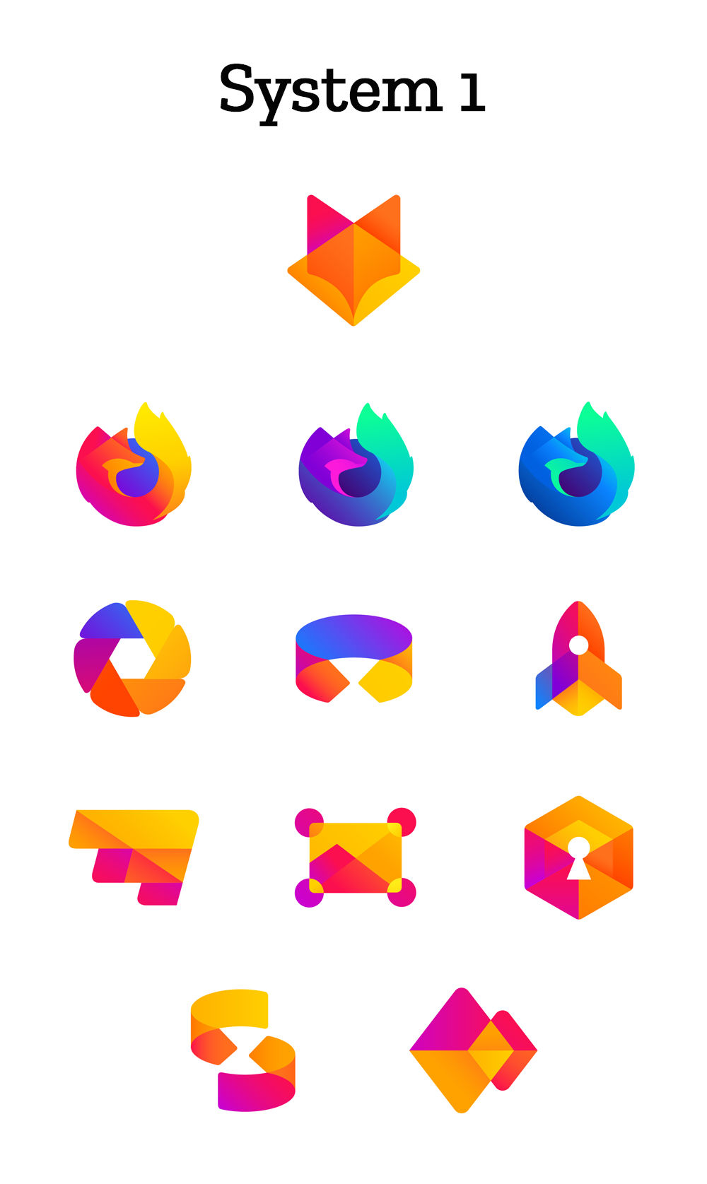
System 2
The second system, on the other hand, offers a larger spectrum of colors paired with slender, more refined lines. 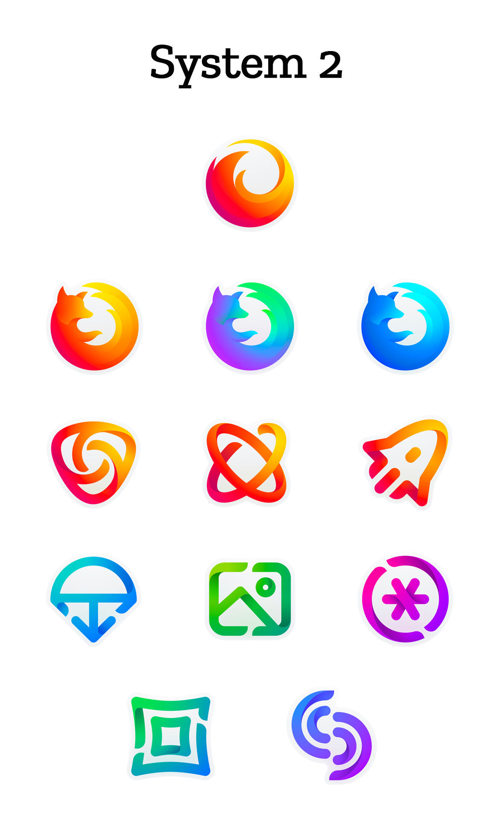
My Take
These design propositions, while unmistakably modern and corporate, don’t strip away identity or legacy, unlike some other recent rebrands. Rather, it’s a genuine progression of the identity, maintaining its quirky essence. Aligning with prevailing sentiments in Mozilla’s blog comments, I believe the icons of System 2 could seamlessly merge with the graphical elements of System 1, resulting in a harmonious blend. A point of slight concern comes from this quote: “With your input, we’ll have a final system that will make a Firefox product recognizable out in the world even if a fox is nowhere in sight.” I’m not convinced Mozilla intends to dismiss the fox iconography completely, but should the question arise, here’s my advice to the community: Retain the beloved fox, if you please.
