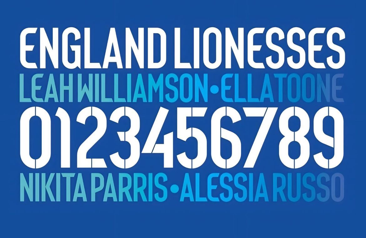
The renowned graphic designer Neville Brody has joined forces with sports giant Nike to craft a sleek, modular typeface for the kit of England’s Women’s Football Team.
With a career overflowing with diverse achievements, Brody is a household name in creating visual identities, most notably his influential album artworks for bands such as Depeche Mode, 23 Skidoo, and Cabaret Voltaire.
Leveraging his wealth of experience in typography, Brody has now shifted focus to the world of sports, specifically the England Women’s football squad – enthusiastically known as the Lionesses. In a creative partnership with Nike, he has engineered an innovative font to be showcased on their 2023 team wear.

The primary goal for this new typeface was to marry daring design with clarity. The stencil-inspired cuts that separate the characters give it an edgy distinctiveness while prioritizing functional clarity. Its geometrically inspired shapes and clever play with positive and negative space enhance readability—crucial for quick identification on the pitch.
Reflective of his earlier work, Brody drew inspiration from the typeface he designed for the England men’s team kits for the 2014 World Cup. Here, the lettering is condensed and the bold weight dialed down to suit the varying sizes and styles of the women’s apparel.
The color palette for Brody’s typeface adheres to traditional kit conventions. It flourishes on the soccer jerseys, with blue characters making a statement on the pristine home whites. In contrast, the away kits feature crisp white lettering set against blue.
Brody’s design successfully fuses aesthetic appeal with functional prowess. It is simultaneously utilitarian and strikingly stylish. The unique characteristics endowed to the Lionesses’ kits set them apart, yet these sports garments maintain the legible quality essential to a professional sports uniform.


