Periodically, the realm of web design throws us curveballs that stir both intrigue and perplexity. The current selection is no exception.
Some design patterns may be visually appealing and adhere to certain principles, yet their practicality or user experience may raise eyebrows. At times, the results are unexpectedly successful, while in other instances, they might miss the mark. How these designs resonate with you is a matter of personal judgment.
These are the web design movements making waves this October:
1. Overlaid Text on Hero Visuals
Observed in various styles, the trend of superimposing text above the hero imagery or videos can present a mixed bag. Some examples show images that remain entirely in view, while others extend beneath the fold.
On desktops, this approach can sometimes overshadow the imagery, leading to a diluted visual experience. In the mobile context, the prominent text emphasizes the messaging, capturing users’ focus instantly. User interactions and scrolling behaviors differ vastly between desktop and mobile, often resulting in desktop viewers glossing over the central message to reach the visual content, whereas mobile users rarely overlook it.
Taste adopts colossal, boldface headings set against a stark canvas to grab your attention before you scroll down to the video. The home screen’s only splash of color and animation comes from the rotating menu icon, which is quite the unconventional navigation feature. The enormous “TASTE” script subtly defies conventional design expectations.

Lusion strikes a balance with text leading the hero animation that responds to your scroll. While the design guides the eye pleasingly, you might entirely skip the prominent headline in favor of the animation’s draw. (Notice the cool liquid hover effect.)

Liz Sintoni’s portfolio kicks off with a strikingly large headline floating above the image/video block. Additionally, she integrates an auxiliary text box and call-to-action button to the left, guiding you deeper into her portfolio and shedding light on her professional narrative.

2. Adjacent Narrative Elements
Presenting design elements side by side is hardly groundbreaking, as such configurations have come and gone in web design. However, what’s evolving is the technique and execution.
Emerging trends see designers blurring the division between side-by-side narrative components, leading to less discernible separations.
Some execute this approach exquisitely, as illustrated in the first example. Others pose significant legibility dilemmas.
The Midnight Post Book website epitomizes this design method, displaying a vivid illustration to the left with text to the right, yielding a visually pleasant and readable experience.

Café Del Mar exemplifies a slight merge between the sides. While readability remains intact, it can challenge viewers at certain screen sizes. The combination of animated images, an eccentric typeface, the zig-zag divider, and subtle-colored motifs present users with a hefty visual feast.

CCL Hospitality Group takes a traditional stance on side-by-side storytelling but introduces an original twist: an unconventional video shape on the right. Though aesthetically striking, the video’s composition and placement likely posed a significant challenge.

3. Puzzling Peculiarities
Occasionally, you encounter a collection of designs so wildly divergent yet leaving you with an identical “Wait… what?” impression. Each representation houses its own bewildering trend. Would you dare to adopt any of these quirky tactics?
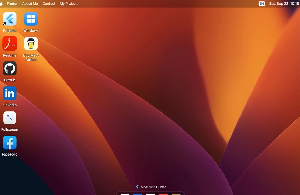
DC Tech’s portfolio compels a second glance with its uncanny resemblance to a default Mac desktop, complete with interactive “Finder” navigation and icons.

White Stone integrates a gamut of design features into a deceptively minimalist style. The overlapping video segments and seemingly random placement of elements are complemented by a mammoth headline and dynamic mouseover effects, creating a visual cornucopia.

The Bowie project (created by a student) garners interest due to its poster-like ambiance for the web. It’s a celebration of artwork that stands as digital art itself. Absent are the usual homepage fixtures—navigational aids, textual prompts, or actions to take. Instead, subtle scroll and animation effects add layers as you discover the single-page display, a clear departure from the norm.

In Summary
Web design trends often come with a presumption that certain conventions must be adhered to or experimented with. However, this is not a rule set in stone. What is effective for one may not necessarily suit another.
Each trend and example depicted here embraces this concept. While they may be a perfect fit for their respective content, they might not find practical applications elsewhere. It’s up to you to explore, evaluate, and enjoy the creative process.

