
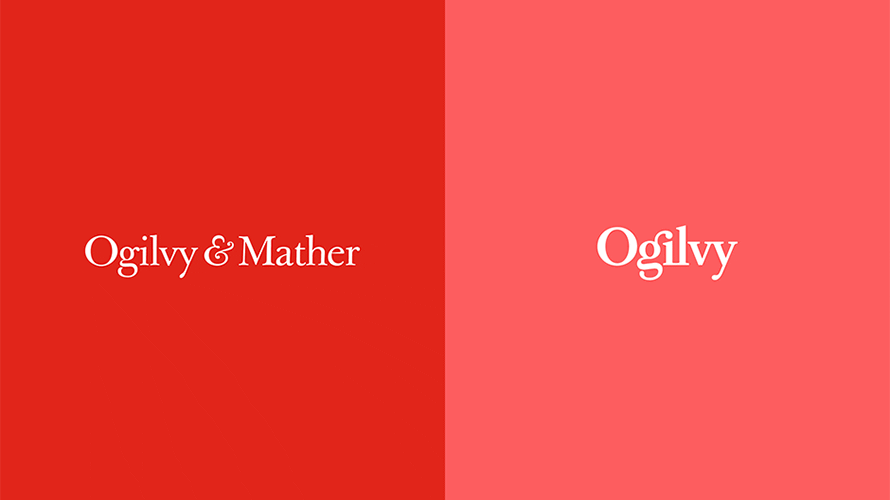
 Central to these seismic shifts is a revamped logotype, a bold new design, and a fresh color palette. These elements are showcased prominently on its redesigned website. Upon arrival, visitors are greeted by the new logo, while engaging visuals sweep across the screen. The site is now structured as a portfolio, with imagery representing various case studies and an adjustable image scaling feature to tailor content visibility. Moreover, interactive surprises await as each hover over a story alters the backdrop to a random color, toggling the emblem from black to red. The brain behind the visual overhaul was none other than Brian Collins, founder and chief creative officer of Collins design firm, who brought his past experience as a former CCO of Brand Integration Group at Ogilvy to the fore:
The ethos of Ogilvy is steeped in an unyielding quest for excellence…The bond between Ogilvy’s clientele, its team, and its alliances all share the same fiery passion that propels the company forward.
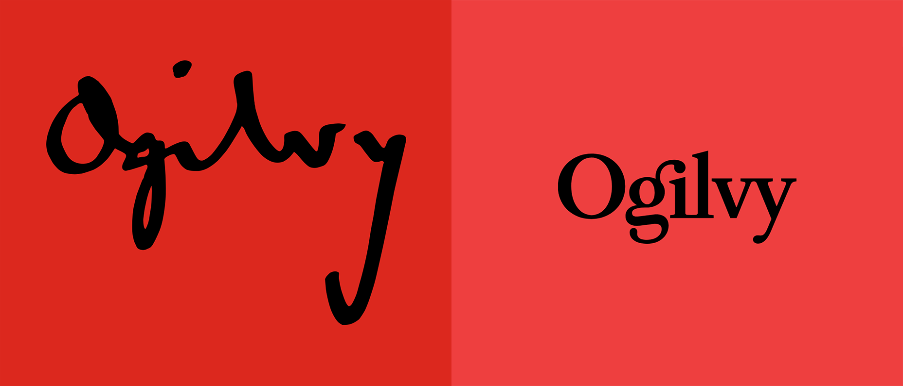 The transformation from the original Ogilvy emblem (left) to its modern counterpart (right). The transition from intricate cursive letterforms to a cleaner and more legible serif font is quite apparent. The iconic red hue has been subdued, reflecting the firm’s drive for modernization while still respecting the foundational principles that have steered its success. Accompanying the visual transformation are new core values conceptualized collaboratively by Ogilvy and Collins. Outlining five key tenets, these values redefine leadership within the innovative brand.
The evolution didn’t pause there. Ogilvy consolidated several of its sub-brands, including OgilvyOne, Ogilvy PR, Social@Ogilvy, and Ogilvy CommonHealth Worldwide, unifying them under one consolidated banner. Introducing 12 distinct “crafts” such as Creative, Strategy, and Data, alongside six “core capabilities like Brand Strategy and Digital Transformation, the company restructured to create a more cohesive and centralized operation. Ogilvy Enterprises, the successor to OgilvyRED, remains at the forefront across the restructured organization. 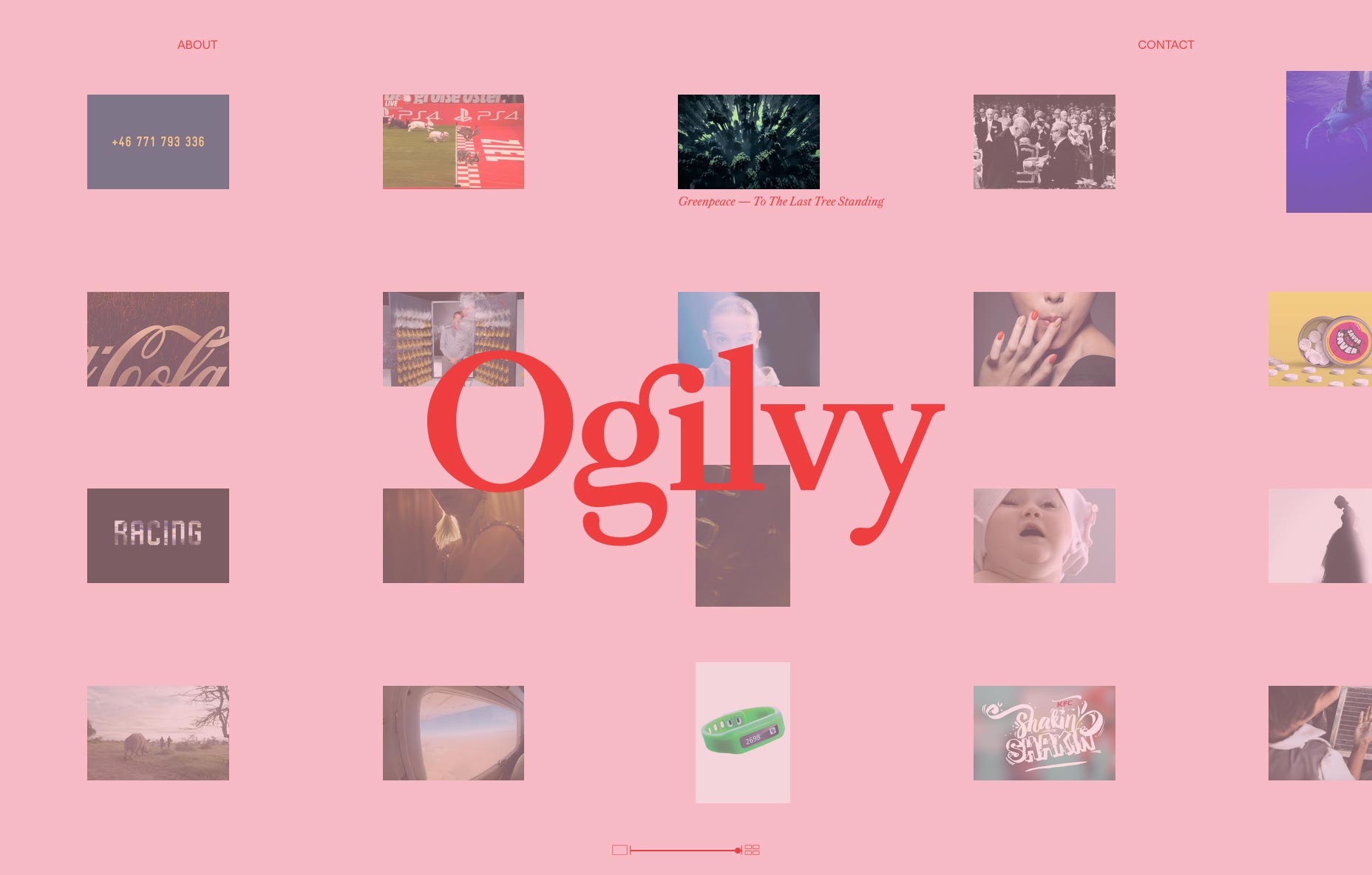 John Seifert, the global chairman and CEO, characterizes this transformation as a significant evolution rather than a final conclusion. Emphasizing the drastic nature of the changes, Seifert reveals how essential these modifications were to address the company’s complexity. Citing an anecdote highlighting the disconnect in the company, Seifert illustrates his commitment to creating a truly integrated enterprise. Additionally, the firm has pledged to bolster its support for gender equality by significantly increasing female hires across various roles. Tham Khai Meng, the incumbent CCO of Ogilvy, encapsulated the brand’s vision succinctly:
We are leveraging the creative legacy of David Ogilvy as a springboard for our future aspirations.
It’s evident that Ogilvy is set on delivering performance and focus like never before. The new branding has been met with enthusiasm and is designed to sustain the company’s leading position in design well into the future. Redefining a corporation from the ground up is no small feat, but Ogilvy seems to have achieved it with grace, gearing up to reap the rewards of this bold transformation.
