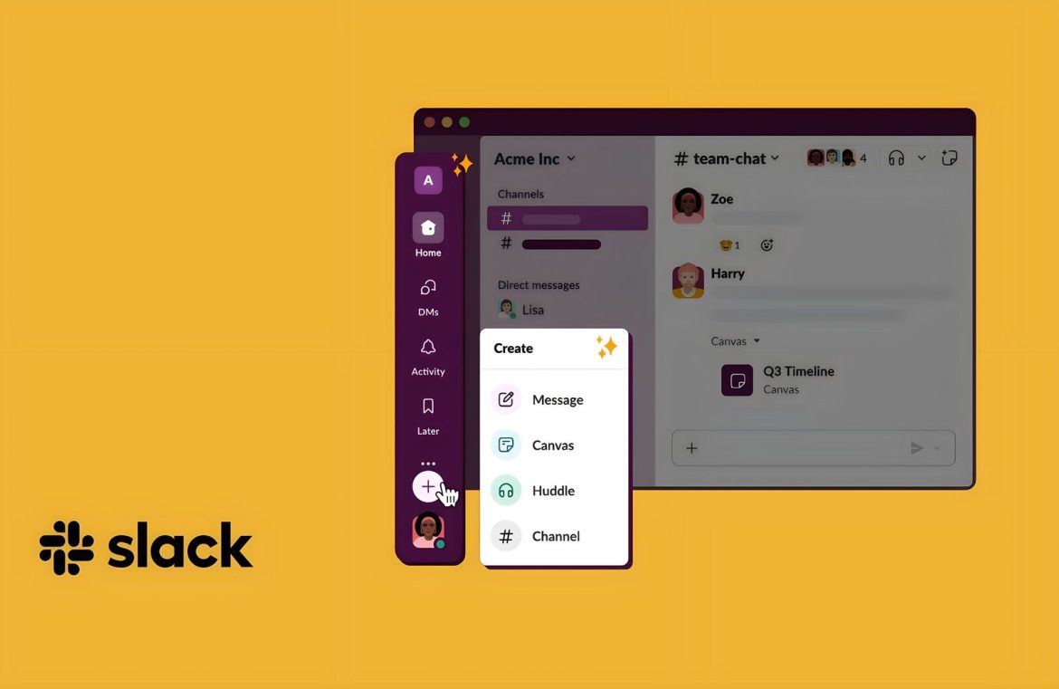
Slack has rolled out an extensive interface overhaul as of August 9. The refresh aims to streamline navigation across the platform, making every feature, whether established or recently introduced, more intuitive and accessible for users. The updates are tailored to enhance user concentration, accessibility, and overall efficiency.
Since its inception in August 2013, Slack’s rise in the professional communication sector has been rapid and pronounced. What started as a luxury for seamless professional dialogue has become an essential asset for countless organizations globally. In an era of remote work, Slack is often the digital hub for corporate interaction, serving as a virtual conference room, collaborative workspace, and informal chat venue rolled into one.
Naturally, with its expanded role comes increased expectations. Slack continuously introduces new functionalities to better support its user base and enhance communication dynamics. Huddles, a feature for spontaneous video conversations, is Slack’s nod to platforms like Zoom. Threads help team members keep conversations neatly organized, while Canvas offers a collaborative virtual canvas for document creation and editing.
However, incorporating myriad features has occasionally resulted in a user interface that is somewhat convoluted, posing a steep learning curve for newcomers. Recognizing this issue, Slack has rolled out a major redesign project, aiming to simplify user interaction with the platform and make it more user-friendly for all, especially those working remotely.

Image Credits: Slack
A striking change is seen in the left-hand sidebar. Direct Messages (DMs) now feature a dedicated button for quick access. The revamped Activity widget consolidates mentions, group channels, and thread notifications. Slack has also introduced a new system for flagging less critical messages to be reviewed at one’s leisure, found under a new ‘Later’ category.
A key innovation is the newly integrated ‘create’ button, symbolized by a plus sign at the bottom left corner of the screen. This hub unifies formerly scattered functions—such as starting new conversations, crafting canvases, initiating huddles, and setting up channels—into a single, easily navigable tool. Prior versions often scattered these options, leaving many users puzzled (remember when the headphone symbol was the gateway to launching a huddle?).
Overall, the latest tweaks to Slack have imbued the platform with an aesthetic and operational similarity to many current social media interfaces. The streamlined layout is a welcomed refresh, ushering in a significant improvement for engineers, developers, and all looking to maximize their productivity. Slack will implement the new design gradually over the coming week for free account holders, with premium subscribers set to receive the enhancements later in the autumn season, subsequent to Slack resolving any preliminary technical snags.

