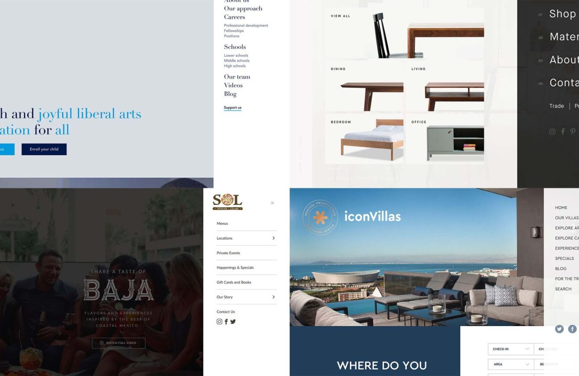
The hamburger menu is my favorite pet peeve. Simultaneously, I adore and loathe it.
I find myself at odds over this small yet significant detail in web design; I’m torn between its elegant simplicity and potential for clutter.
Indeed, I’m not the only one caught in this web of indecision. Despite its widespread adoption, the controversy over its convenience hasn’t settled – a conflict I face with each new endeavor together with my colleagues.
The uncluttered aesthetic that the hamburger menu delivers is captivating to me, yet it’s hard to ignore those pesky usability concerns that linger in the back of my mind, fueling my ambivalent feelings toward it.
Admiration: The Allure of Minimalism
The spaciousness that the hamburger menu bestows can lend a sense of chic sophistication to a design. Its minimalistic approach steers clear of clutter and superfluous elements stacked upon one another.
By constraining your navigation space, it compels the design team to make critical deliberations regarding content and user engagement. The hamburger menu necessitates judgment on what constitutes essential navigation, sparking vital discussions.
Such limitations on navigation focus your team’s attention on the goals of the website and the actions of users, aligning design with user intent (and that’s commendable).

Disdain: A Hurdle for Certain Users
The innocent hamburger icon – three horizontal lines – can often perplex a user segment. For audiences that are either mature in age or less tech-savvy, this icon can become a stumbling block, possibly leading to them leaving the site prematurely.
While it resonates well with tech enthusiasts, it isn’t universally understood. If your main audience is browsing from desktop computers, it may be time to reconsider its use.
Admiration: Embraced by Mobile Users
Witnessing the rise of the hamburger icon has been quite intriguing. Initially, many speculated it was a passing fad doomed to fade.
Contrary to that belief, it has become a norm on mobile devices, with most users grasping its purpose and functionality.
Faced with the challenge of making navigation links easy to select on small screens, designers embraced the hamburger menu, designing tap-friendly areas that enhanced usability.
![]()
Disdain: The Pitfall of Overcrowding
The temptation to cram every bit of information into the hamburger menu layout is overwhelming for some. This can lead to a cluttered, scroll-intensive experience – exactly what I loathe.
It’s critical to identify key pages that users must access quickly and feature them prominently in the menu. Overloading the navigation defeats the purpose of streamlined user flows.
Admiration: Swift Access to Important Links
The layout of the hamburger menu can facilitate immediate access to relevant content.
As observed by the Nielsen Norman Group, providing users with a direct route to their desired content, unlike the tedious serial progression through content, is a significant advantage. This means fewer steps for users to find what they need quickly.
If an expansive navigation is unfeasible, incorporating a search function within the menu can be an excellent workaround for users in search of specific information not immediately visible.

Disdain: Concealment of Instantaneous Information
The one aspect of hamburger menus that can be disconcerting is their tendency to obscure vital website context. A well-structured navigation menu instantly presents keywords and insights.
While a carefully considered design can mitigate this issue, it’s crucial that the design retains the website’s context via visible page content.
Admiration: Creative Use of the Hamburger Screen Space
The slide-out nature of the hamburger menu affords designers with a blank canvas for creativity.
Using this additional space imaginatively can greatly enhance the user experience. I find immense pleasure in engaging with a hamburger menu that surprises and adds value to my interaction with the website.

Disdain: The Click-Through Quagmire
Are you, like me, easily bothered by cumbersome navigation? Whenever multiple clicks are required to discover content on a website, I find myself losing interest fast.
Hamburger menus can contribute to a tiring cycle of clicks or taps to navigate, which might be cumbersome despite their speed. Let’s face it, patience is thinning in the era of instant gratification.
Final Thoughts
So, what’s my final stance on the hamburger menu? It’s complicated. I’m torn between affection and frustration, a dichotomy that will remain until a superior solution presents itself. What’s your take on it?

