590
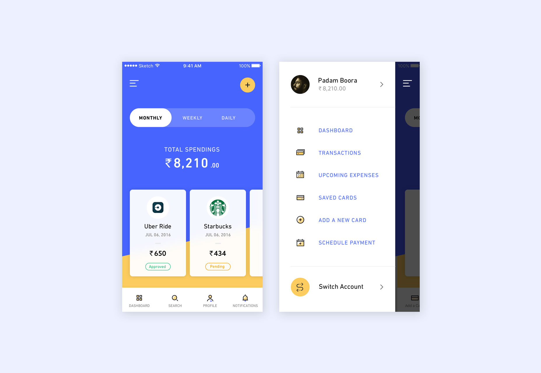
The once-trendy hamburger menu has gained notoriety for tucking away navigation options, aiming to keep digital interfaces neat and directed. Early on, Android cemented this element within its Material Design guidelines, influencing numerous Android and iOS applications and even desktop interfaces. While its implementation varies, the hamburger menu is, at times, chosen for visual appeal rather than for providing a superior user experience. It has become a familiar feature in the terrain of both digital product and web design.
In the realm of desktop applications, the hamburger menu’s justification falls short. Screen space is rarely at such a premium that one must resort to a hidden navigation menu. Companies like Google include this feature more for product uniformity and a unified cross-device experience than actual utility. This can result in frustration for users, especially when essential navigation options are concealed.
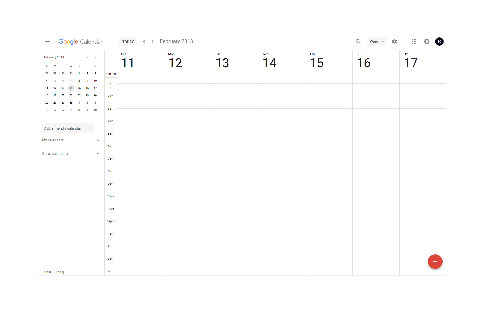
For standard websites like online portfolios, landing pages, and business platforms, concealing menus on a desktop display is inexcusable. With abundant space at designers’ fingertips, even the most elaborate navigation layouts are manageable. Desktop design isn’t bound by mobile protocols, allowing for inventive solutions like hover dropdowns and layered menus that enhance usability without hiding crucial links.
The emergence of elegant solutions such as hover-activated dropdowns and multi-level menus further proves that the hamburger icon is frequently an easy way out rather than an optimized design choice. Buried menus disrupt the flow of navigation and can baffle even tech-savvy users.

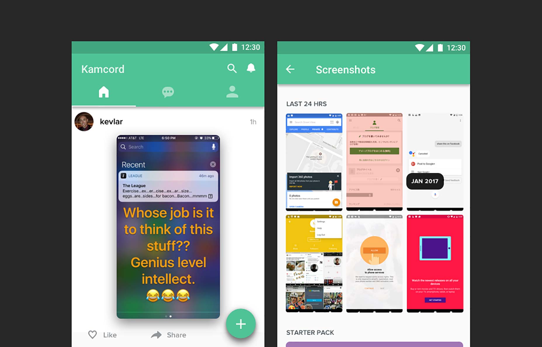
As screens shrink to the sizes of tablets and smartphones, the space-saving role of the hamburger menu comes into perspective. For mobile platforms, it’s a quick fix for tight screen space, a trend mirrored in the design of mobile sites and apps. Even iOS’s ‘More’ tab icon at the bottom of the screen offers a more reachable means of navigating. Despite the convenience, we must question whether the hamburger menu is the ultimate solution, especially when it requires repeated actions to access different items, affecting both primary and secondary features.
To replace the hamburger menu effectively, the alternative must be consistently applicable across varied apps and device ecosystems. One approach is rearranging the app title and utilizing the top right for primary icons, potentially with an overflow icon for additional options. A revised tab bar featuring icons instead of text labels can also streamline navigation, doing away with the need for secondary menus in many cases.
With these alternatives, the overall design focus shifts to usability, compelling creators to distill navigation elements into more intuitive tabs, rather than stashing them behind the hamburger icon. This practice can reduce title bar clutter in Android apps and prompt a move towards more user-friendly design methodologies. As design frameworks like Google’s Material Design continue to evolve, they’ll likely propose refined navigation methods that phase out the outdated hamburger menu, leading to more user-friendly and accessible digital products.
In the realm of desktop applications, the hamburger menu’s justification falls short. Screen space is rarely at such a premium that one must resort to a hidden navigation menu. Companies like Google include this feature more for product uniformity and a unified cross-device experience than actual utility. This can result in frustration for users, especially when essential navigation options are concealed.
For standard websites like online portfolios, landing pages, and business platforms, concealing menus on a desktop display is inexcusable. With abundant space at designers’ fingertips, even the most elaborate navigation layouts are manageable. Desktop design isn’t bound by mobile protocols, allowing for inventive solutions like hover dropdowns and layered menus that enhance usability without hiding crucial links.
The emergence of elegant solutions such as hover-activated dropdowns and multi-level menus further proves that the hamburger icon is frequently an easy way out rather than an optimized design choice. Buried menus disrupt the flow of navigation and can baffle even tech-savvy users.
As screens shrink to the sizes of tablets and smartphones, the space-saving role of the hamburger menu comes into perspective. For mobile platforms, it’s a quick fix for tight screen space, a trend mirrored in the design of mobile sites and apps. Even iOS’s ‘More’ tab icon at the bottom of the screen offers a more reachable means of navigating. Despite the convenience, we must question whether the hamburger menu is the ultimate solution, especially when it requires repeated actions to access different items, affecting both primary and secondary features.
To replace the hamburger menu effectively, the alternative must be consistently applicable across varied apps and device ecosystems. One approach is rearranging the app title and utilizing the top right for primary icons, potentially with an overflow icon for additional options. A revised tab bar featuring icons instead of text labels can also streamline navigation, doing away with the need for secondary menus in many cases.
With these alternatives, the overall design focus shifts to usability, compelling creators to distill navigation elements into more intuitive tabs, rather than stashing them behind the hamburger icon. This practice can reduce title bar clutter in Android apps and prompt a move towards more user-friendly design methodologies. As design frameworks like Google’s Material Design continue to evolve, they’ll likely propose refined navigation methods that phase out the outdated hamburger menu, leading to more user-friendly and accessible digital products.