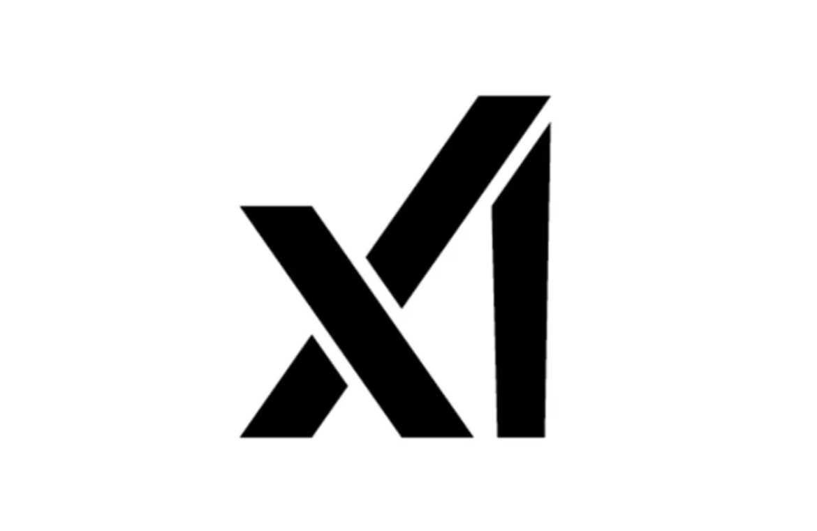
Elon Musk, the driving force behind giants like Tesla, SpaceX, and Twitter, recently graced the headlines with the introduction of xAI, his latest venture into the realm of artificial intelligence. However, the unveiling of the brand’s emblem has sparked a split in opinions.
Positioned to rival the likes of OpenAI, the powerhouse publisher of ChatGPT, xAI emerges not long after Musk vocalized his concerns about AI’s threat to humanity.
The debate over the minimalist approach to xAI’s logo has swiftly captivated designers and netizens. A camp of enthusiasts lauds the ingenious minimalistic design, proclaiming the logo’s ability to communicate xAI in a mere triplet of lines. Conversely, there are voices critiquing it for simplicity to the point of obfuscation, placing it on par with the unpredictability of Musk’s stance on AI.

Critics primarily challenge the logo’s legibility, positing that the mark could be perplexing without prior knowledge of the company’s moniker. While the ‘x’ is readily identifiable, the ‘A’ hinges on the assumption that the extending right line belongs to it. However, this introduces ambiguity with the ‘I’, as interpreting the right stroke as said letter makes the central line seem like an extension of the ‘x’, therein lies the visual conundrum.
While some commentators infer the lower segment of the ‘X’ to represent the ‘A’, others are left seeing variations like ‘xA’, ‘X1’, or ‘XI’ rather than xAI. Amid these mixed reviews, the emblem is both commended for its succinctness and disparaged for falling short in clarity. Musk’s xAI insignia serves as a testament to the value of collaborative feedback during the typographic logo design process. Coupled with recent observations likening the Tesla logo to an IUD, it’s evident Musk’s logos are fertile ground for interpretation.

