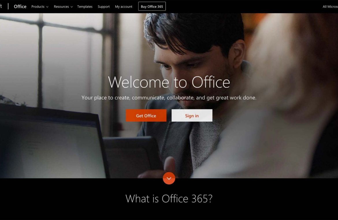
The Formative Years
Post-Microsoft’s pioneering work, landing pages flourished across the burgeoning web—cluttered, loud, and often a mélange of aggressive sales pitches, glowing endorsements against plain white canvases. The style, however, started to shift in 2009 when landing pages began to adopt a cleaner, more professional look almost seemingly overnight with the rise of specialized design agencies. These entities ushered in the modern landing page era—concise, sometimes humorous copy, an array of blues replaced stark whites, and imagery sharpened into focus. It wasn’t just about looks; the landing page concept was honed with A/B testing methodologies, providing empirical data on what truly resonated with users.
Composing a Landing Page Today
Scores of online resources offer successful strategies for crafting high-converting landing pages. These tips, distilled from seasoned marketers’ experiences, shape our contemporary understanding of a landing page: an inviting headline, a compelling intro that speaks directly to the user’s needs, and an unambiguous call to action. For example, Lance Jones from Copy Hackers advocates for constructing a landing page in a reverse engineering manner—beginning with the call to action and tailoring the rest of the content to encourage that crucial click, excluding any material that won’t contribute to this goal. The CTA has become the quintessential element of an archetypal landing page. Some marketers continue to include elements like testimonials and detailed problem-solving narratives, while others have pared back to the essentials—a conspicuous ‘buy’ button or a prompt to enter an email.
Efficiency is Key to Engagement
Putting the ‘buy’ button or sign-up field front and center can be an effective design choice, particularly for well-known brands with established reputations. Yet, for smaller enterprises or those marketing complex, higher-value services, a straightforward landing page may not suffice. The options have diversified; some favor an initial simple view that leads to more information upon scrolling, arranged in an appealing and intuitive fashion, or they might pivot to capturing leads rather than closing immediate sales.
The Emergence of Squeeze Pages
Squeeze pages have carved out their niche as a subtler cousin to the landing page—designed for capturing a visitor’s contact details without hard-selling upfront. Often offering freebies or no-commitment engagements, their success depends on making it abundantly clear to the customer that the offer is indeed complimentary.
Direct-to-Search Approach
Another stratagem for delivering complex services involves jump-starting the visitor’s search process. Think of how airline booking platforms tailor the content displayed based on the user’s search terms.
Should Landing Pages Have Links?
While the vast majority of landing pages feature links, there’s ongoing debate about their effectiveness. Some A/B tests suggest they can distract from the conversion process, but these tests can’t quantify the behavior of more cautious consumers who prefer to explore a site before committing. Notwithstanding, some experts, like Neil Patel, advocate for a minimalist approach where the only clickable items lead to the call to action or provide additional information for those still on the fence.
The Appeal Must Match the Business
What’s evident is that there’s no one-size-fits-all landing page template that works universally. All businesses have unique needs, and their landing page must reflect that—whether it needs to be simple and direct or more detailed for those providing complex solutions. Neil Patel summarizes it aptly: your landing page content should be straightforward, engaging, and persuasive, prioritizing clarity over creativity.

