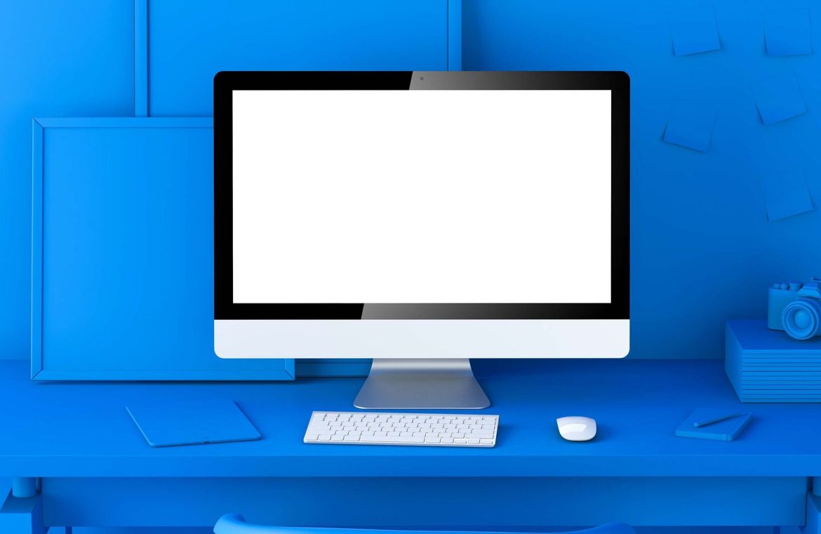
Over the past ten years, minimalism has captured the hearts of many designers. Originating as a reaction to previously ornate designs, it embraced an aesthetic of simplicity and clarity in both web and user interface design. This approach meant reducing design elements, which not only expedited development but also allowed digital products to load with greater speed.
From the outset, minimalism has been an influential concept. Reflect on the timeless designs of the company Braun or the architectural feats of Mies van der Rohe, and it’s clear that simplicity has long been a source of inspiration.
Simplicity has long been a source of inspiration.
Minimalism was thrust into the spotlight with the rollout of iOS 7. Apple steered away from previously favored rich aesthetics to echo the minimalist design of its hardware. This resulted in a user experience characterized by slim icons and a uniform appearance, giving off a cold, bare impression. Over time, Apple has refined its minimalist approach somewhat, yet it retains a ‘less is more’ philosophy in its design.

Apple serves as a fascinating case study in minimalism. They engage customers through streamlined design – crafting products that seem innately simple to understand and operate. Their relentless pursuit of simplicity, exemplified by controversial decisions such as omitting the headphone jack and the home button, shows a commitment to a minimalist future.
Apple’s stunning peripherals are a triumph in aesthetics, yet they trail significantly in ergonomic design.
However, a deeper examination of Apple’s minimalistic approach reveals a prioritization of form over function, which can sometimes be detrimental to user experience. For example, Apple’s sleek peripherals may look elegant but can cause significant ergonomic discomfort. In contrast, Microsoft focuses on a balance of simplicity and user comfort.

Consider the iPod Shuffle 3rd Generation, which eschewed traditional controls for a minimalist facade, yet its intuitiveness suffered greatly. Such extreme applications of minimalism aren’t exclusive to Apple; it’s a phenomenon seen across varying industries, spurred by consumer demand for clean, uncluttered lines in products.

The compromises of minimalism are equally present in digital interfaces as they are in physical product design. The trend toward ultra-simplified design can lead to problems such as drab color palettes, inadequate differentiation of elements, challenging navigation, and overall poor accessibility.
Essential actions become difficult to identify, often hidden among monochromatic hues and cryptic symbols devoid of text descriptors. Furthermore, typography meant for content can be diminutive, posing accessibility challenges for a significant portion of users.
Thus, design choices espousing the minimalist ethos can inadvertently alienate users, particularly those dependent on clear accessibility considerations.
Ultimately, minimalism is centered on aesthetic restraint — subtracting rather than adding and making thoughtful design decisions. Famous architect Frank Gehry criticized it as a ‘dead end’, pointing out in this short interview that it can strip designs of emotion, heading towards a barren extreme.
Designers are often caught in a quandary. Minimalism can produce visually elegant work that is gratifying to implement when done judiciously. Yet the question remains: should aesthetics hold such sway in digital and product design? It’s rare for an optimal user-centric design to fall neatly within the minimalist category.
It suggests that minimalism might be best reserved for purely visual aspects of design and less so for interactive or user-centric applications, encompassing everything from user interfaces to websites and physical devices. Striking a harmonious balance in design is critical, navigating a middle path between minimalist and maximalist extremes.

