1. Steer Clear of Cumbersome Mega Menus
Mega menus seemed like a good idea for a while, but they ended up causing more confusion than clarity. They bombard users with too many options and dilute the overall experience. Be decisive: dive into your site’s analytics, understand what your audience seeks, and streamline your menu accordingly. Most users resort to a search function if they don’t immediately find what they need, so a mega menu might not be as helpful as you’d think. 
2. Highlight the Search Feature
With search becoming an integral part of navigation, it’s vital to ensure it’s easily noticeable on every page. Users often prefer to search for specific items directly, so embedding a large, accessible search box within the main navigation can greatly enhance usability. Plus, having an effective search tool can keep visitors browsing your site longer. 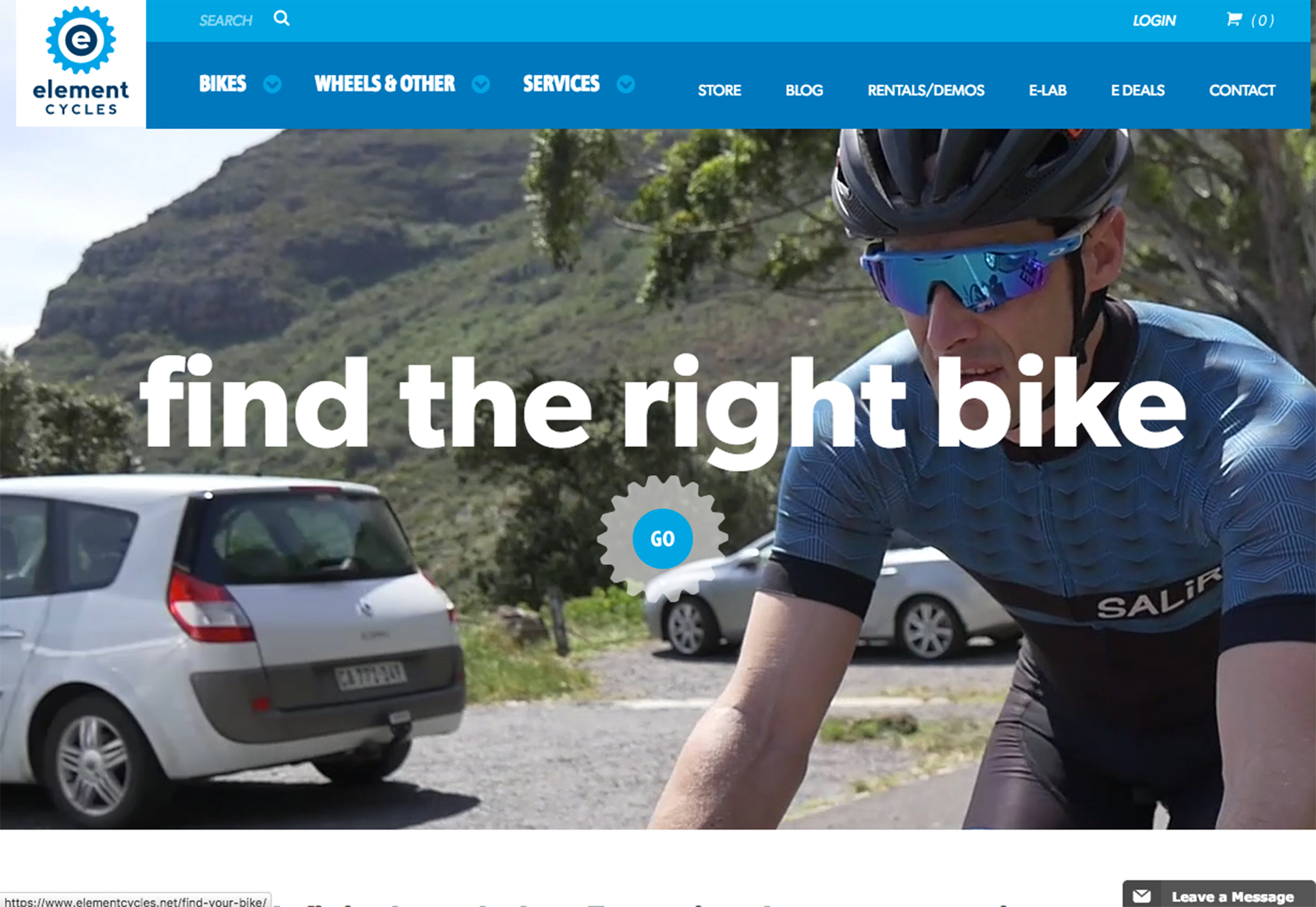
3. Optimize Menu Choices
Curate your navigation menu by prioritizing the most sought-after pages and information. Essentials like search, about/contact, and shopping cart or purchase links should be a given. Tailor the rest based on your site’s content and user engagement to avoid overwhelming your visitors with too many options. 
4. Personalize the Navigation Experience
A smart navigation menu anticipates user needs and facilitates a smooth transition from one content piece to another. It’s a good practice to have different navigation options available depending on where the user is on your site. Take inspiration from online giants like Amazon, who tailor their navigation to include personal greetings, recent activities, and personalized recommendations. 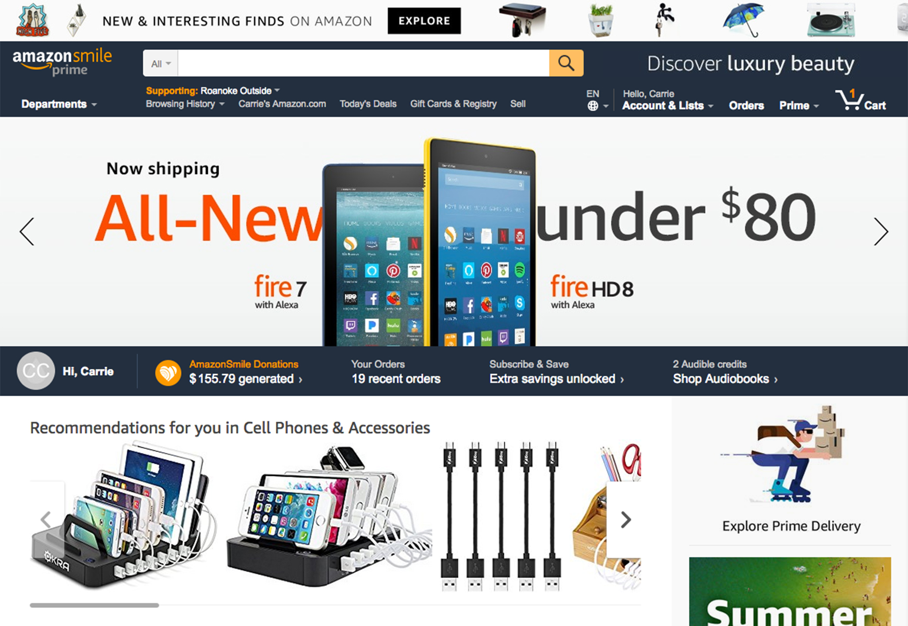
5. Thoughtfully Arrange Navigation Elements
The sequence of your menu items is crucial, with the first and last elements often being the most memorable and clicked on, according to the serial position effect. Analyze your web traffic to identify which pages to feature prominently in your navigation, ensuring users have immediate access to high-traffic areas and key content. 
6. Implement Sticky Navigation on Lengthy Pages
For pages that involve a lot of scrolling, consider a sticky menu that remains in view as the user moves through the content. This convenient feature keeps navigation within reach at all times, encouraging prolonged engagement with your site and potentially increasing conversion rates. 
7. Maintain Clear Visibility of Navigation
Navigation should never be an Easter egg hunt. Avoid minuscule menus, hidden links, and purely icon-based navigation without clear labels. Your navigation should be conspicuous and consistent across all pages, ensuring visitors have a clear path no matter how they landed on your site. 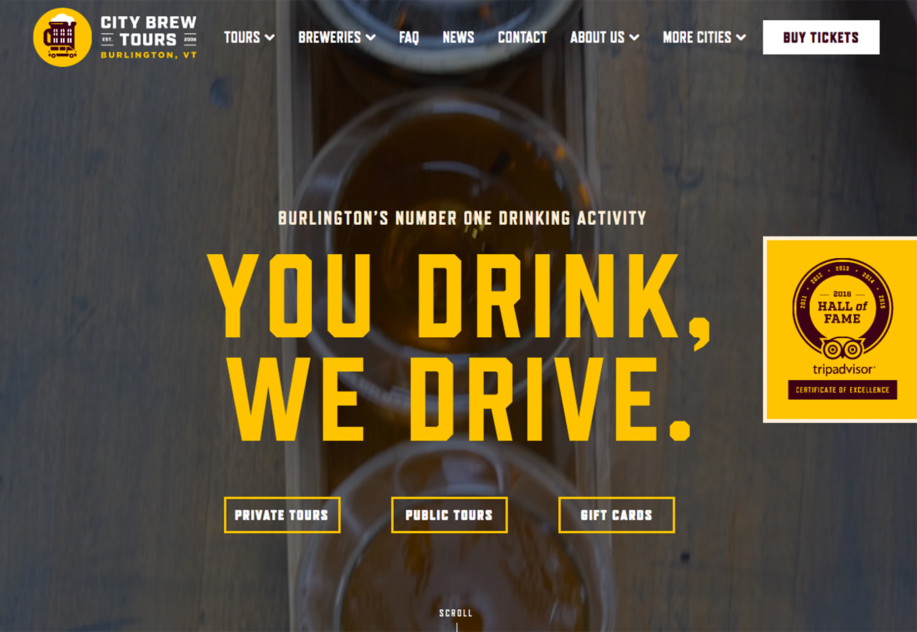
8. Label with Precision
Every navigational cue, from the text to the icons, must clearly communicate its function and destination. Use universal symbols and complement them with descriptive text labels to remove guesswork, ensuring a smooth navigation experience that doesn’t rely on users’ familiarity with generic or vague terms. 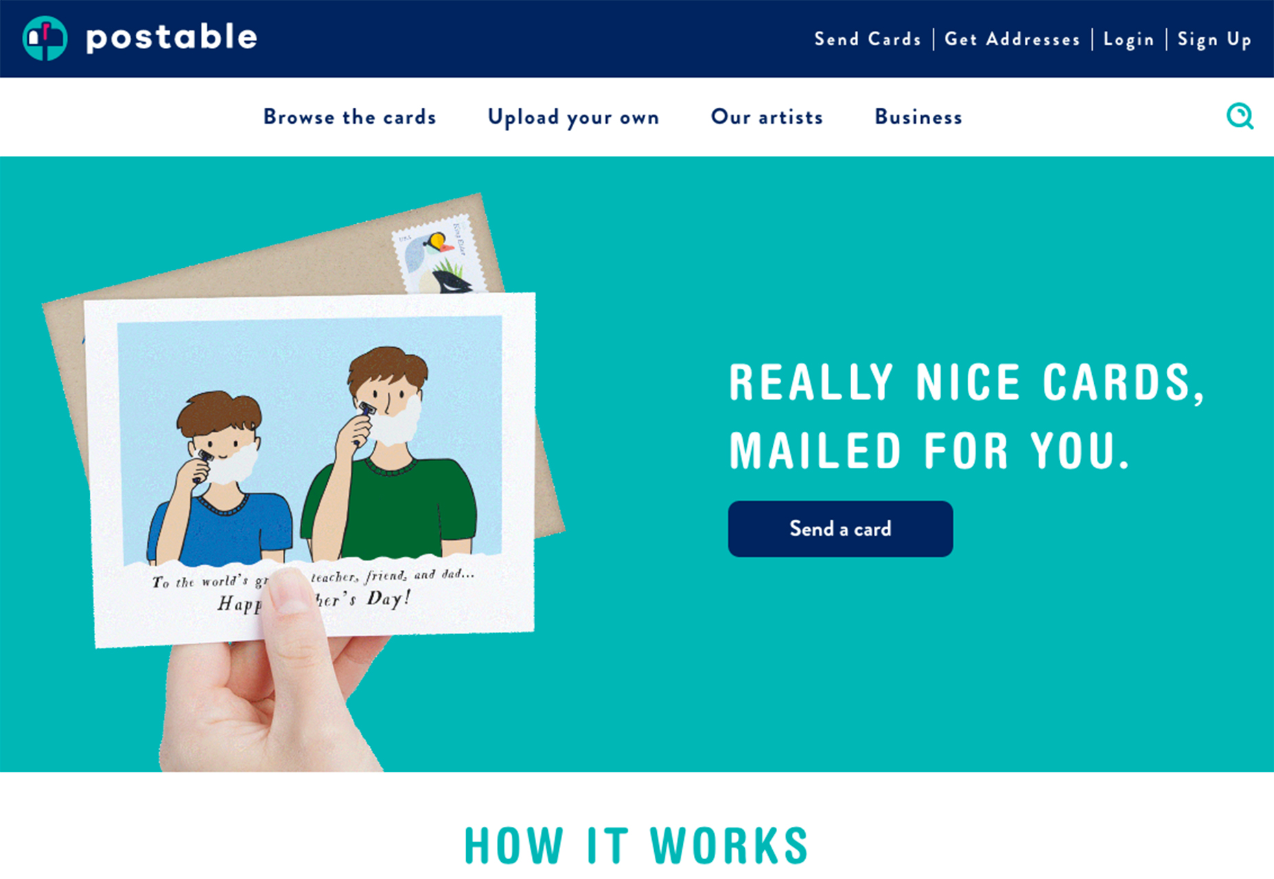
9. Explore Full-Screen Navigation
For minimalist websites or those with fewer critical sections, full-page navigation can put important content front and center. This bold approach is particularly fitting for portfolio or project-based sites where you want to draw focus to a few standout elements. 
10. Embrace Vertical Menus
Vertical navigation has become a modern trend, offering a refreshing take for sites needing more navigational breathing room. Perfect for fitting in more items cleanly, vertical menus can transform a dense array of options into an organized and sleek sidebar.