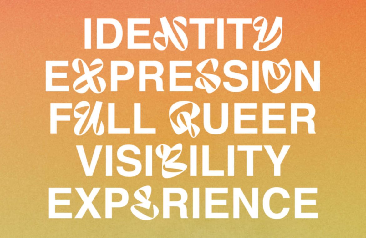
Typography is essential in crafting designs that can provoke emotions, solidify brand recognition, organize information visually, and convey the intended ambiance of your material.
Thus, we’ve curated a handpicked selection of the finest typography gems we’ve uncovered on the web over the last month. Dive in and enjoy!
Bold Expression: Audaz
Audaz offers a distinct presence, meticulously crafted for Nike’s “No Pride, No Sport” campaign. This custom typeface presents novel expressions of traditional character forms, with each glyph distinct yet steadfastly representing the Latin alphabet.

Hushed Edginess: Korium
Korium, a contemporary variable font, boasts condensed shapes influenced by Humanist flare. Featuring inviting exteriors and piercing interiors, it’s perfect for designs that demand a modern sans serif with a twist.

Angular Charm: Dockland
Dockland presents a dynamic slab-serif, with sharp angles and confidence. Drawing from historical blackletter and 1890s lithography, its contemporary scale and versatile weights are ideal for branding endeavors.

Animated Dots: BDot
The dot-based BDot typeface enchantingly animates across various dot thicknesses. Best displayed in light weights or larger sizes, it harmonizes magically with its sibling font, BLine.

Elegance Redefined: Moisette
At the crossroads of tradition and modernity, Moisette shines with its bold contrasts and spacious x-height, offering clarity and sophistication perfect for editorial use.

Witty Classic: Avgarde
Avgarde winks at the Helvetica-esque hand-lettering of a Boston rail station. Eschewing the austerity of the International style, it serves as the cheerful rogue of typefaces.

Versatile Ingenuity: Britney
An experimenter’s delight, Britney unfurls a versatile font system with legible uppercase and two unorthodox lowercase sets ideal for playful design concoctions.

Swift Elegance: Raptor Text
Much like its namesake in Jurassic Park, the Raptor Text font excels in agility at smaller sizes, with time-tested styling choices to please the discerning reader’s eye.

Hand-Drawn Aesthetic: Laica
Laica skillfully combines the essence of both broad and pointed nibs, creating an earthy, handcrafted character that defies the haughtiness of formal typesetting.

Art Deco Elegance: Ernst
The Ernst typeface sports a stylish slab serif refinement, adept at extended reading yet brimming with engaging details at larger sizes, inspired by 20th-century Parisian cinema.

Tapestry Inspiration: Aubusson
Aubusson captures the textural essence of French tapestries, translating their woven artistry into warm, approachable letterforms reminiscent of the weaver’s craft.

Functional Elegance: Rom
Rom claims its place as a sans-serif workhorse, marrying Gothic and Grotesk tendencies for a family that’s a natural fit for the dynamic needs of corporate visuals and logos.

Playful Past: Hooey
Embracing the nostalgia of Y2K aesthetics, the delightful Hooey font bursts with a playful disposition suited for eye-catching display purposes, reviving the flair of youth culture.

J. Carlos Redux: Melindrosa
Channeling J. Carlos’s 20th-century Brasilleiro stylings, Melindrosa stands out as a distinctive display face that reverberates with Art Deco dynamism.

Building Blocks of Type: Basel
Basel underscores its versatility with a series of styles, from the unsparing Grotesk to the finessed Classic variants. Its variable font editions take full advantage of tailored weight options without overwhelming the page.


